Why you can trust TechRadar
Running on the Symbian Series 40 platform, the Nokia 7230 has a functional, if unspectacular interface, offering up three ways of accessing the phone's main functions.
With a click of that central menu button, you'll see icons for all of the basic functions or alternatively, the left-hand selection key brings up the highlights on a scrolling list. The right-hand key offers quick access to your contacts.
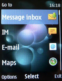
Finally, opting for the Home Screen mode brings up mini icons for media and networking to scroll through.
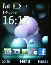
Which one is best? To be honest, we found ourselves using all three randomly, with none of the menus offering quite what we wanted on first use.
But don't despair, you can change the shortcuts to your own preferences with a bit of time and effort through the menu settings, so if web access on the go is a big thing for you, just stick a quick icon to it on the home screen instead of Facebook.
But even allowing for that, the interface does seem a little messy purely by trying to cover too many bases.
Granted there isn't a touchscreen interface to play with, but one well thought-out way of accessing all functions (like on the lower budget Samsung Genio Slide) would certainly be better than the three different solutions currently on offer.
When you first log in, you'll also be offered the option to sign up to Ovi for phone-based email.
It's something Nokia is rightly proud of, but we found the experience slow and not without error messages.
We got there in the end, but with the thought that the Nokia 7230 might be used by first-time phone and email users, it is something that needs tightening up.
Nokia 7230: Calls and contacts
Nokia has been making mobile devices for as long as most of us have been alive, so as you would expect, the calling side of the 7230 runs as smoothly as a high-end sports car.
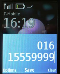
Voice calls are clear, with no obvious drops in the network as we were using it.
Accessing calls is also a doddle (just a slide and touch of a button), the ringtones, which are both available as presets and MP3, are loud enough to wake the heaviest of sleepers and the keypad is large enough to accommodate the biggest of fingers when fumbling to answer.
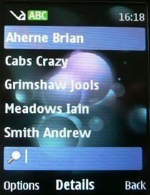
Setting up contacts is just a matter of entering details in a few fields, although you can augment your entries with personalised images and sounds, as well as web and email details. Accessing is just as easy, simply press the right hand soft key and you're flung into the contacts list.
There's a big, bold font for typing out and reading those texts and an equally large message when a call is incoming. No video calling, but we suspect you've already guessed that one on a handset for this price.
Current page: Nokia 7230: Interface, calls and contacts
Prev Page Nokia 7230: Overview and design Next Page Nokia 7230: Messaging and email