Why you can trust TechRadar
Nokia C2-01 review: Interface
With no touchscreen present you are reliant on the D-pad and a pair of soft menu buttons to get around the Nokia C2-01. The classic software design makes this possible – there are always soft menus available and the centre of the D-pad also gives you access to options.
The main screen comprises four areas, which you can personalise. Out of the box, only the top and bottom of these are set up with shortcuts: the top one to email, the bottom one offering a shortcut bar that takes you to apps.
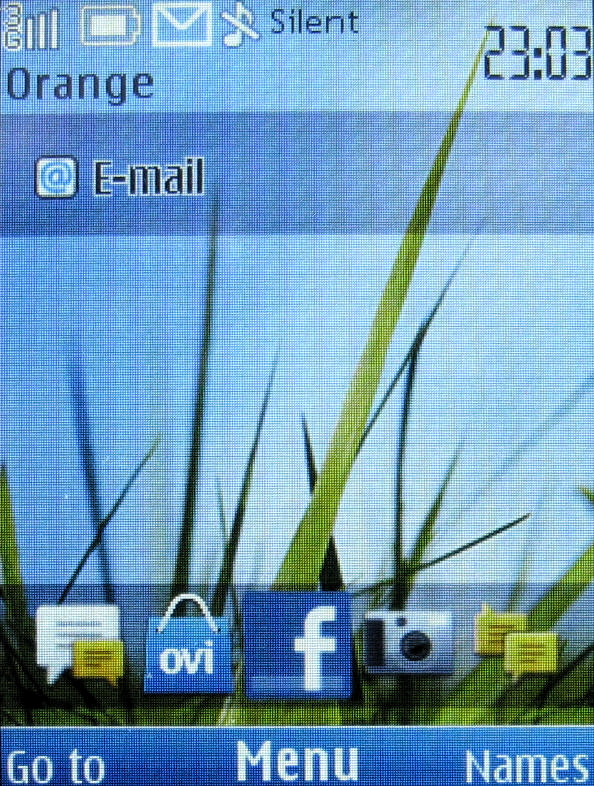
Changing these settings is not difficult, but it is time consuming. You need to go into the Settings area which takes a few presses of the D-pad, and then you can make changes.
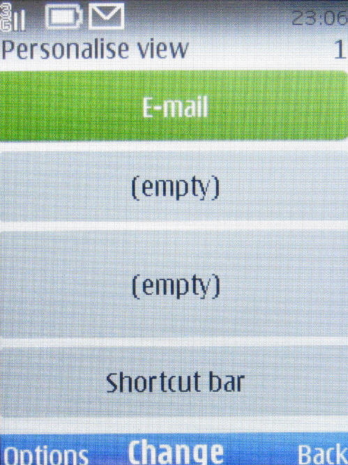
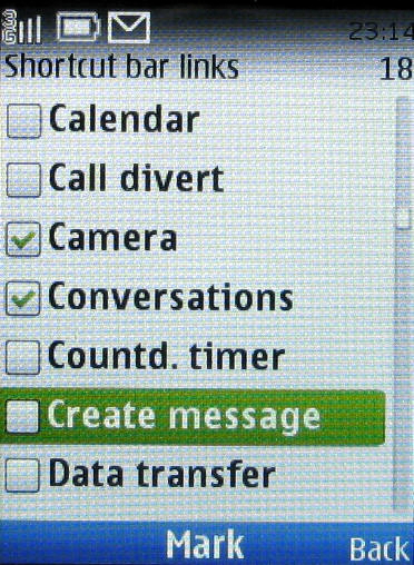
You can only have one shortcut bar, but this can offer access to a wide range of apps and services in a horizontally scrolling bar. It's a shame you can't fill every one of the four slots with its own shortcut bar, but Nokia clearly thinks this would be overload. Thanks, Nokia, but the user can be the judge of that.
The other three areas can be set to contain one of a smaller number of options but at least you can include some live information such as notifications.
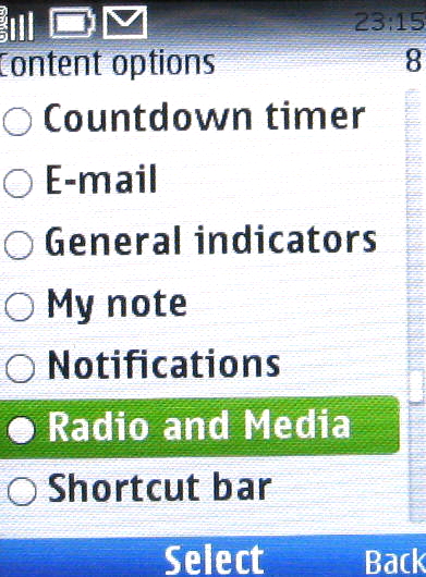
You can also configure what the right and left softkeys do on the main screen, as well as what the four points on the D-pad do. This does at least give you the potential to access more apps and services quickly.
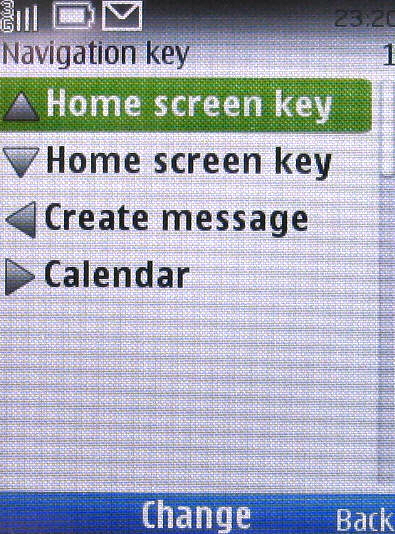
Once you have everything set up the way you want it, you can move about pretty quickly through the most often used parts of the Nokia C2-01. Which is a good thing, since the main menu system is tedious to get around.
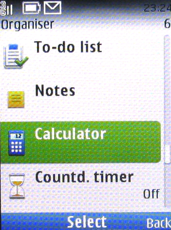
The old-fashioned way the Nokia C2-01 relies on nested menus is a real pain. You need to remember where apps and services are located, and tap the D-pad a lot to get to them. For example, say you want the Calculator.
First you tap the D-pad when on the main screen and up pops the apps menu.
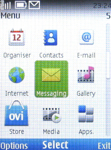
Next you have to choose Organiser, for it is grouped in this folder along with lots of other apps such as the alarm clock, calendar, to do list manager, note taker, countdown timer, stopwatch and, yes, Ovi Maps. What's Ovi Maps got to do with a group called 'Organiser'?
On the plus side, things do move quite smoothly. The processor doesn't have much to do to get you between apps, and most of the time on-board apps don't take ages and ages to run. You do have to wait a little for Ovi services to kick in, and for the web browser to run, but these are exceptions.
Current page: Nokia C2-01: Interface
Prev Page Nokia C2-01: Overview Next Page Nokia C2-01: Contacts and calling