Why you can trust TechRadar
So, we've noted that the Nokia C3-01 Touch and Type runs S40 6th Edition, which is basically Series 40 enhanced for touch support.
We weren't that excited when S60 got the touch support treatment with the Nokia 5800 XpressMusic, and it never got much better for us. Nor have we been bowled over by S60's successor, Symbian^3, seen so far in the Nokia N8 and C7.
However, adding touch to S40 seems somehow to have made a positive difference to what is quite a restricted operating system by modern standards. Touch makes using something fairly basic that bit easier, and we like that.
We did find that the screen sometimes registered a tap when we were really just making contact to start a sweep. The screen is resistive, which means that responsiveness in general isn't what it could be. But overall we much preferred tapping the screen to using a D-pad.
The 2.4-inch screen itself delivers a relatively paltry 240 x 230 pixels and, while it is fairly sharp, it isn't going to give top-end displays a run for their money.
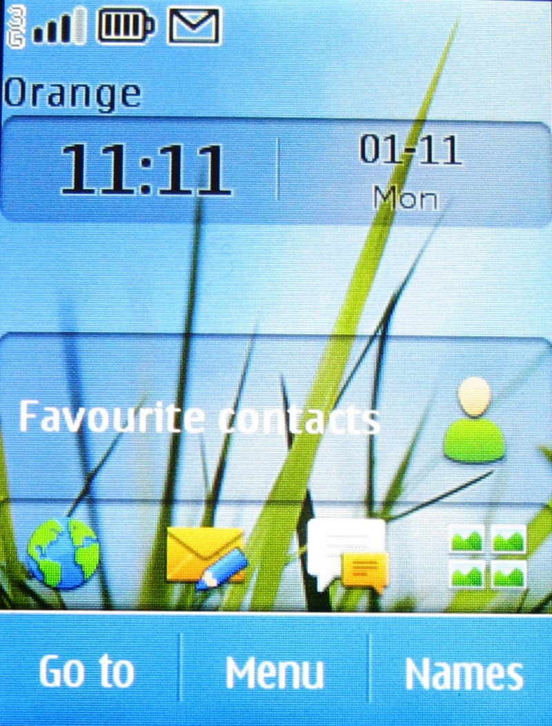
There are three softkeys beneath the screen. Tap the centre one to go to the main apps menu. Tap the right-hand one – Names – to get to your contacts. The left hand one – Go to – takes you to a personalised set of nine shortcuts.
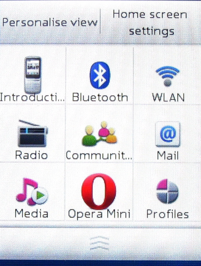
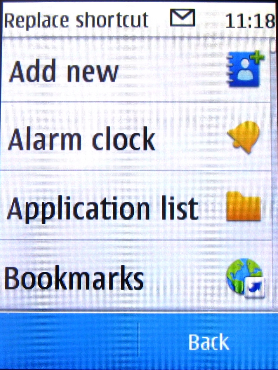
You can fiddle with this so it shows the shortcuts you want, and this isn't too much of a pain to do. Hit Personalise View, tap a shortcut, then choose what you want to replace it with from the list on offer. Finally, hit OK.
You can also fiddle with the Home screen settings from this Personalise screen by choosing Home Screen Settings. You can decide what you want to display on four different horizontal panels.
The top one defaults to the clock, the second is empty, the third is set for favourite contacts and the fourth is a shortcut bar. You can swap the first three for anything else in the list of options.
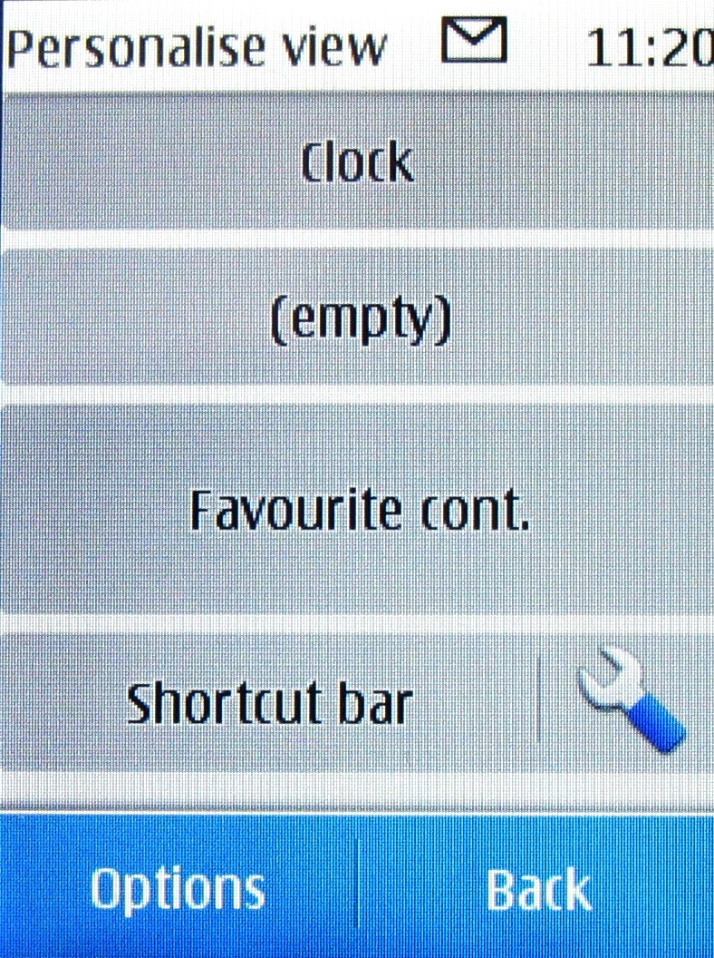
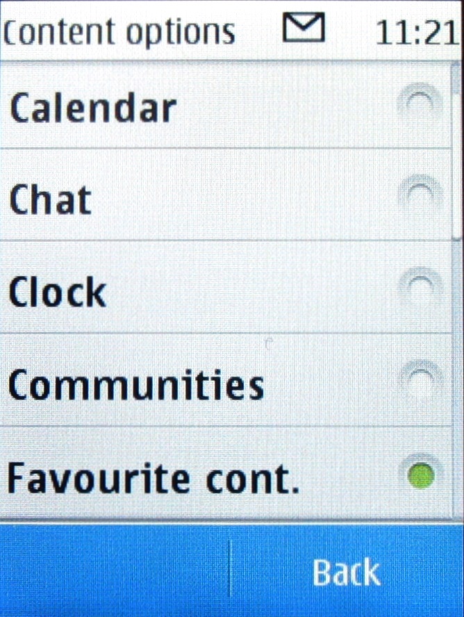
The shortcut bar can be swapped for another long panel, or you can set up four different shortcuts within it.
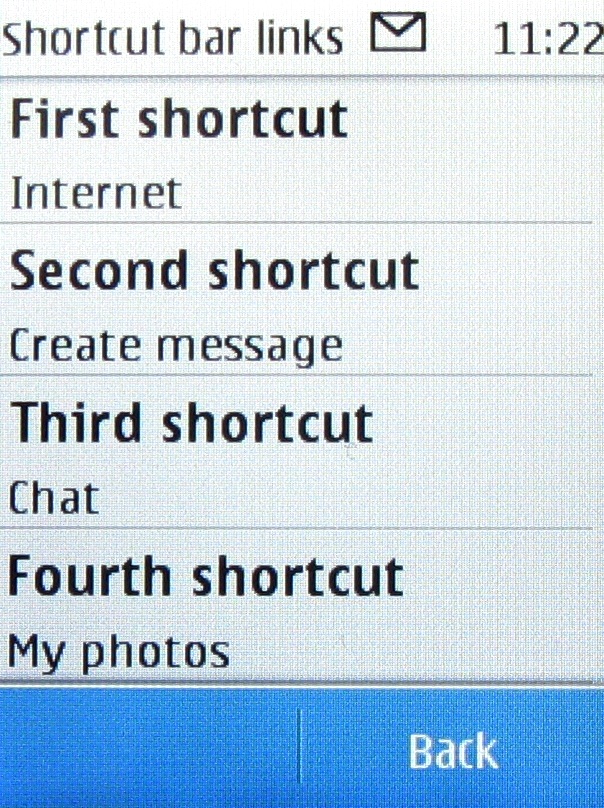
It is quite a flexible system and not too difficult to configure, but this being S40 you do only get the one home screen to play with.
When it comes to fiddling around in the menu to find apps, Nokia doesn't really understand the modern convention that people tend to like one list rather than nested folders. So, the main menu screen is only the beginning.
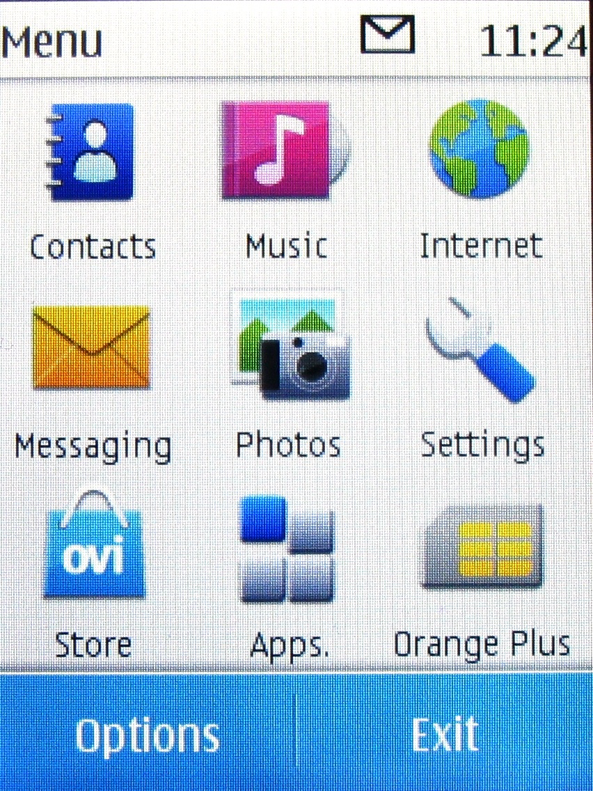
When you tap Apps you get a list another list.
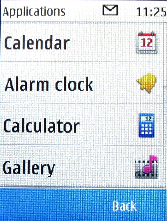
Scroll vertically through this list to see all the on-board apps. Hit Extras and there's another new section containing games and apps you've downloaded, and giving access to the contents of your microSD card.
It isn't as complex as with S60 or Symbian^3, but it's still rather convoluted.
Current page: Nokia C3-01 review: Interface
Prev Page Nokia C3-01 review: Overview Next Page Nokia C3-01 review: Contacts and calling