Why you can trust TechRadar
The Nokia C3 is a Symbian handset, which won't come as a big surprise to anybody. However, it runs Symbian S40, which, rather like the unfortunate younger brother in a Jane Austen novel who has to go into the church to make a living, is a far, far lesser thing than its S60 sibling.
And we're afraid S40 doesn't have the saving grace of being morally sound, lovely to be around and generally a good egg.
No, Symbian S40 feels cut down, hampered and, well, quite simply less than its big brother.
If you've never experienced S60 then you probably won't mind this, but to us the whole thing feels out of step.
Still, the Home screen offers a range of information and application shortcuts so that it looks quite busy and is very useful.
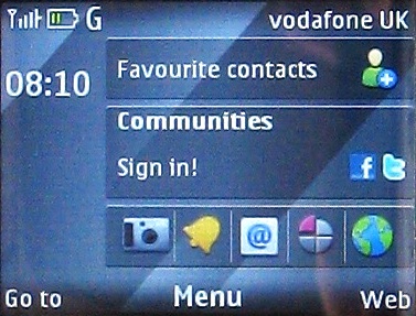
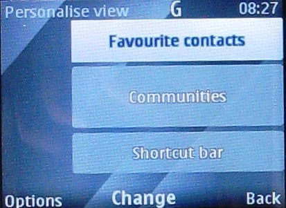
The first row of information is a set of shortcuts to contacts. Five are visible at any one time, with little thumbnail pictures of them. Beneath these is the Communities area.
Before you sign in to Facebook and Twitter there's a blank space here. Sign in to one or both of these and you can see updates, but only for whichever you select as the main account.
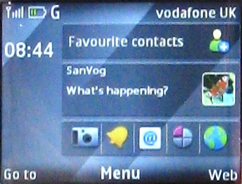
You use the D-pad to see older updates. Click the centre of the D-pad to go to a proper app for each service. Multiple accounts for both Facebook and Twitter are supported and it's easy to flick between them to choose different ones as the main account.
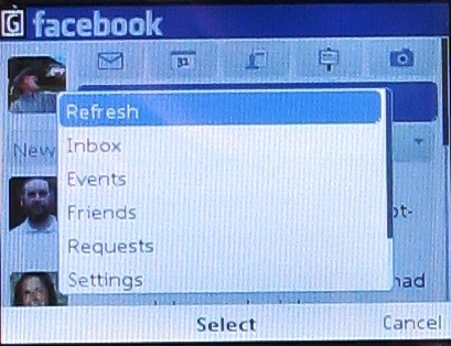
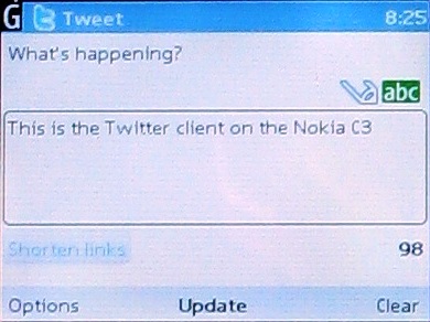
It is also easy to go to the Facebook and Twitter apps themselves. It's all very slick and on its own makes the C3 a great handset for social networking.
Beneath this is the Shortcut bar which shows shortcuts to five different apps. You can personalise these so that they show the apps you access most frequently.
And, in fact, you can personalise all three areas, so that they show other things instead of the presets. Options include calendar data, Ovi Chat, notifications and WLAN status.
On the main screen the two softkeys are mapped to the Web and a quick Go To selection of more shortcuts, while the centre of the D-pad takes you to the main apps menu. The whole thing is, as you'd expect from Nokia, extremely slick.
Current page: Nokia C3: Interface
Prev Page Nokia C3: Design & overview Next Page Nokia C3: Calls and messaging