Why you can trust TechRadar
Nokia C5-03 review: Interface
Utilising the Symbian OS (S60, 5th edition), the user experience is pretty clunky overall. Slow is the order of the day, with a side of occasional random crashing when the battery gets a little low and you attempt to open some apps, such as Twitter.
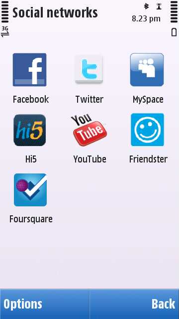
It's straightforward to navigate (you've seen it all before), and comes preloaded with social networking apps to get you started. However, the apps of choice, which, in actuality, aren't all apps but simply shortcuts to mobile sites, might explain a few things.
Facebook, Twitter and YouTube appear as standard, but also in the mix are Hi5, MySpace and Friendster... so if you still remember those log-in details from MySpace days gone by, you're in luck. Welcome to 2005.

The 3.2-inch resistive touchscreen weighs in at the same size as the capacitive offering on the HTC Wildfire, but doesn't match up to the HTC 7 Mozart's beastly 3.7 inches, the 3.5 inches of the iPhone 4, or even the 3.5 inches of the Nokia N8.
Yet the display is generally sharp, and videos – though a little laggy thanks to the OS – are watchable, though the pixelation can get a little dire, especially using the YouTube app.
A slightly frustrating bit of programming is the incredibly short time between the phone being active and sleep mode turning off the display, but this can be adjusted in the settings; either turned off completely or adjusted to fit a specified time.
To make sure you're not frustrated by a short auto screen lock time, delve into the settings to turn off the keyguard.
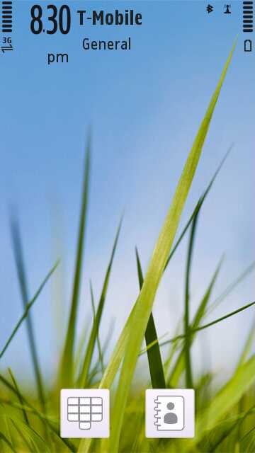
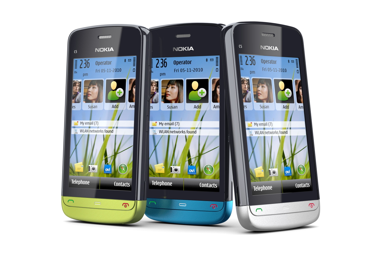
The Nokia C5-03's Home screen is customisable, with options to put favoured widgets and networks on display and shortcuts to your email inbox. However, if you're not a fan of the world being able to see your fondness for Freecycle, and you're not in dire need of a shortcut to Twitter's mobile site, we'd suggest the sleek Basic theme, with just two portals – one for your contacts, one for old-school dialling.

The nicely designed softkeys residing below the resistive touchscreen enable you to shortcut to dialled numbers and call log, the menu, and the screen lock and profile settings respectively. While you can only activate the profiles through the shortcut rather than personalise them, it's a nice minor touch that some past Nokias have lacked.
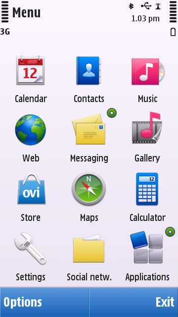
The menu screen is nicely laid out in grid format, though that could be changed to a list if you so desired. Social networking apps are already cornered off in their own folder and the music player and gallery are separated out from the app folder, which simplifies accessing media files greatly.

Also in the menu are Ovi Maps and the web browser, contacts, calendar, calculator and settings. Simple and easy to use – perfect for a newcomer to smartphones.
Current page: Nokia C5-03: Interface
Prev Page Nokia C5-03: Overview, design and feel Next Page Nokia C5-03: Contacts and calling