Why you can trust TechRadar
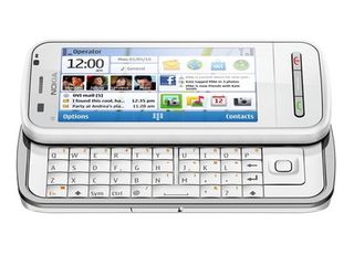
While it's undoubtedly mid-range, there seems to be some confusion over exactly who the C6 is exactly aimed at.
Using the phone, it comes across a very businessy, especially with its Traveler application. However, Nokia suggests it's for keeping in touch with your friends – a social networking phone.
Actually, maybe that's not fair. Nokia seems to be aiming it more as a kind of messenger-phone plus. There's certainly a niche for that, but it tends to heavily dominated by the BlackBerry.
We liked
The Home screen's rectangle layout is eminently sensible, causing no strange errors when you switch between landscape and portrait. It gives less freedom within the widgets, but we think it's a good trade-off.
The phone's matte plastic body is great and feels as though you could punt it across a car park without worry, if it weren't for that occasionally dodgy build quality.
Ovi Maps is great on pretty much any phone, and in conjunction with a nice 3.2-inch screen and A-GPS, this is one its strongest showings.
The screen is nice, and while it's not in the class of the iPhone 4 or Samsung Galaxy S, it's impressive for a far cheaper phone.
The camera is capable of some nice close-up shots, but were more impressed with all the different options available.
Messaging on the phone is pretty strong, including email that's gloriously easy to set up.
We disliked
The touchscreen just isn't a very strong feature on the C6. It comes down to a combination of a very average resistive screen combined with an OS that lags occasionally.
You get used to using it, so you start just switching to your fingernail for precise actions and just press hard the rest of the time, but it's just a million miles away from great capacitive screens.
And we feel the need to reiterate – that OS really is laggy. Having to wait for the screen to deign to come on for several seconds before you can see who's calling is just not on.
If you don't think a few seconds is a long time, just leave your phone for five seconds next time it rings out loud when you're in a quiet environment. It's a lot longer than you think.
Not only that, but for all the years its been around, Symbian just isn't that polished. The random double-tap menus, apps hidden within folders within folders within menus, accelerometer's that are turned off by default – it simply lack the thoughtfulness that goes into Apple's iOS or HTC's Sense UI.
For a messaging, mid-range smartphone, we were also surprised not to see any social network integration in the contacts. The C6's little brother, the C5, had this, and yet this is supposed to be the clever one. It's an odd omission.
The camera wasn't great at taking most photos, seemingly due to struggling with metering, and video weren't much cop, either.
Verdict
You might notice we haven't mentioned the keyboard above. We're calling it neutral – well-made, but with keys just too close together. Maybe we'd be more forgiving if there wasn't so much wasted space around it.
While we're criticising Symbian for being laggy, we should mention that C6 does feel robust, software-wise. Though it lacks shine, it's got features coming out of every port (save for proper social network integration).
There are useful widgets, speedy internet access and a nice screen, but those are offset by general usability frustrations.
If you really want a touchscreen phone with a nice screen and a keyboard for free on a cheap-ish contract, we recommend this over the Sony Ericsson Vivaz Pro.
However, if the number of pixels on-screen and physical keyboard aren't vital for you, but you'd like a slick interface, you might want to cast your gaze towards the HTC Wildfire, which also has the bonus of feeling much smaller.


