Why you can trust TechRadar
The Nokia C6's 3.6Mbps HSDPA 3G mobile broadband connectivity, Wi-Fi capabilities and selection of connected widgets and apps mean the internet is at the heart of this phone, rather than an afterthought.
The primary outlet for this will always be the browser. Nokia's standard web browser is accessible from the main menu, or the Home screen if you set up a shortcut.
On the 3.2-inch screen's 640 x 360 resolution, Nokia's software fares quite well. Upon opening, it gives you the option to visit your bookmarks or recently visited pages.
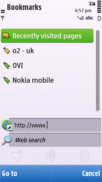
Hidden in a shortcut down the bottom is what looks like a search symbol, which brings up the URL entry box and a web search box. We don't know why they're tucked out of the way like this, but once you know where they are it's fine.
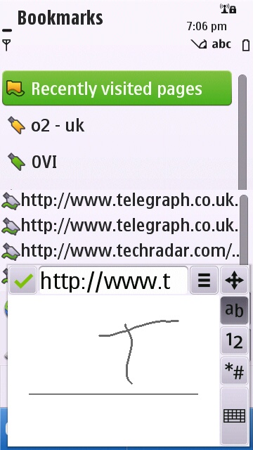
You can use the keyboard to type in a web address, a T9 pad on the screen or there's even handwriting recognition (which works fine if you use your nails, until you get to the dots – it kept seeing ours as apostrophes).
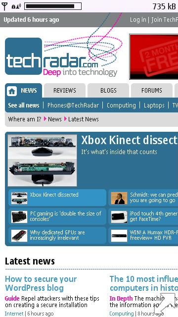
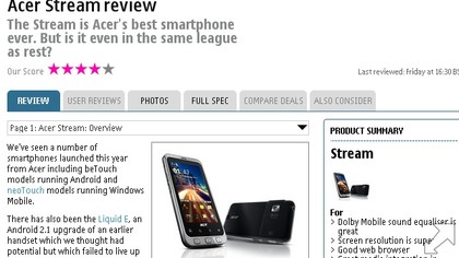
Once the page is loaded, it goes fullscreen, with a little arrow in the bottom corner if you want to bring up the controls.
From here you can access a panel of options that looks like it was from the original Macintosh operating system – right down to being greyscale.
Sign up for breaking news, reviews, opinion, top tech deals, and more.
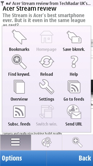
You can also bring up the URL and search boxes again, as well as a zoom slider. Being a resistive touchscreen – so no pinch to zoom, multi-touch ability – the slider is actually pretty solid.
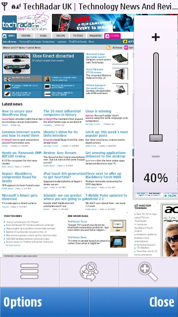
Rather than the long press and then movement of some resistive phones, which can mean you're just guessing how much to move your finger, and are obscuring what you want to see, this gives you a finite scale to work with on the edge of the screen.
If you have to go resistive, this is definitely the way to do zooming.
Pages render quickly for the most part, though images can take a little while to appear, even over Wi-Fi. Generally, performance was good for its Symbian heritage, but pales compared to Android's WebKit-based browser.
Hit the Back button at the bottom-left of the screen, and you get taken to a page overview of the sites you've been to. It looks just like the 'tabs' interface you get on something like the iPhone, but the C6 can't do more than one page, so it's quite confusing the first time it comes up.
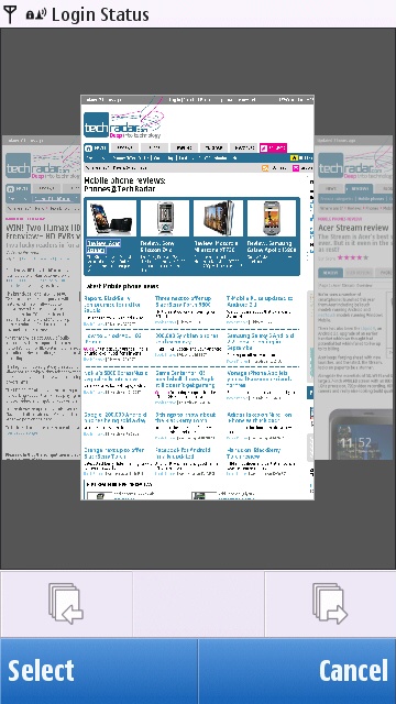
We actually really like it as a concept, because it makes going back two or three pages just a matter of flicking your finger along until you see the one you want (they're all rendered, so you can choose one at a glance), but it still takes you back a bit the first time you see it.
Having tried out the built-in browser, we had a look at the Ovi Store and spotted Opera Mobile among the recommended apps. We installed it, and compared it to Nokia's offering.
On loading TechRadar, it was no faster initially than the preloaded browser, but then it loaded the whole of the site at once, rather than starting with the top corner like Nokia's software did.
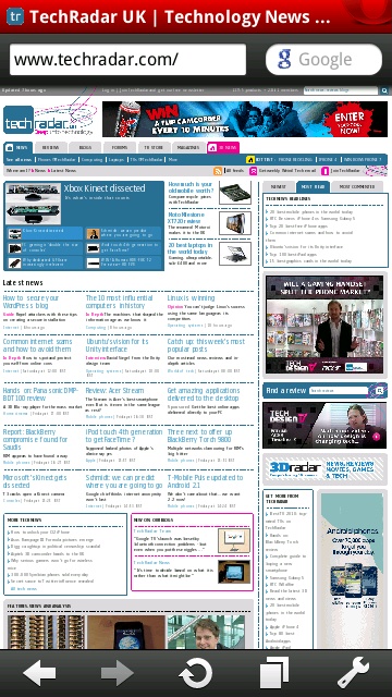
Zooming is handled with double-taps, which is generally fine – and fast – but lacks the precision you get with the slider.
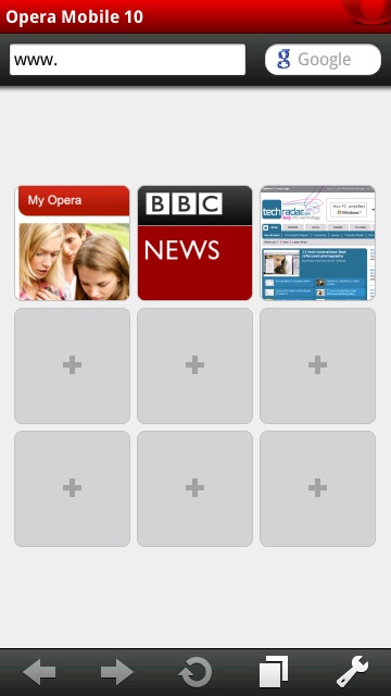
Opera opens with a kind of bookmark screen, just like the built-in effort, but the Speed Dial screen is far fancier. You add you favourite sites and it offers thumbnails to spruce things up a bit.
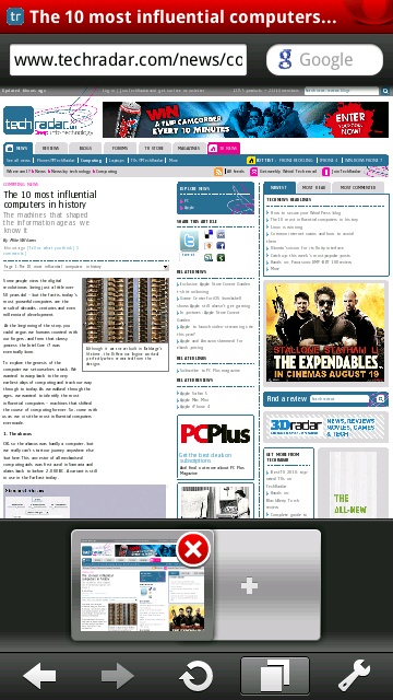
Opera also features tabs, besting the standard browser in one fell swoop, if you're an online multitasker.
We actually ended up using both browsers on and off, and we ultimately wouldn't say one particularly beat the other in any meaningful way. Opera is certainly slicker, with a few more features, but Nokia's browser is built into the OS more, and you rarely feel the desperate need to switch.
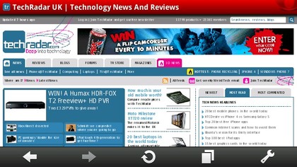
We should mention, though, that trying to have the TechRadar home page open on both browsers at the same time (Nokia's was running in the background, with Opera open) caused a loss of memory, and we couldn't go any further until we'd quit some background apps.
Flash Lite is available in Nokia's browser, but it doesn't actually get you much. BBC's site videos are out of the question, for example.
Internet access is also available through the Home screens connected widgets. We've already looked at the email widget, but there are plenty of others, including Facebook, CNN Video, Bloomberg, VoIP, MySpace (if that's still your thing) and others.
The Facebook widget would be the most useful, if it were in any way interesting. It shows two screens on rotation, the first of which shows your name (which you really ought to be aware of anyway), how many unread messages are in your inbox, how many friend requests you have and how many pokes you've been poked.
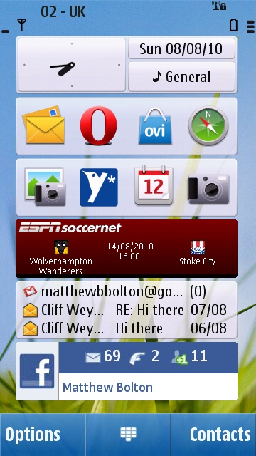
The second screen scrolls through some recent messages from your friends. It includes parts of conversations between two of your friends, but it only says who's written the message, not who it's to. Without context, they tend to be a bit baffling.
More use (for people who like football) is the ESPNSoccernet widget. At the time of writing, it scrolls through the forthcoming first weekend of Premiership matches, telling you who's playing whom, and when they kick off. It can do FA Cup matches instead, but no other leagues or cups are reported.
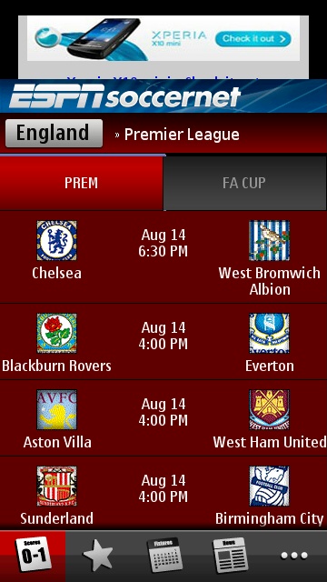
Click the widget and it takes you through to a larger app, which shows more information at once, but is so laggy that the less it's mentioned the better. It'll do if you really, really need to see the league table in a pinch.
