Why you can trust TechRadar

The Nokia C7 is not an inexpensive handset. At £389, it is on a par with the likes of the HTC Desire and recently announced BlackBerry Bold 9780.
As an early Symbian^3 smartphone it will certainly garner some attention. But we aren't sure Nokia has done enough to make its revamped OS special. It still has nested menus that would make HTC and Apple cringe, and our review handset crashed a couple of times, which ought to make any handset manufacturer hang their head in shame.
Symbian^3 just doesn't feel like it has the sparkle or ease of use to take on the leaders, we're afraid.
We liked
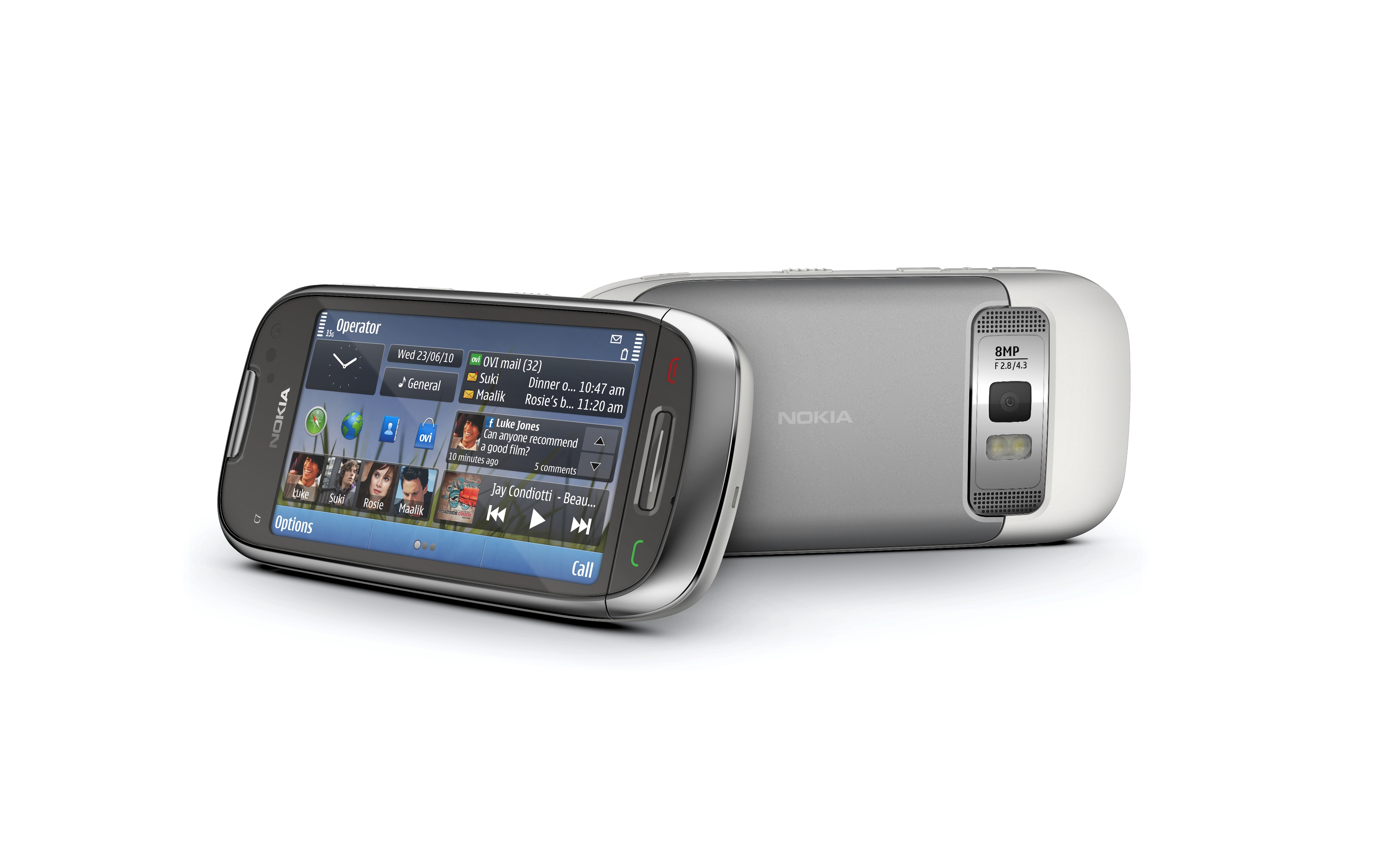
Neat and tidy to hold with a thin design.
Superb speakers and a well-positioned headset slot coupled with an all-too-rare FM transmitter.
Superb battery life.
A good camera that produced some great 720p footage.
Three home screens with a reasonable amount of flexibility in widget placement seem fine to us, although we can see how some people might not like the rigidity of the grid design.
We disliked
No handset should ever crash.
Symbian^3 just doesn't feel modern enough. Sometimes, there are two different menu systems – for instance, when using the camera – which can be confusing. Also, nested apps in the main menu should really be a thing of the past.
Poor integration of Facebook and Twitter data with contacts.
No text reflowing in the web browser.
Verdict
Some aspects of the Nokia C7 are great. We like the good battery life; the screen is sharp and clear, if a little small; and there are plenty of apps on board. We find the three home screen system is perfectly liveable, and the camera and video playback are both well above average.

But Symbian^3 might not be enough to lift Nokia from its current popularity levels into the stratosphere.We feel that Nokia has tried to box clever by retaining much of the old S60 look and feel in order to prevent forcing a steep learning curve on existing fans. In doing so, it's constructed a new OS that is too close to its predecessor for us.
Nested menus in the main menu listing is a disaster for quick access, as is having to remember how to navigate through two different menu systems when using the camera.
