Why you can trust TechRadar
Unlike many of its touchscreen rivals, the Nokia E5 doesn't have multiple home screens between which you can sweep and swipe.
But as we've already hinted, it does have has a dual home screen system. On the handset these are referred to as Business and Personal.
You've got lots of options as to how you'd like to set these up, with many different elements available.
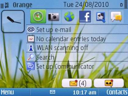
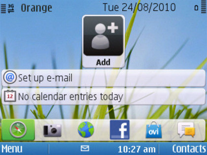
You can have a screen peppered with shortcuts and notifications, perhaps one that shows a contacts bar, offering your key contacts as little thumbnails, or maybe a more simple vertical menu sitting down the left hand side, with submenus that pop up as you pass the cursor over them.
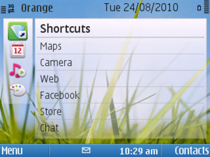
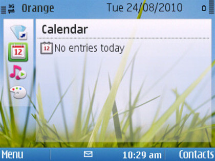
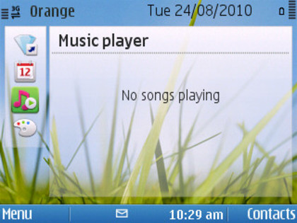
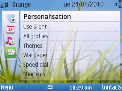
There are various colour themes available on the Nokia E5, plus you can configure which apps appear as shortcuts on the six app bar and allocate the two softmenu keys to a range of different shortcuts. By default they are set up to take you to the main menu and to contacts.
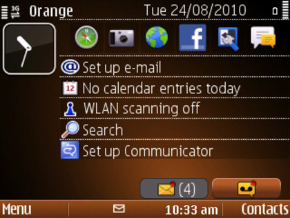
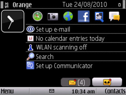
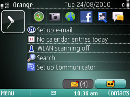
That ability to switch between two different modes and layouts gives you two chances to personalise the home screen to your liking, of course, so play around a little and you can customise things a heck of a lot.
The home and messaging shortcut keys have a little surprise up their sleeves too. Short press on the messaging screen and you are into the messaging main menu, where you can create new messages and view existing ones.
If you just want to send a quick text on the Nokia E5 though, long press the messaging key and you are right in the texting screen.

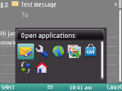
Meanwhile a long press on the Home key calls up an app switcher that lets you quickly shuffle between already opened apps
Current page: Nokia E5: Interface
Prev Page Nokia E5: Overview Next Page Nokia E5: Contacts and calling