Why you can trust TechRadar
Nokia E7 review: Interface
Ah, the interface. Here lies the reason why the Nokia E7 isn't the best available in its price bracket: it runs on Symbian. Even running the more lauded Symbian^3 doesn't help – it's still slow, laggy software.
If you're not a previous Nokia owner, then know that the user experience is clunky and filled with trial and error, though flipping from slab to slide-out QWERTY has thankfully no worse a reaction time than anything else you ask this handset to do.
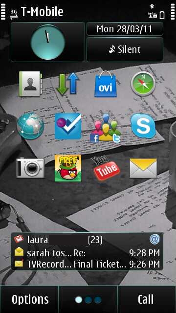
It's not instantaneous, though, and again Nokia proves that HTC handsets utilising Sense UI, such as the HTC Desire S and HTC Incredible S, are the only smartphones that can keep up with the iPhone 4 for usability.
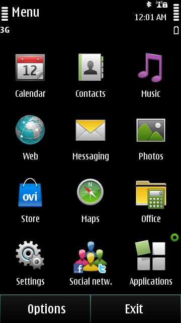
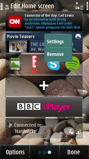
Navigating the phone is everything you've seen before – grid menus, neat and organised (if not intuitive), and customising the three Home screens would mean you'd rarely have to dip into the main menu if you really wanted to avoid it.
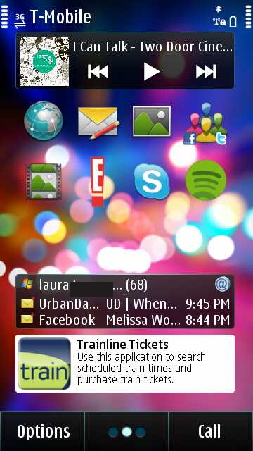
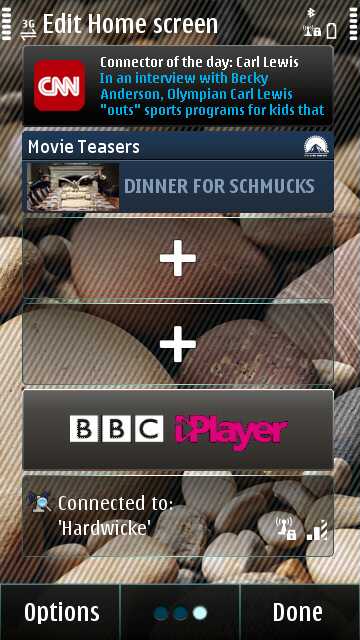
That said, actually customising takes too much effort in our opinion and you absolutely have to have four widgets to a column or none at all, which seems a little daft. Unlike previous handsets, the organization of the menu isn't particularly intuitive.
Thanks to the larger screen, email is no longer grouped in with Messaging and is lumped into the Applications widget. Not too awful, but it was handy to have an email inbox hooked up to the SMS/MMS inbox.
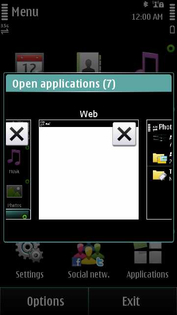
On the plus side, the Nokia E7 will happily multitask away, but closing any of those open apps takes an embarrassingly long time – in fact, the amount of times we accidently opened an app instead of closed it because of the lag was a constant source of irritation.
On the subject of lag, the sluggishness between Home screen swipes is also disappointing. It rarely crashed however, though if it did it would be because Nokia Ovi clients were humming away, forgotten in the background.
The amount of interactions a simple option can take does make you feel like you're dialing the automated bank service of the smartphone world. "Choose from the following options… Press 1 to be a little frustrated. Press 2 for a dollop of 'Where did I find it…?' confusion…"
Overall it gels together provided you're used to it and takes a little bit fiddling around if you're not, which, while not too bad, isn't intuitive enough to excuse the price point.
Current page: Nokia E7 review: Interface
Prev Page Nokia E7 review: Overview, design and feel Next Page Nokia E7 review: Contacts and calling