Why you can trust TechRadar
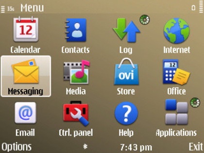
The Nokia S60 3rd Edition Service Pack 2 user interface is familiar stuff for Nokia smartphones, in this instance configured for the landscape format of the display.
The icon-based menu system is, of course, not as slick as the leading touchscreen user interfaces that have overtaken S60 but will be recognisable for most Nokia users.

It can be long-winded to locate and use some options, taking numerous clicks to find stuff like the navigation key or notification light options or certain settings.
However, it's generally straightforward enough to manage in most places, and you can click from page to page rapidly.
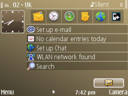
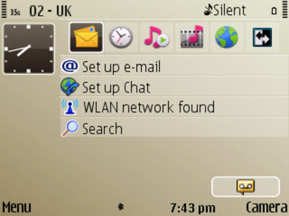
The home screen setup follows the E-Series convention by offering two alternative home screen views you can switch easily between – one marked as 'Business', the other as 'Personal' (though these labels can be changed).
Effectively, this allows users to set up their phone to have either work or downtime home screen shortcuts, features and information displayed, depending on when the user is operating the device.

For example, in Business mode, you may want calendar, notes and work email shown, whereas in personal home mode you may prefer music or other media apps to be displayed.

Either home screen is customisable; six shortcut icons ranged towards the top of the display can be changed in the menus to pretty much any function or app the phone is capable of using, or set up to access any one of the browser's bookmarks.
Additional status information and access panels down the screen – such as Wi-Fi, email, instant messaging, calendar and so on – can be customised too.
Transitions between menus are fairly prompt, and the E72 can support multiple open applications without appearing ponderous. It's worth checking occasionally via the Home button though and closing down unused apps to optimise the performance.
Current page: Nokia E72: User interface
Prev Page Nokia E72: Design and handling Next Page Nokia E72: Calls