Why you can trust TechRadar
The Nokia Lumia 1520 launched with Windows Phone 8 and is now upgradeable to Windows Phone 8.1, complete with Nokia's own "Denim" software modifications. We're not talking Samsung-tweaking-the-life-out-of-Android levels here. Just a few thoughtful modifications to the still-sharp WP8 experience.
But first things first - what does Windows Phone 8 look like on that super-sharp 6-inch 1080p display? Much the same as it does on any other Windows Phone 8 device, is the simple and somewhat disappointing answer.
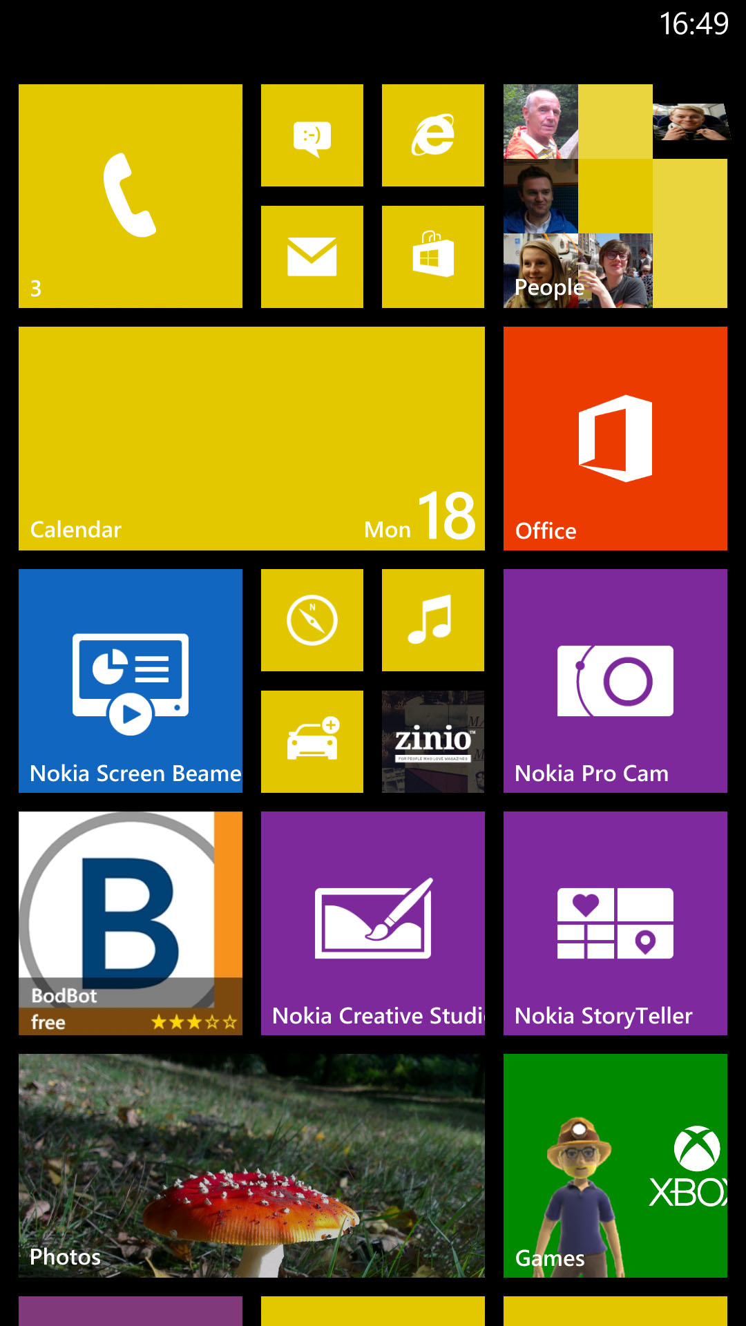
The main difference is that there's an extra column of Live Tiles on the start screen. It's never looked more like a colorful mosaic, with familiar faces and images popping out at you amongst live message alerts and other app icons.
In truth, it's actually a little overwhelming now, with the ordered uniformity of the previous two-row set-up giving way to a Windows 8-like sprawl. We're sure we'll get used to it with time, but for now it's just that little bit harder to identify and access the information you want in a pinch.
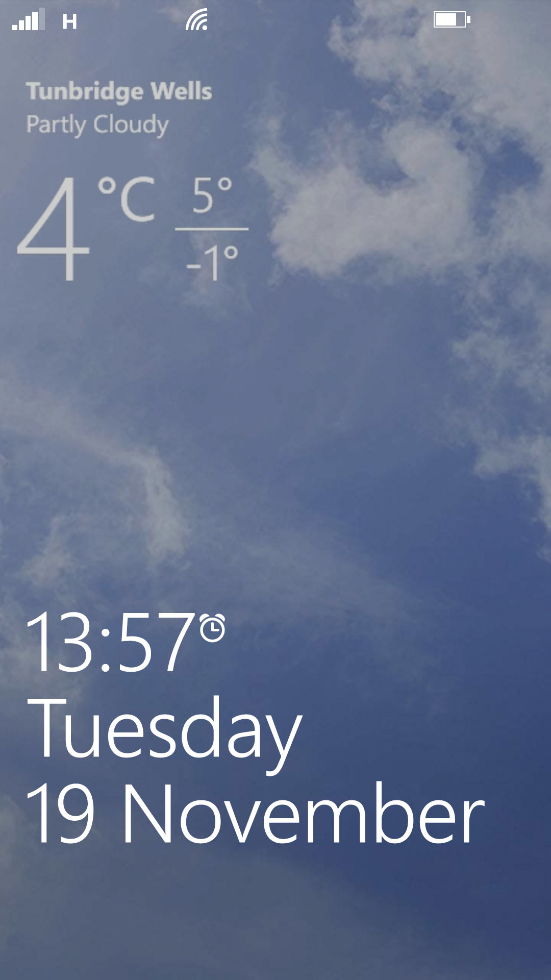
The lock screen is the same mix of sharp wallpaper pic and minimal information - just the time, date, and your latest calendar date, reminder, or missed call.
Nokia hasn't so much enhanced this lock screen as partially undermined it with its Glance feature. This adds a permanent, faint clock to your phone's display when in sleep mode, along with a count of any pending notifications.
You can also add the likes of Bing Weather information to your lock screen, offering a one-glance appraisal of the day's conditions and a representative image without forcing you to step into the OS proper.
We also appreciated Nokia's new double-tap-to-unlock system, which seemed particularly reliable, and saved us from scrambling for that hard-to-feel-out power key.
Windows Phone 8's Live Tile system itself remains the most elegant and well-integrated implementation of widgets in any mobile OS. They're essentially expanded app icons, which come in three different sizes. However, each can display a certain amount of live information from within the relevant app.
Weather apps may show you the current temperature and conditions, before flipping over to give you a three day forecast. The default Photos app cycles through your camera roll, lending your home screen that extra dose of personalization without the need to set up your own wallpaper.
Speaking of home screens, Windows Phone 8 just has the one. It scrolls up and down as you add more Live Tiles, and that extra column means that you'll probably be doing a lot less of this on the Lumia 1520.
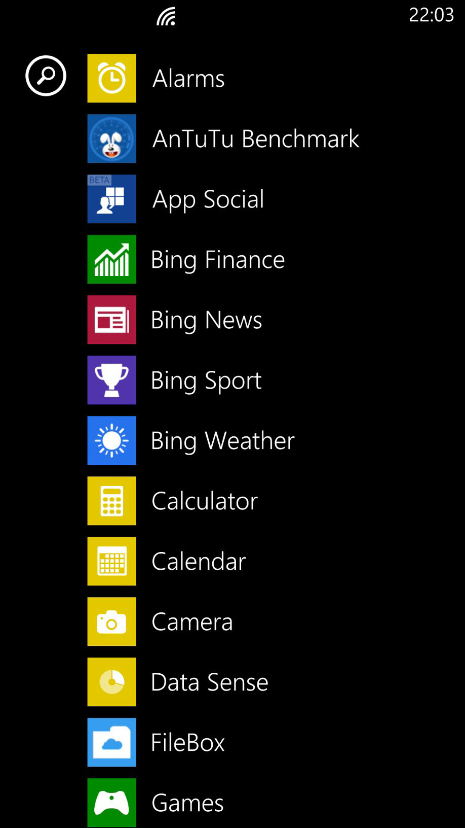
There is an extra screen accessed by swiping to the right, but this is effectively the app tray, where all of your applications are listed in alphabetical order.
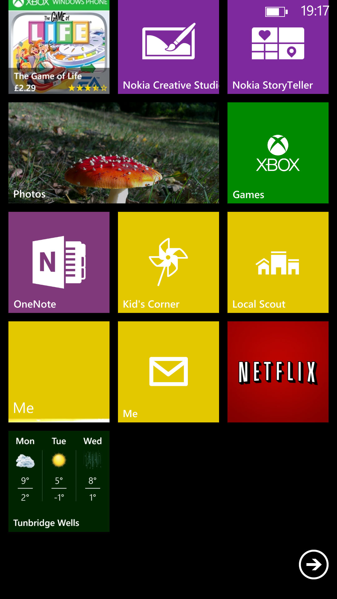
Pressing and holding on any of these will enable you to add it to the Start screen, probably complete with an expanded Live Tile.
Notifications remain a little undercooked in Windows Phone 8. You get a little banner appearing at the top of the screen when fresh messages come in, but you can't expand this as you can with iOS and Android.
You also miss out on the settings toggles that these provide, meaning that you have to dive into the general Settings menu to do things like turn off Wi-Fi.
Thankfully these things are fixed by the update to Windows Phone 8.1, which adds Action Center, allowing you to swipe down on the screen for full notifications and quick toggles. The update also adds Cortana, finally giving Windows Phone a Google Now and Siri competitor.
Plus there are a bunch of other new features added, like a new and improved Word Flow keyboard and folders. In short it doesn't drastically change the appearance of Windows Phone but it adds a whole lot of new functionality and it's all for the better. That's not the last update it will see either, with Windows 10 Mobile likely to hit it when available too.
Nokia has stuck with the standard three capacitive soft keys for general navigation, as stipulated by Microsoft. There's a back-up key, which is also used to access multitasking through a long press.
Then there's the distinctive Windows home button, which also has a secondary function. Press and hold, and it will bring up WP8's voice-activated assistant.
Through it you can open apps, make calls, launch Bing searches, and the like. It's nowhere near as powerful or useful as Siri, but it's handy for making calls when you attention is otherwise occupied.
The final soft key is for search, which initiates a manual web search (you're restricted to Bing again).
There's no secondary function here, which is a shame - Microsoft could have implemented universal search for quickly finding files, contacts or apps. Such a feature is present in iOS and Android, and it's badly missed in Windows Phone 8.
Going back to multitasking, it brings up a list of thumbnails showing recently opened apps, which have been held in stasis at the point you left them. These can be returned to with a tap or, new to the lasted version, dismissed with tap of the delete prompt. It looks and handles a lot like iOS 7's approach, though it's worth noting that Microsoft's solution came first by several years.
Overall, Windows Phone 8 runs like a dream on the Nokia Lumia 1520. With its Snapdragon 800 CPU and that huge 1080p display, it's never had as much headroom to spare, both in terms of screen space and in terms of power on tap.
On the latter point, it's worth noting that Windows Phone has always felt slick (if not always fast) regardless of the hardware running it, thanks to Microsoft's extremely tight spec guidelines and efficient software design, not to mention slick animations that serve to disguise variances in performance.
The OS runs very well here, too, but the difference between this and even a mid-range handset like the Lumia 720 isn't what you'd call night and day.
Current page: Interface
Prev Page Introduction (Overview, design and feel) Next Page Contacts and calling