Why you can trust TechRadar
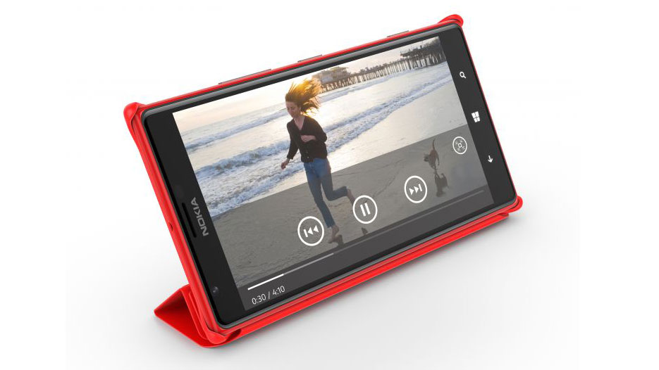
Sending messages on the Nokia Lumia 1520 is an intuitive and fluid experience, but it does serve as an example of where Windows Phone 8 needs to be more flexible when it comes to larger devices.

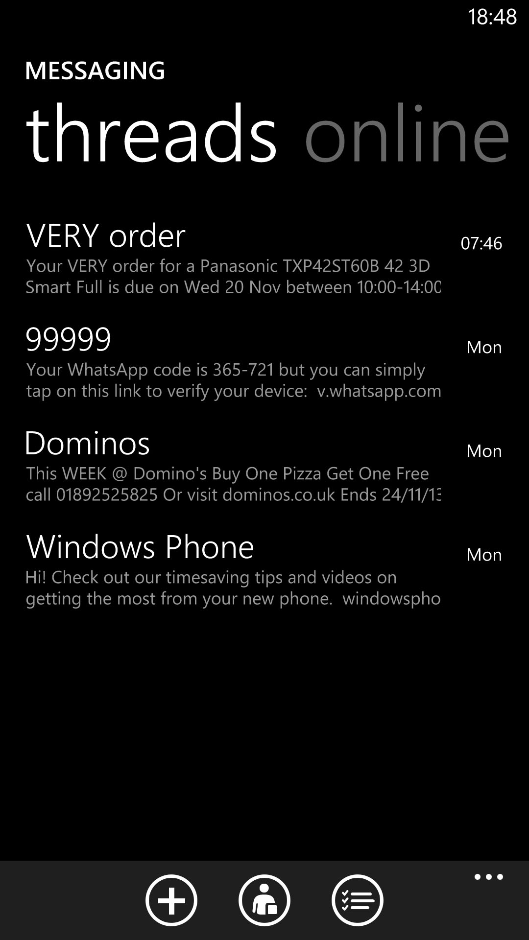
The messaging app itself is a typically crisp and succinct way to send SMS and MMS messages, with the main messaging screen showing you your most recent threads.
These threads take the chat-style indented speech bubble approach that's now pretty much standard across all three major smartphone platforms. Of course, in Windows Phone 8 it comes with a sultry black background, which looks inkily seductive on the Nokia Lumia 1520's display.
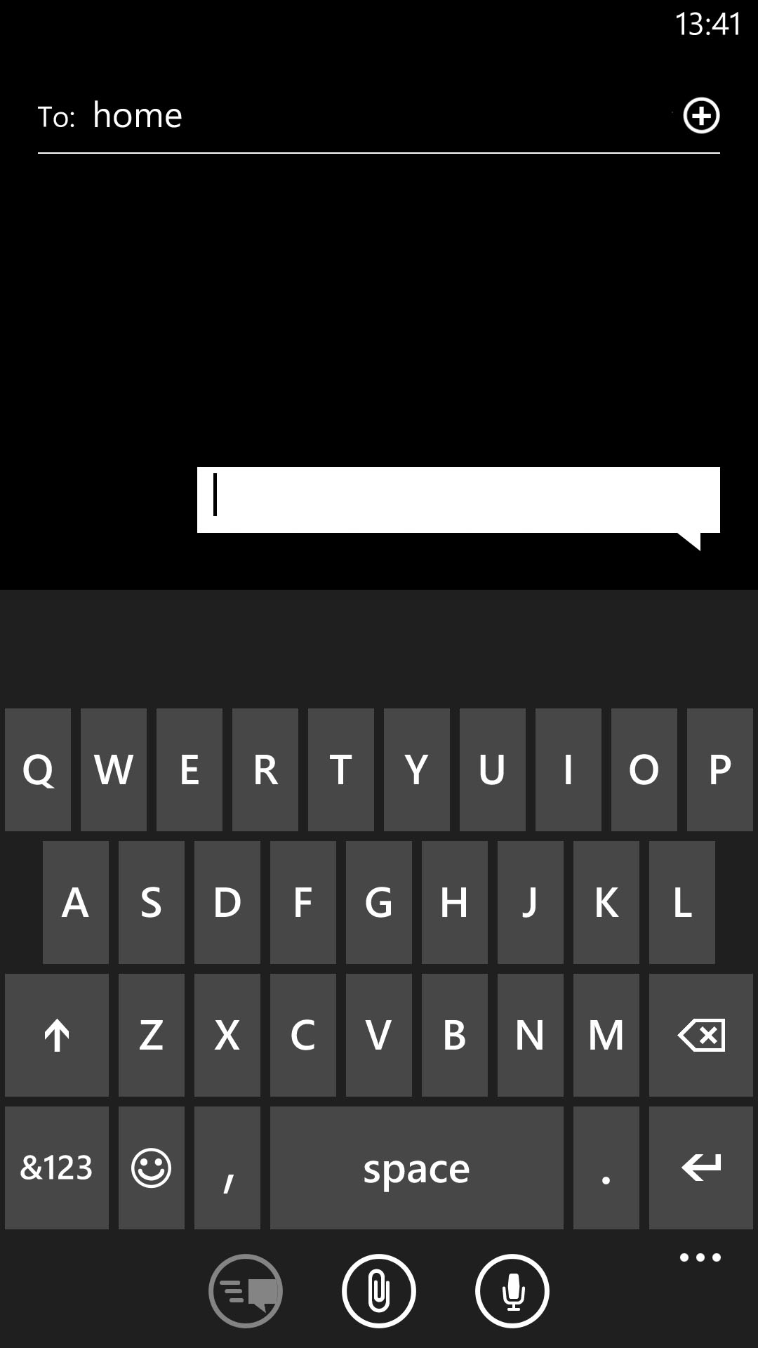
There's also the permanent option to attach a picture, video, location, contact or voice note to a message through the little paperclip icon at the bottom.
Back to the main messaging app, and a lateral swipe will take you to the Online section, Here you can also access Facebook chat, change your status, and check out which of your Facebook contacts are online.
It's at this point that we should probably address the Nokia Lumia 1520's keyboard. It's no different to the keyboard on any other Windows Phone 8.1 device, but that's the problem.

Thanks to Microsoft's restrictive requirements (you can't download keyboard alternatives like on Android, for example), Nokia has had to stick with a keyboard that was designed for a much smaller form factor.
It means that it still takes up a good half of the Lumia 1520's screen, which is complete overkill on a 6-inch device. More than that, it feels completely unoptimized.
It could have benefited from a dedicated row of numerical keys, or at the very least the ability to shrink it and reposition it to one lower corner of the screen to enable single-handed text entry.
Still, you get the same clearly laid out keyboard and the same unobtrusively smart word suggestion system, and with the Windows Phone 8.1 update it also gets the ability to swipe words rather than tapping them out, so it's by no means a write-off. It's just that the Lumia 1520 isn't the messaging or emailing power-house that it could have been.
Speaking of email, the Lumia 1520 comes with the usual email tools available to other Windows Phone 8 users. Set-up is easy, as it's set-up to deal with Hotmail and Nokia Mail (of course) as well as Gmail and Yahoo. We were even able to set up our Apple Mail account by selecting the "Other account" option, and it worked without a hitch.
There's still no unified email app for all of these disparate accounts, though, which is a bit of a pain. You have to have a different Live Tile for each account, which feels a little messy.

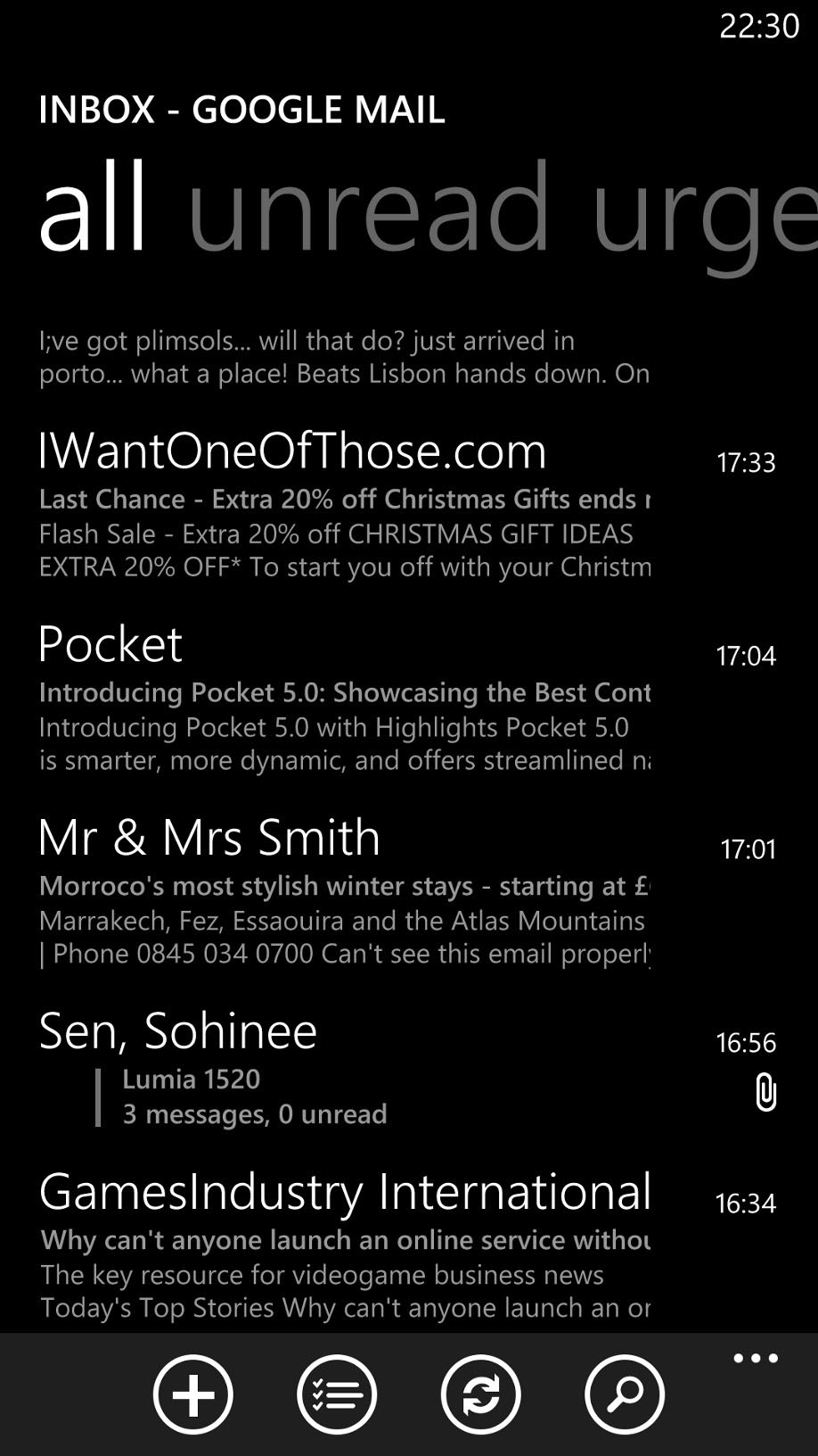
Especially as each app handles the same. You start with the All screen, which is a list of your emails, from newest down to older. Scrolling right enables you to order them by Unread or Urgent instead.
It's also possible to access all of your email account's separate folders by expanding the settings bar along the bottom and selecting Folders, so can view your drafts, deleted items and the like.
We like the way that individual emails are handled in Windows Phone 8. They're automatically resized to fit the width of the screen, so on your Lumia 1520's 6-inch HD display you get a supremely readable view. It's especially noticeable when you receive image-heavy emails (and tap the prompt to download images), such as those from any subscriptions you might have.
Here, at least, Windows Phone 8's default tool scales up well.
Attachments are also smartly handled, sitting just under the sender information near the top of the email.
You get the same drawbacks with the oversized keyboard in the email apps, but you also get helpful @ and .co.uk prompts added to the default QWERTY view, which is handy. The email-entry screen is also white by default, which helps set it apart from the black messaging equivalent.
There remains a lack of haptic feedback for typing, which may prove an annoyance for some.
