Why you can trust TechRadar
Key features
The Windows Phone 8 OS is still a distant third behind Android and iOS, so the consumer deck is already stacked against the Lumia 520, despite its success last year.
However, the sheer value to be had here counts very strongly in the Lumia 520's favour, as does the build quality and some of the apps on offer.
Since the initial review the Lumia 520 has been updated to Microsoft's latest mobile operating system Windows Phone 8.1, which brings a host of improvements to the handset.
These updates include Cortana, Microsoft's virtual assistant and answer to Apple's Siri.
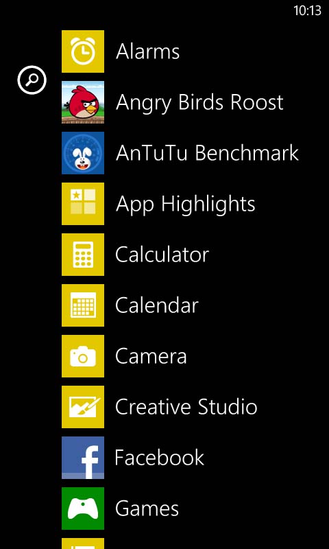
Having Microsoft Office and OneNote on board adds some serious value. Both of these apps are fairly feature rich, with Office in particular proving impressive as it lets you create, view and edit documents, spreadsheets and presentations.
Doing much more than reading them on a 4-inch screen isn't the most pleasant experience in the world, but it could come in handy in an emergency.
Likewise, I'd have to say that one of the key features of the handset is the way in which social media is handled.
Microsoft has really nailed social media integration with Windows Phone 8. It's all fairly straightforward really: you access them from the People app, which gives you an alphabetical list of all your contacts, complete with thumbnails.
Tapping on someone brings up all the information you have stored on them – from email and phone number right through to office location, birthday and address.
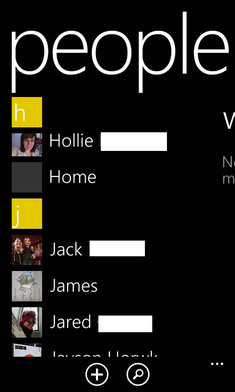
You can then just tap on a phone number or email to call or message them, and it's easy to add new details to a contact at any time by tapping the edit icon at the bottom of the screen.
Swiping right from a contacts page will take you to a 'history' screen, which keeps a record of communications between the two of you as well as their recent posts and updates on social networks.
Swiping to the left brings you to a 'what's new' screen, which combines the likes of Twitter and Facebook into a single feed, giving you an overview of recent happenings without having to use a separate app.
It's simple stuff, but combining contacts and social network feeds is something that no other phone OS does quite as well as Windows Phone 8, and I'm a big fan.
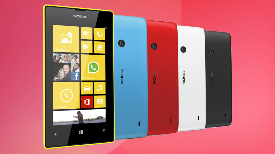
Nokia has really given its Lumia phones a personality – thanks to the bright colours and interchangeable backs. Anyone tired of the constant black, white or silver options on other handsets will enjoy carrying a bit of colour around with them.
Interface
Operating the Nokia Lumia 520 is a fairly painless experience. Swiping around the various screens is smooth and responsive, while the 4-inch display is plenty big enough to do most things comfortably.
While it's only 480 x 800, the display also has a good enough resolution to prevent tiles and menus becoming a blur.
One thing I did notice though is that the screen feels ever so slightly sticky, for lack of a better word. It's responsive but somehow doesn't feel as accurate to the touch as many others do. On top of that it seems more prone to picking up smudges and fingerprints than I'd like – which can make things a bit of a mess.
The interface on the Nokia Lumia 520 is much the same as on any other Windows Phone 8.1 handset.
You start on the lockscreen, which displays the time and date along with an overview of your latest email, or any pertinent reminders pulled from Facebook or your calendar. Behind that you get wallpaper – or if you'd prefer you can set Facebook to display random images from your account.
With the Lumia Black update, Nokia introduced a feature called Glance 2.0 that displays more notifications on the lock screen. Unfortunately, due to the Lumia 520's limited 512MB of RAM, it misses out on this feature.
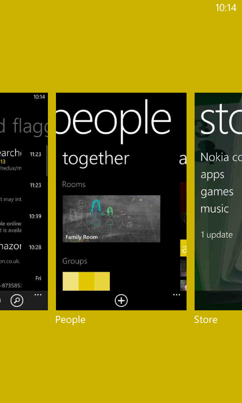
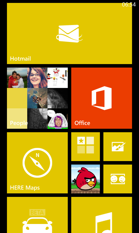
Swiping up clears the lockscreen and takes you to the start screen. This has tiles for various apps and menus, and you can scroll through them vertically.
Long-pressing on a tile lets you move it, resize it or unpin it from the screen, while if you dig into the settings menu you can also change the colour scheme. However, there are no custom wallpapers or widgets to play with. That keeps things simple and intuitive, but some may find it limiting.
The tiles themselves are 'live tiles', which means that they're not just a static image. Instead they can display additional information – so for example the People tile will show you thumbnails of contacts images, while the calendar will display upcoming events.
Thanks to the Lumia Black update, you can now organise live tiles in folders on your start screen. This is a feature that's been available for Android and iOS for some time, and it's good to finally see Nokia adding in the functionality.
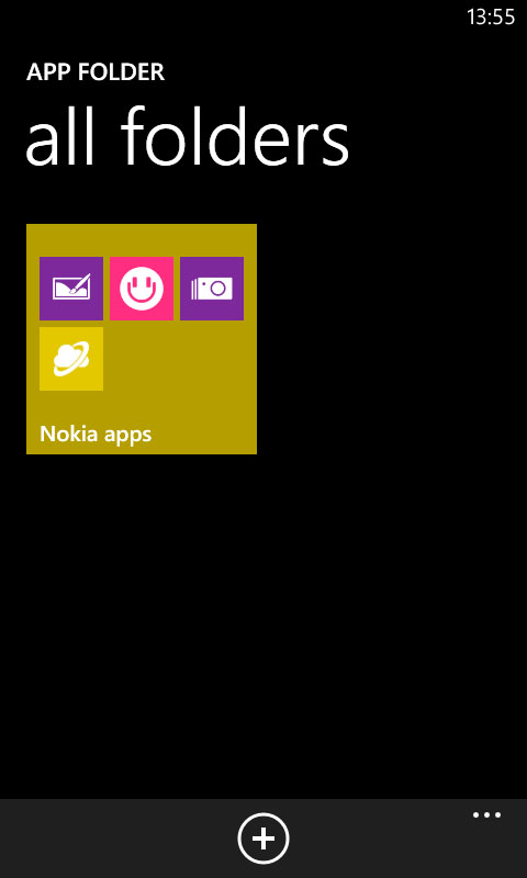
Once updated, you can download the App Folder app from the Windows Store and use it to create folders that can then be pinned to the Start screen like any other tile. It's a great way of saving space and very useful for lumping similar apps, like games or email, together.
Swiping left from the start screen brings up a list of all your apps in alphabetical order – and again you scroll vertically up and down through these. Long-pressing an app on this screen lets you pin it to the start screen or delete it.
You'll find the settings screen in here (though like everything else it can be pinned to the start screen for easy access if you'd prefer). From here you can change ringtones and other sounds, alter the start screen theme, set up Wi-Fi networks and more.
It's all well laid-out and clearly labelled, though I wish certain options were more easily accessible, such as toggles for Wi-Fi and Bluetooth.
I'd also love to be able to see how much battery percentage I have left without having to delve into the depths of the settings screen.
Current page: Key features and interface
Prev Page Introduction and design Next Page Performance, internet and battery lifeJames is a freelance phones, tablets and wearables writer and sub-editor at TechRadar. He has a love for everything ‘smart’, from watches to lights, and can often be found arguing with AI assistants or drowning in the latest apps. James also contributes to 3G.co.uk, 4G.co.uk and 5G.co.uk and has written for T3, Digital Camera World, Clarity Media and others, with work on the web, in print and on TV.
