Why you can trust TechRadar
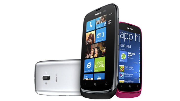
The Nokia Lumia 610 runs Windows Phone 7.5 Tango, a stripped down version of Mango designed for low-end phones with only 256MB of RAM. Though a number of concessions have been made, they have had minimal impact on the interface, which remains much the same as Mango.
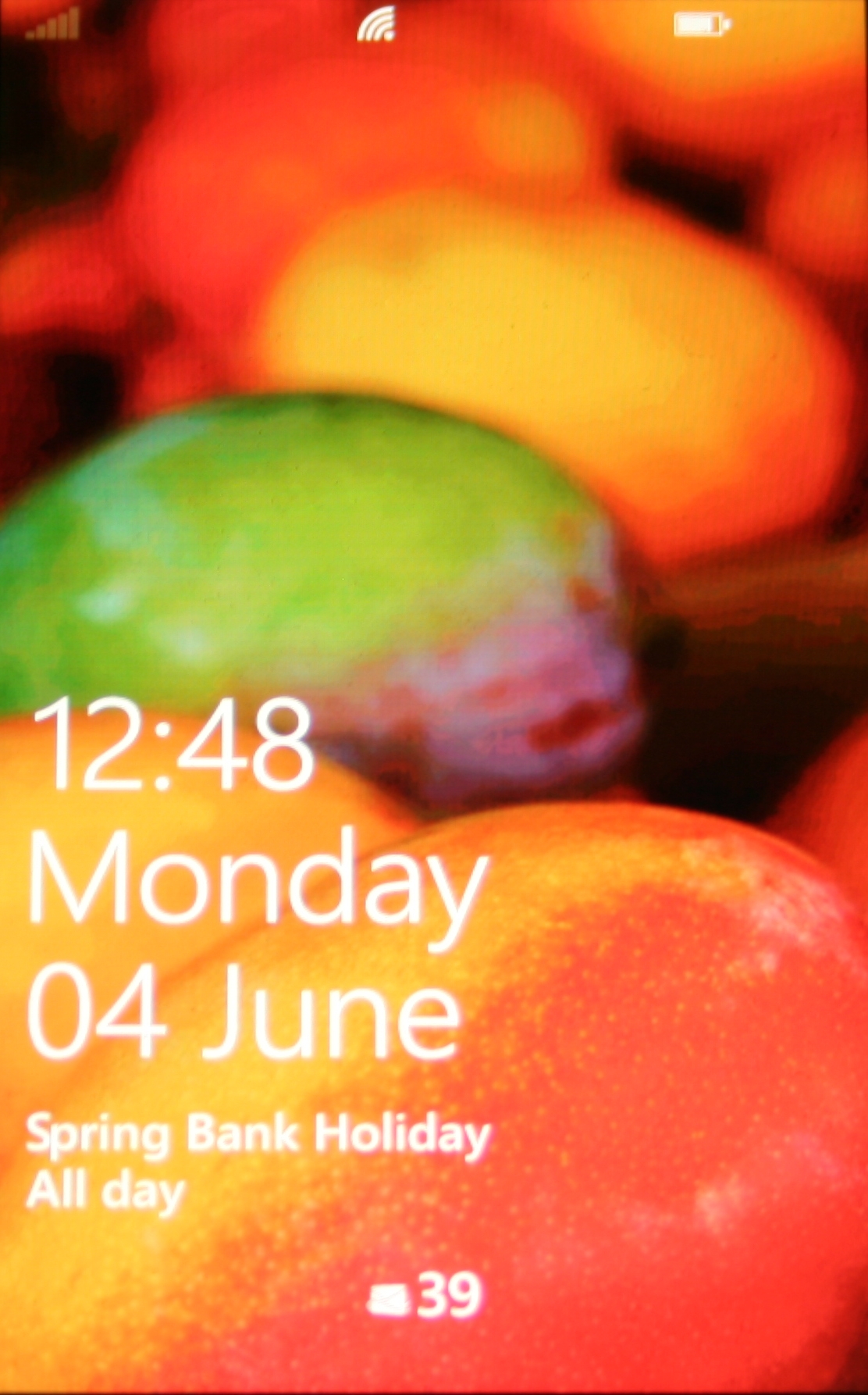
When you turn the phone on or wake it up you are greeted with a lock screen showing you the time and date in big writing, along with your next reminder or calendar event shown smaller below that, and an unread email and SMS count at the very bottom.

It also displays how much battery you have left and the signal strength at the top. All of this is written in white and it's a very clean look, with the bulk of the screen taken up by a wallpaper of your choice.
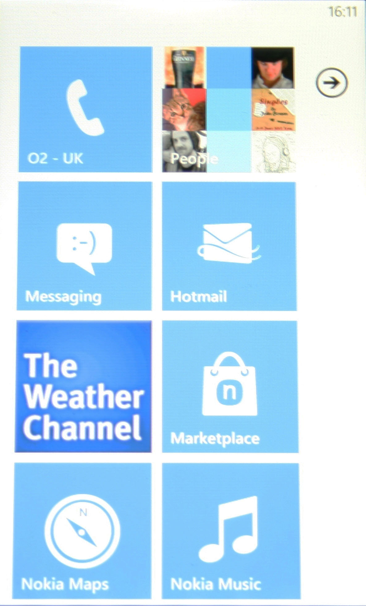
Swiping upwards clears the lock screen and brings you to the phone's home screen. This uses the same attractive tile-based design of other Windows Phone handsets, and scrolling down takes you through all of your home screen shortcuts.
The colour of the tiles can be changed, with a selection of 11 colours to choose from, and the background can be made black or white, but that's all you get. There are no custom wallpapers and no widgets to be found here.
A swipe to the left will bring up a list of every application installed on the Nokia Lumia 610, along with a link to the settings menu. Any of these applications can be pinned to the home screen by long-pressing them and dragging them into position, while web pages and contacts can also be pinned to the home screen.

Though games will automatically be put in a separate folder, there is no option to make your own folders, meaning that if you're planning on installing a lot of things the two main screens could easily become clogged with applications.
Pressing the back button will always take you one screen back (or one page back when using the web browser), while a long-press of the button will bring up images of recently viewed pages or applications and enable you to select from them.
The home button brings you to the home screen, and a long press on that enables you to give voice commands.
This actually worked surprisingly well, with most commands carried out correctly, including simple texts and web searches. However, inevitably it did sometimes struggle, and it's not going to challenge Siri. We're also still not convinced that voice commands are generally any quicker or easier than just doing things the old fashioned way.

Scrolling around is fast, and there's not even a hint of slowdown when moving between menus, but opening downloaded applications and even built-in apps such as the picture gallery is a little slower, leaving you with a white screen for a few seconds while they load.
It's not a big deal, but it's a constant reminder that you're using a low-end phone. Equally, some of the built-in applications weren't performing optimally, with the People and Games applications in particular often jerking from screen to screen rather than moving smoothly.
The whole interface is reasonably intuitive. If you've used a recent version of Windows Phone before then it will all be much the same, but even if you're new to the operating system it's easy to find your way around, since there are basically only two main screens and everything is clearly labelled.
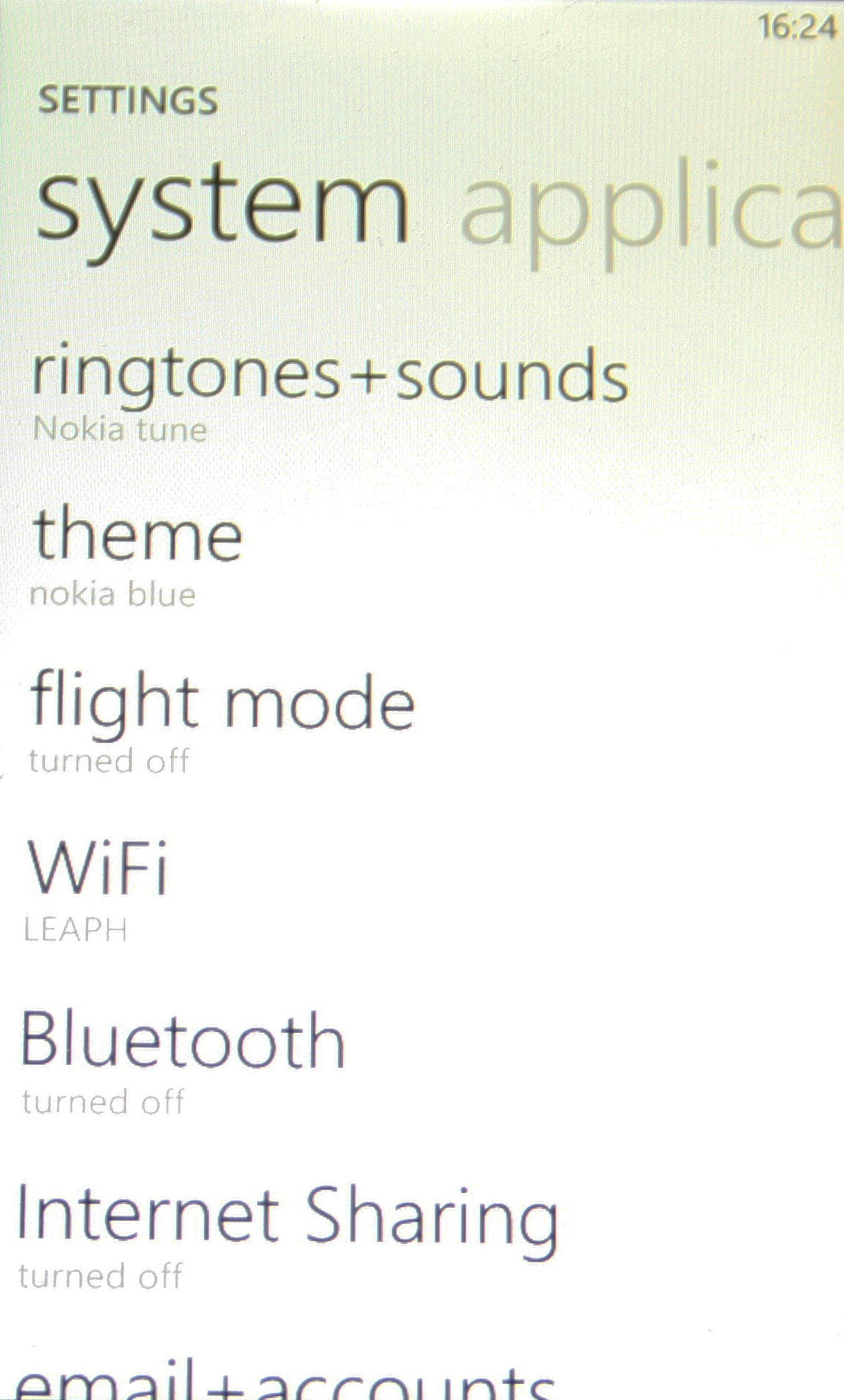
The only caveat to that is that the settings screen is hidden away on the applications list by default, and because this is a screen you'll likely be using a lot, it would be better suited to a place on the home screen, but it's easy enough to pin it there yourself.
The TFT screen provides reasonable image quality and is fine indoors, but in direct sunlight it can be almost impossible to make out. The viewing angles aren't great either, when not in direct sunlight you can see the display from every applicable angle but it does become slightly less clear whenever it's not viewed straight on.
James is a freelance phones, tablets and wearables writer and sub-editor at TechRadar. He has a love for everything ‘smart’, from watches to lights, and can often be found arguing with AI assistants or drowning in the latest apps. James also contributes to 3G.co.uk, 4G.co.uk and 5G.co.uk and has written for T3, Digital Camera World, Clarity Media and others, with work on the web, in print and on TV.
