Why you can trust TechRadar
The Nokia Lumia 620 is standard Windows Phone 8 through and through.
When you turn it on or unlock it you're greeted with a lock screen complete with the time, date and battery level overlaid on customisable wallpaper.
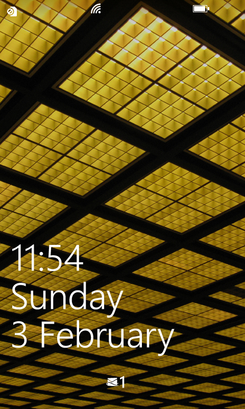
You can clear it with an upwards swipe and you'll land straight on the Start screen (or whatever screen you were last on).
Microsoft has done a great job with the Windows Phone 8 start screen, making it arguably more distinctive than those on either iOS or Android.
Rather than a series of horizontally scrolling screens, Windows Phone 8 scrolls vertically and doesn't have separate screens - it's just one continuous stream of apps.
It's not necessarily a better way of doing it, but it's certainly different from the competition.
The apps themselves are laid out as tiles, which can be made into any of three different sizes.
They largely follow a uniform colour scheme (of your choosing) and they slot together elegantly.
We've said it before, but it's very hard to make the Start screen on Windows Phone look messy or ugly.
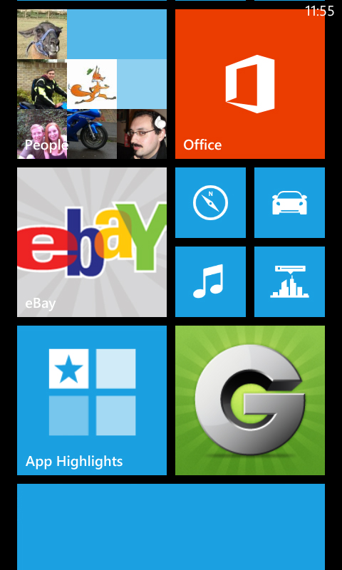
Many of the apps on the Start screen can also have live tiles. Much like a widget on Android, this means that the tiles aren't static.
For example, the People app will scroll through pictures of your contacts and the Calendar app will display upcoming events and reminders - all right there on the start screen.
Tapping a tile will open the associated app, while if you want to resize, move or delete a tile you simply long-press it and then either drag it into a new position, tap the size button that appears, or tap the unpin button to remove it from the screen.
Aside from doing that and picking a colour scheme for the tiles, the only other customisation option available is picking from a light or a dark background - there's no custom wallpapers here.
The only thing other than tiles on the start screen is the time, which is displayed at the top-right of the screen.
However, if you tap the top it will also briefly bring down a battery bar, signal level and list of any active data connections.
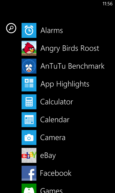
Swiping right from the start screen brings you to a list of all of your apps, including those not currently pinned to the start screen.
You can launch any of them from here by tapping on them, and pin them to the start bar or uninstall them by long-pressing them.
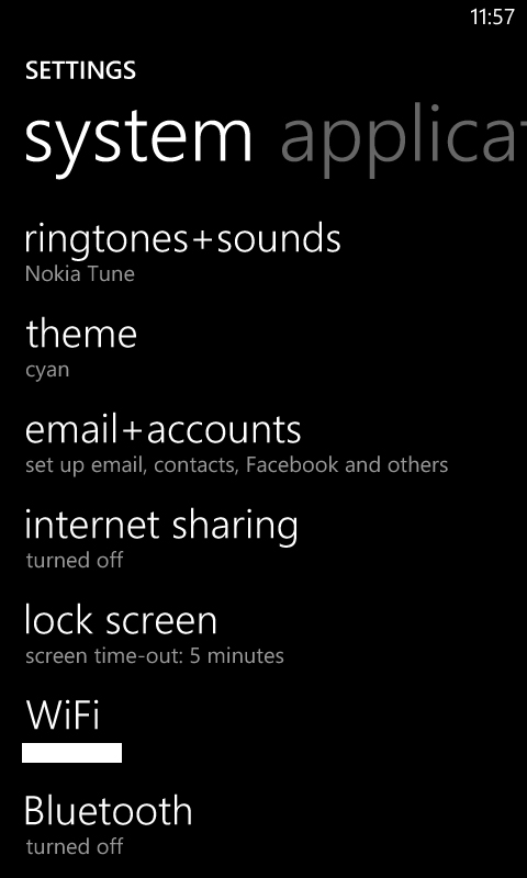
This is also where you'll find the settings screen, though that too can be pinned to the start screen for easier access if you'd prefer.
From here you can customise the colour scheme, set up Wi-Fi networks, change your ringtone, adjust the brightness and more.
Most of the options are fairly standard and self explanatory, but there's one that's worth mentioning - kid's corner.
This enables you to set up a separate user area for children, where you can limit access to certain apps and media.
Once it's set up you can easily get to it by swiping right from the lock screen.
The Nokia Lumia 620 isn't the only phone to have this feature, but combined with the low price tag, robust back and colourful, changeable covers, it makes it a fairly child-friendly handset.
That's about it for the main interface. It's very simple, and for the most part very intuitive. Despite being a low-end handset, the Nokia Lumia 620 also has enough power to make getting around a breeze.
Scrolling and swiping on the screen is fast, smooth and responsive, and with a 246ppi display, everything looks fairly crisp and clear.
The only other thing to mention is the three soft touch buttons at the bottom of the screen.
As with most other things on the Nokia Lumia 620, these are a standard Windows Phone 8 feature.
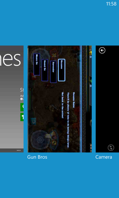
But for those new to the OS, there's a Back button on the bottom-left, which scrolls back through the previous screens and apps that you've used.
If you long-press it you can even get a visual overview of them all and simply tap on the one that you want to return to.
Then there's a start button in the centre that takes you back to the start screen.
Long pressing this one brings up a voice search box. It can be used to do an internet search, open apps or even text or call contacts.
Better yet, it actually works. Or it does if there's no background noise anyway - good luck using it in a pub.
Finally, on the bottom-right there's a search button; this simply launches Bing and enables you to tap out a web search.
All in all, both the interface and performance are pretty comparable to the HTC Windows Phone 8S, which given that the Nokia Lumia 620 can be bought for less money is pretty impressive.
James is a freelance phones, tablets and wearables writer and sub-editor at TechRadar. He has a love for everything ‘smart’, from watches to lights, and can often be found arguing with AI assistants or drowning in the latest apps. James also contributes to 3G.co.uk, 4G.co.uk and 5G.co.uk and has written for T3, Digital Camera World, Clarity Media and others, with work on the web, in print and on TV.
