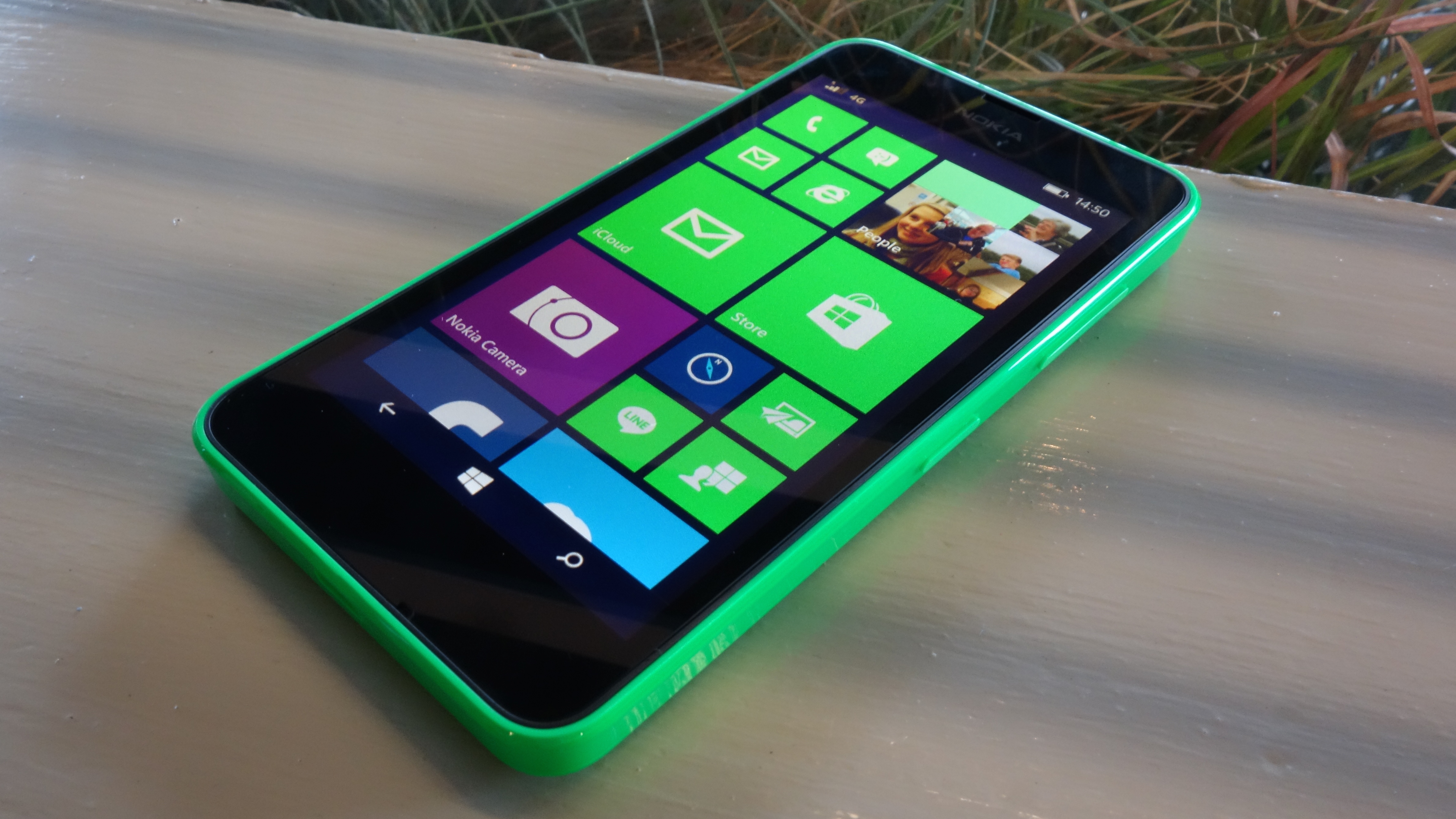
TechRadar Verdict
Nokia's latest budget phone sports 4G and Windows Phone 8.1 out of the box, and benefits from all of the things we liked about the Lumia 630. However, it's not quite enough of an improvement to justify the additional premium.
Pros
- +
Windows Phone 8.1 is improvement
- +
Strong build quality
- +
4G capable
Cons
- -
No flash or front camera
- -
4G price bump not such great value
- -
Screen lacks sharpness
Why you can trust TechRadar
The Nokia Lumia 635 adds a sprinkling of 4G magic and external bling to the impressively solid and ultra-affordable Nokia Lumia 630. It makes a positive first impression but is its existence strictly necessary?
While Microsoft's modern Windows Phone reinvention was intended as a premium smartphone experience, Nokia has established that the low-end is where it's at for the platform.
With the Nokia Lumia 520 flying off shelves (relative to previous Windows Phone handsets at least) and now even Microsoft seeing value in affordability with the likes of the Microsoft Lumia 640 and the Microsoft Lumia 535, Windows Phone 8.1 is establishing itself as a bona fide alternative to all those cheap (and sometimes nasty) Android phones.
The Nokia Lumia 630 was one of the first to show off Nokia's vision of a classy entry-level phone, and the Nokia Lumia 635 is identical in all but three areas.
The first and perhaps most notable of those areas is its price tag. At the time of writing the Lumia 635 is available SIM free from around £85 (US$90 / AU$170) for the Lumia 635 compared to a roughly £70 (US$85 / AU$130) price tag for the 630.
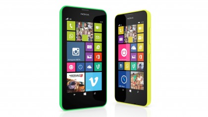
That additional cost gets you 4G LTE network connectivity, as well as a glossy finish to the Lumia 635's colourful rear cover. That price bump used to be bigger, but the question remains, is it worth the extra?
Alongside these extras, the Nokia Lumia 635 offers the same 4.5-inch 854 x 480 display, the same quad-core Snapdragon 400 CPU backed by 512MB of RAM, the same 8GB of storage, and the same 5-megapixel rear camera as the 630.
In fact, it inherits pretty much all of its sibling's strengths and weaknesses.
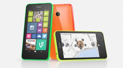
With the average smartphone size seemingly expanding by the year, the Nokia Lumia 635 almost feels small in the hand. In fact, moving from an iPhone 5S to the Lumia 635 didn't feel like such a jolting leap as moving to something like the Nokia Lumia 1520 or the OnePlus One did.
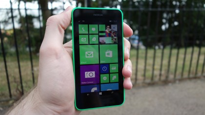
But with a 4.5-inch display, it's small in relative terms only. In fact, I'd probably say that the Nokia Lumia 635's screen is very close to optimal in terms of the balance between single-handed usability and widescreen media clarity.
Sadly the Lumia 635's screen is not going to show your HD movies or favourite web pages in the best light. At 854 x 480, the resolution is distinctly behind the smartphone curve. The similarly priced original Motorola Moto G, for example, offers the same size of screen with a 1280 x 720 resolution.
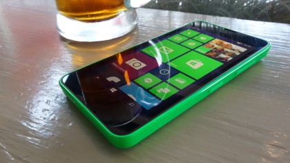
Still, Nokia has always had a number of display tricks up its sleeve, and the Lumia 635 is no different. IPS and ClearBlack technology combine to ensure that viewing angles and outdoor legibility are above what you'd normally expect from a "cheap" smartphone.
However, I was disappointed that there was no apparent sign of Nokia's super sensitive touch display technology, meaning you can't operate the phone with gloves on. This was even present in the Nokia Lumia 520, so it's not as if it's a high-end feature.
Nor do you get the desirable tap-to-power-on option that the likes of the Nokia Lumia 1320 possessed, or the ability to glance at the time and whether you have any new notifications by hovering your finger over the display. The absence of these features is perhaps a little more understandable as Nokia strives to keep costs down on the Lumia 635.
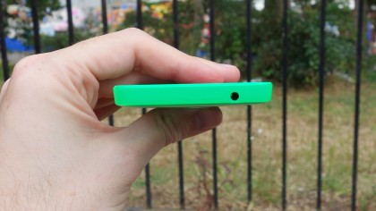
Aside from a somewhat underwhelming display, the Nokia Lumia 635 is a pretty desirable piece of kit. Like the Nokia Lumia 630, it features a clever two-part design that almost makes it feel like one of Nokia's premium unibody constructions.
The screen, the removable battery, and all of the phone's innards for that matter are all contained within a skeletal core unit. The other part of the Lumia 635 is an extended cover, made of fairly thick plastic (or 'polycarbonate' to use the fancy official branding), which fits around the back and the sides of the device.
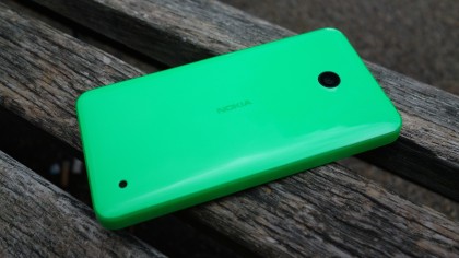
Once clicked into place, this is a solid device with minimal flexing or creaking. We've said it before, but no one does affordable phone design as well as Nokia.
Having said that, I didn't find the Nokia Lumia 635 to be as nice to look at or hold as the Nokia Lumia 630. It's opted for a glossy dual-layer effect, which makes it look like it's covered by a thin, clear gel layer.
While this differentiates the Lumia 635 from the 630, I preferred the latter's matte finish. Not only does it look nicer (which is admittedly subjective), it also feels nicer in the hand (which is less so). There's a certain clammy greasiness that accompanies the Lumia 635's slick finish, especially in warmer conditions.
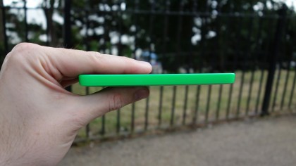
Otherwise, the dimensions of these two Nokia Lumia phones are identical. Like the 630, the Lumia 635 weighs 134g, and measures 9.2mm thick. Not the slimmest or lightest of smartphones, then, but neither is it the bulkiest.
With identical dimensions you can swap a glossy cover for a matte finish one on the 635, so if you really can't live with the shiny shell there is an easy work around.
Button layout is as I like it for any phone over 4-inches in size (which is the vast majority these days), with both the volume and power keys located on the right-hand edge of the phone. This makes them nicely reachable when held naturally in one hand - whether you're talking right or left.
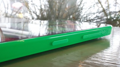
One omission that might rankle with faithful Windows Phone users is the lack of a dedicated camera button. In previous phones this would grant point-and-shoot-like two-stage control over your shots, not to mention reliable snaps when in a rush or shooting from an awkward position.
It would also grant the quickest and most reliable shortcut to the camera app possible. It was missed here, but it's one more element that's been sacrificed in the name of cost cutting, and it's an understandable one.
Nokia has included a microSD card slot in the Lumia 635, which is a good job given the scant 8GB available internally. You'll need to remove both the rear cover and the battery to access this port, though, just as you do with the microSIM slot.
