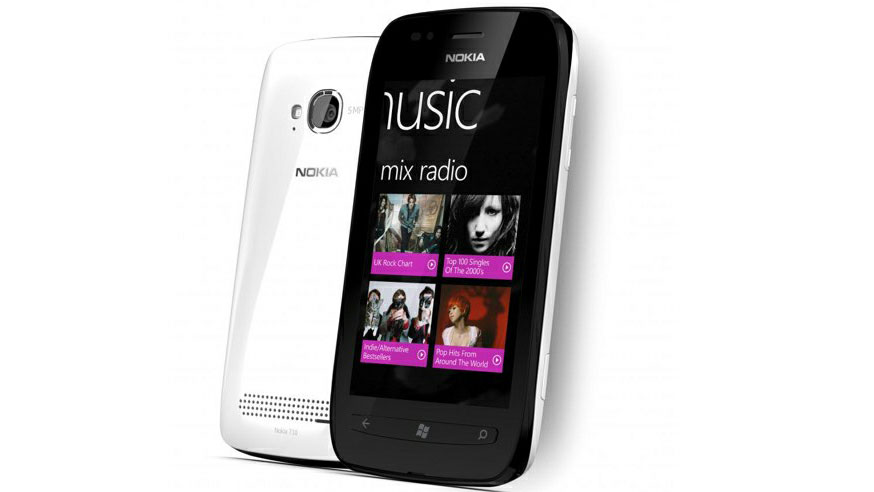
Why you can trust TechRadar
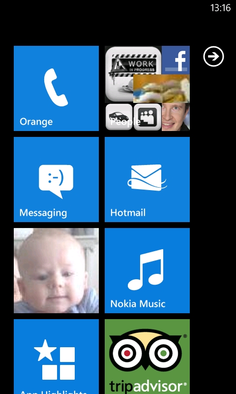
The Nokia Lumia 710's user interface follows the Windows Phone 7.5 Mango standard, which means there's no difference in the usability between the Nokia Lumia 710 and the Nokia Lumia 800.
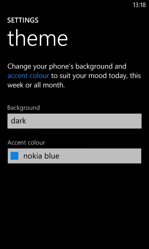
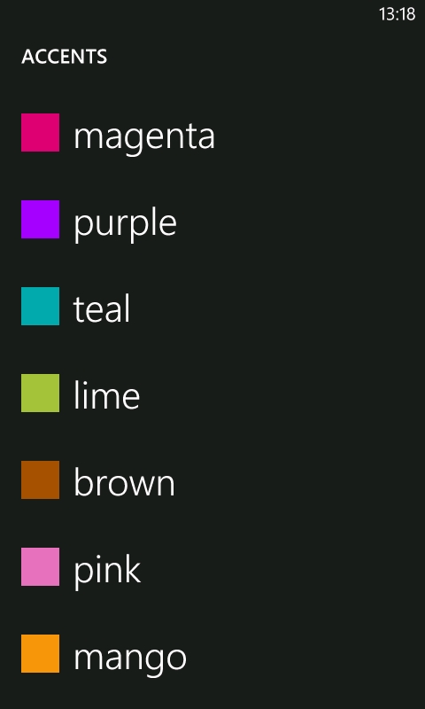
There are some slight differences when compared with the HTC Radar, in that Nokia adds an additional tile colour option (Nokia Blue), 20 additional ringtones and three additional alarm sounds (Nokia calendar, Nokia email and Nokia message). This all means that your new Nokia Windows Phone can still sound like your old Nokia Symbian phone, if you want.
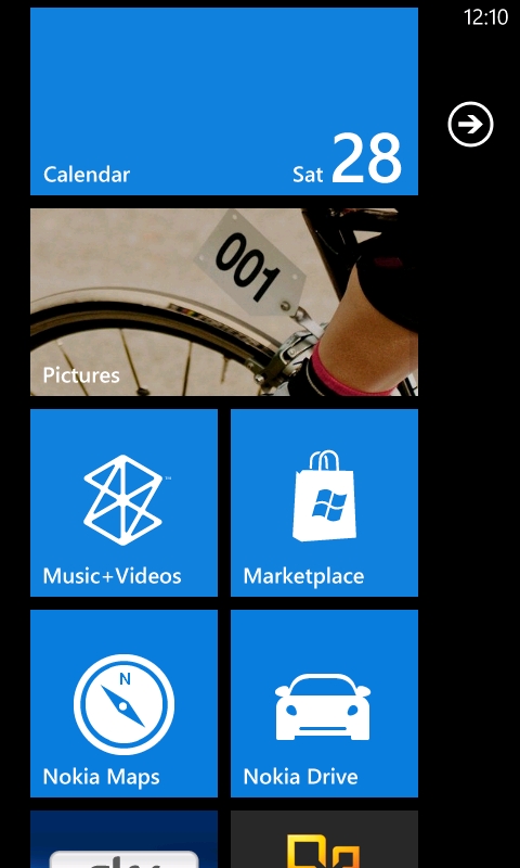
The Windows Phone interface is, at first glance, very different to other smartphone operating systems. As Symbian^3 devices have developed through Symbian Anna to Belle, the home screen has become more Android in appearance, with the menu structure using an app grid with the ability to have folders or sub-menus within menus.
Although there are some similarities to Android, iOS and Symbian in Windows Phone 7.5, the emphasis has changed from having many apps accessible on the home screen to having a few easily accessible apps on the start screen, in a scrollable 2x4 grid, with useful information displayed on their tiles.
This interface with four to eight live tiles on the screen at any time is more intuitive and faster to navigate.
The main negative of the Nokia Lumia 710's interface is the lack of folders, which will hopefully be partially rectified by the release of Windows Phone Tango.
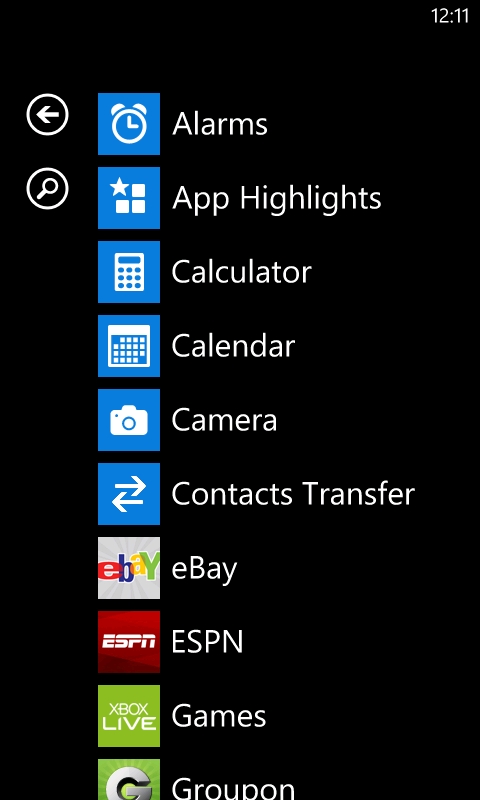
An alphabetically listed app menu is searchable, jumping to first letter functionality when you have 45 or more apps (games don't count) installed. This dearly needs the sub-folder functionality too.
