Why you can trust TechRadar

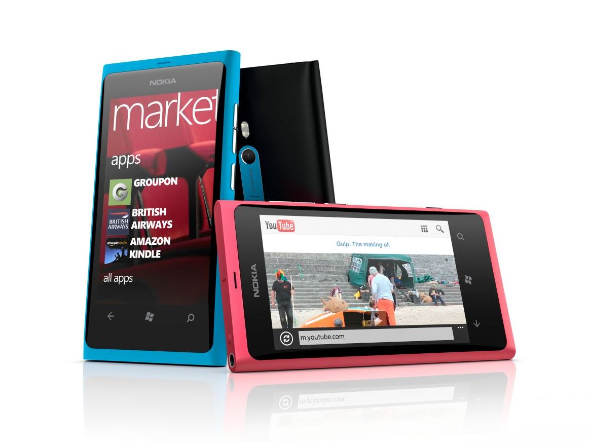
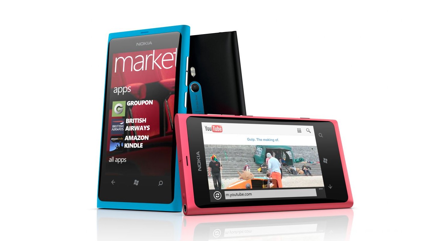
The Nokia Lumia 800 is a very attractive device with a nice weight, and when the on-contract price is free, it's even better. Although the Nokia Lumia 710 has been released as a cheaper alternative, the Lumia 800 doesn't feel at all threatened by its new competition.
We liked
The size, shape and weight of the Nokia Lumia 800 provides a quality feel, and is a unique shape compared to many other phones on the market.
The GUI feels intuitive with a very impressive speed of response, providing a continuity of feel between applications.
The pre-installed Internet Explorer 9 is a super zippy browser, although not the fastest around - but we are impressed with how much of an improvement Microsoft and Nokia working together has made.
The use and merging of multiple cloud sources for contacts, calendar and social apps is well executed, and is actually one of the easiest to use when it comes to linking contacts together.
The games, with their Xbox Live integration, provided a nice look and feel, with the ability to transfer game progress between console and phone.
We disliked
No profiles and this automated profile transitioning as provided on Symbian^3 and newer devices - although this is a problem many smartphones have nowadays.
The phone speaker is disappointing based on previous Nokia devices with a quite tinny sound quality; certainly not among the best on the market, especially in loud conditions.
Battery performance is poor compared with other recent Nokia devices - none of the Finnish bullet-proof battery life we used to be able to rely on, and the update has failed to fix this.
Video recording is not up to recent Nokia standards with no zoom whilst recording and poor light and focus response worsening further in low light environments.
Mix Radio still needs a bit of work to be a truly stand out feature, and the touchscreen issue, although intermittent, rankles when it disturbs what you're trying to do.
Verdict
Although we had our doubts during initial familiarisation with the Nokia WP7 environment, the transition from the Symbian environment will be much less painful than expected for those still entranced by the Nokia brand.
In less than 48 hours we went from wanting to return to our old phones to not wanting to let go of this one. After four months with the Nokia Lumia 800 we still don't want to let it go, although we have had to accept some of its negatives to make the most of its positives.
Whereas the start screen tiles initially felt a little unwieldy and wasteful of the display real estate, the reasoning behind the UI styling soon became apparent so that we realised it is all about simplicity and intuitiveness.
Start screen icons are large to minimise the chances of incorrect icon selection. The phone dial pad screen only has what it really needs to make a call. The alphabetical apps list is the easiest way to find apps, since we all know our A-Z.
We did note a number of issues with the review device, and while many have been rectified by software updates, some remained. The biggest stumbling block of these is the poor video capture and lack of zoom during recording, for which Nokia has promised a future Camera update.
The result of our time with the Nokia Lumia 800 has left us wanting more. The big question you have to ask is: do you buy the Nokia Lumia 800 with WP Mango installed or do you wait to see what devices Nokia releases on the next and Nokia-influenced Windows Phone 8 devices late this year?
We can't look at the phone as just a list of specs. It's the best Windows Phone device out there, but there is room for improvement. We said the same thing with the last crop of WP devices, and while we're happy to wait a little longer, we hope that we start seeing some Microsoft-fuelled superphones in the near future.
Thanks to Orange for supplying our microSIM for our original review.
