Why you can trust TechRadar
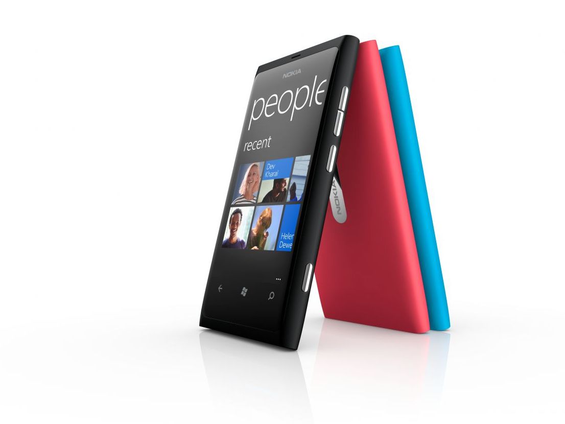
The major difference between Nokia Lumia series and other Nokia phones is the fact that it uses the Microsoft Windows Phone operating system. The system itself is nothing new, of course, releasing its latest incarnation (WP 7.5) on the HTC Titan and HTC Radar in 2011 and due for an update to Windows Phone Tango later this year.
A major point for and against WP7 for some is that it looks completely different to iPhone, Android, Symbian and Meego as the concept of application grids is nowhere to be seen.
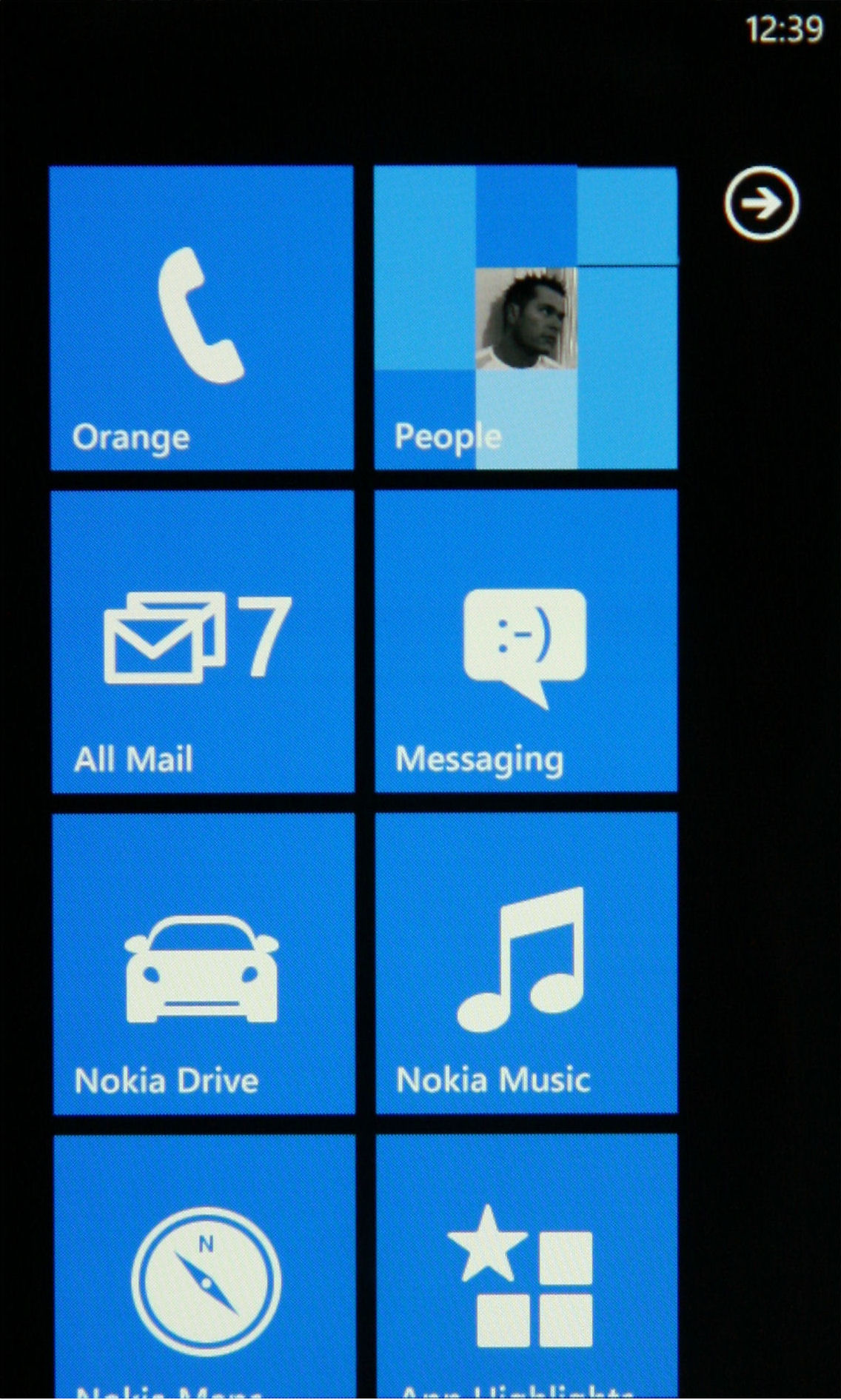
Instead of the more standard home screen, or "Start Screen" in the case of Windows phone 7.5, the Nokia Lumia 800 uses "Live Tiles", fitting a 2x4 grid (although Calendar and Pictures tiles are full screen width) of tiles on the screen, vertically scrolling to display as many tiles as you wish to add.
Adding tiles to the Start screen is as easy as left swiping to the apps list, long pressing an app and selecting "pin to start", with removing a tile requiring a long press on the tile on the Start page and then tapping the drawing pin with a line through it.
Moving tiles around is just as easy, requiring a long press and then dragging them to the desired location.
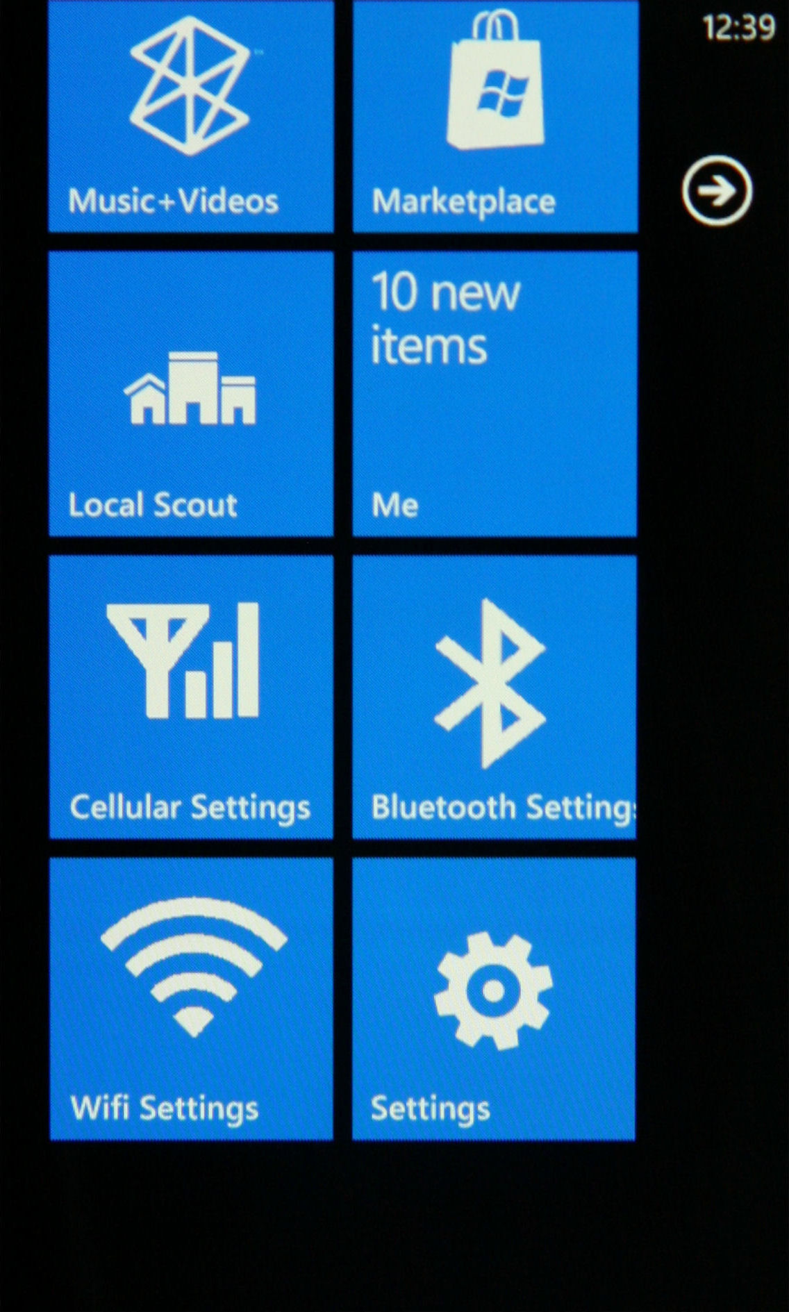
At first we were unsure about the large tile based layout, finding it a little cumbersome and poor screen real estate usage, but within a couple of days our opinion changed. The major advantage is speed of use. You don't need to be looking as closely at your phone to use it as the chances of miss pressing are greatly reduced.
Having now used the phone for a few months, finding our way around the GUI is second nature. However, it still feels that the Start Screen could be better used, since although the 2 x 4 grid of Live Tiles visible at any one time act more as information sources as well as application icons, we still miss having access to more apps from a single switchable home screen.
Going forward, there will also be more advantages to the system as the Live Tiles as applications are able to show dedicated information instead of an icon - for instance, the BA app will turn into a QR code when you're about to board a flight which can be used in place of a boarding pass.
The other section of the home screen is the apps list, which is quite standard, and somewhat antiquated in some ways as it is just an alphabetical list of your apps, or app groups in the case of Office and Games.
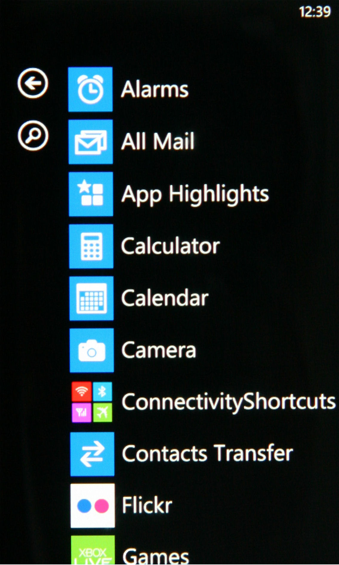
In its defence this form of app list layout is, again, easy to navigate, knowing exactly where an app will sit in the list as done in the Windows PC start menu. This is further aided by the soft search button on the left hand side of the list providing a live filter of the list based on text entry.
This all means that folders are long gone, but after a while you realise that in this format, you don't need them - although as you fill the phone with apps, we would like the ability to sort them into little groups. Being able to search by letter isn't enough - we want customisation in the same way users are able to group together contacts and pin them to the start menu.
A backward step in WP7 is that the top status bar is not interactive like we have become accustomed to with other operating systems.
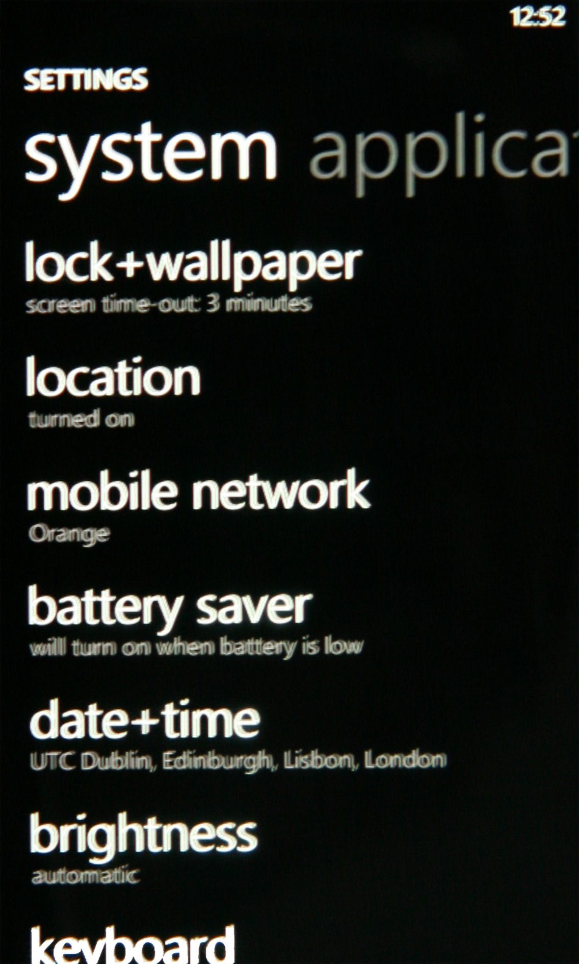
To toggle Bluetooth, Wi-Fi and Flight Mode on/off you have to go through Settings, which was a major frustration until we found an app on the Marketplace called Connectivity Shortcuts which brought this functionality to the Start screen as Tiles.
Another frustration is that the status bar often only displays the time, meaning you have no knowledge of connectivity or remaining power until you swipe down from the top of the screen to see these elements.
Microsoft thinks this cleans the screen up, but given knowing your signal is a pre-requisite for a lot of applications, we'd at least like the option to keep it there constantly - plus too many applications don't support the swipe-down method.
On a more positive slant, the repeated use of familiar icons throughout the user interface for specific functions, means that you know what a button does at a glance without having to read it. In this way the GUI feels intuitive rather than learnt.
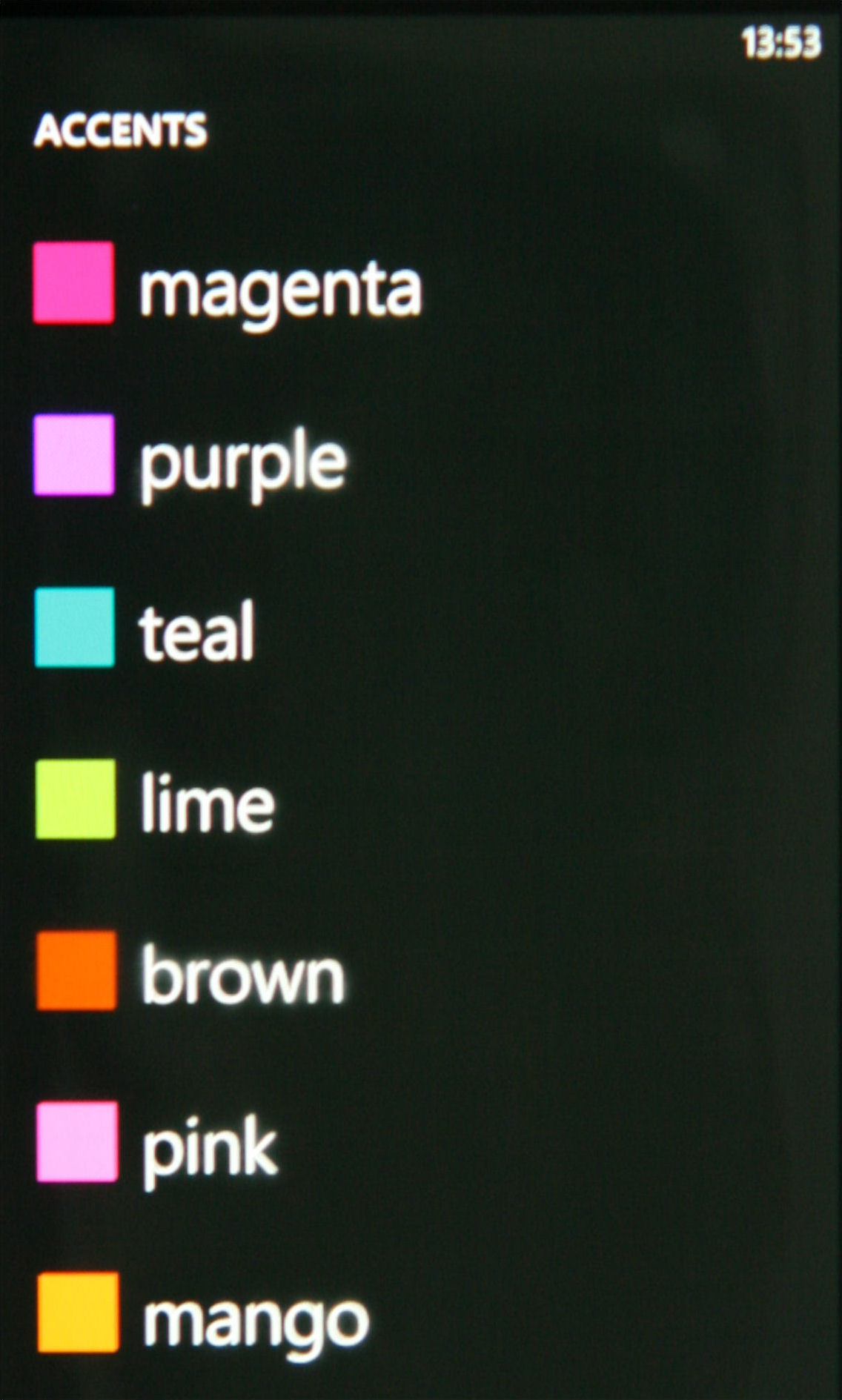
Another feature Symbian users have become accustomed to over the years is the use of profiles to quickly switch between different scenarios in their daily life like, General, Silent, Meeting, Outdoor, Pager and Offline. Sadly, these are all gone except for Offline, which is now Flight Mode, and the ability to put the phone into vibrate only mode.
Although profiles have been around for many years, their usefulness has increased more recently with the invention of location and time-based auto profile switching apps, and this is what we really missed.
We had become used to having our phones automatically switching to sleep mode at night, conserving battery, dimming the screensaver and changing response to phone calls and messages at night and returning to normal mode the following morning.
One major area of frustration while using the Nokia Lumia 800 has been repeatedly hitting the back button to close Internet Explorer and other apps, because there's no Close/Exit button. The current WP7 coding means that apps close via the back button, but only from a specific screen which has to be navigated back to before the app can be closed/exited.
We have identified a way to ease the pain in Internet Explorer by opening the menu, selecting tabs, and closing all open tabs, at which point, a single tap on the back button now exits the app.
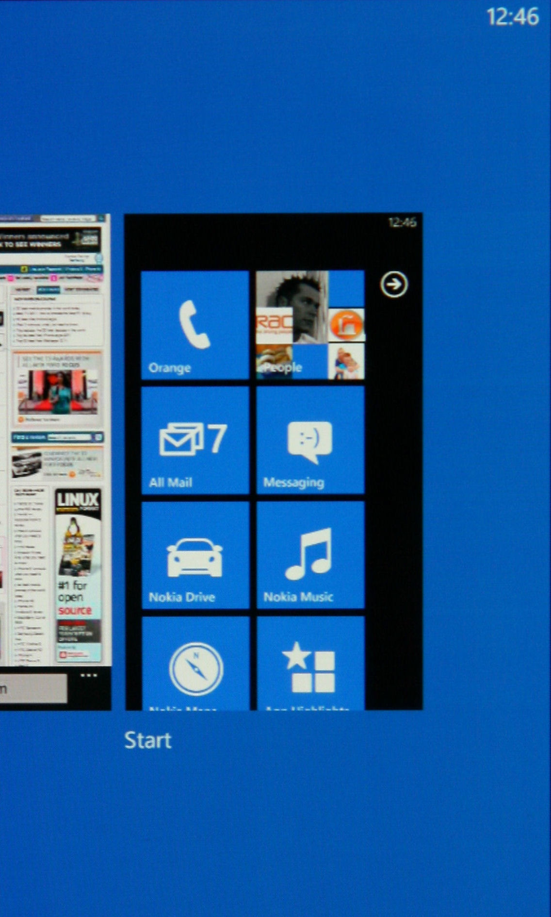
Even long pressing the back button to open the task manager does not provide an option to close open apps, but only permits switching between apps. This said, however we did not note any speed reduction with six apps showing in the Task Manager.
This is assisted by the fact that only a very select set of the apps on WP7 devices can run in the background and the rest are suspended (disabled) when not on top - we were very impressed with the speed of the Lumia 800 throughout testing and in truth, didn't see any real necessity to actually shut down the applications.
One major problem we did note: sliding your finger across the touchscreen would sometimes be inexplicably registered as a tap, opening an app or zooming into the text. We had hoped that the joint Microsoft OS and Nokia FW updates released in February would have fixed this, but sadly not, although the issue does appear to be occurring less often.
If you want to learn more about the new Microsoft mobile operating system, then check out our Windows Phone 7.5 Mango review.
