Why you can trust TechRadar
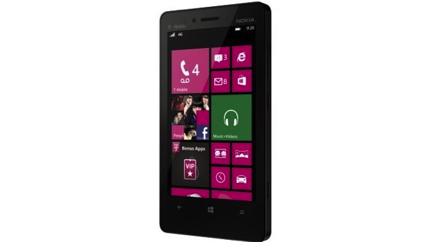
While there are notable differences between Windows Phone 8 handsets, chances are most prospective buyers are interested in the OS because of its head-turning design, which chucks the small icons and grid-based layouts of iOS and Android in favor of large, animated squares and rectangles.

Windows Phone 8 isn't dramatically different in practice from the previous version, but the myriad changes are meaningful, whether it's the informative new Live Tiles or the fact that the Start screen contents are now centered and larger overall, rather than being pushed to the left side of the screen.
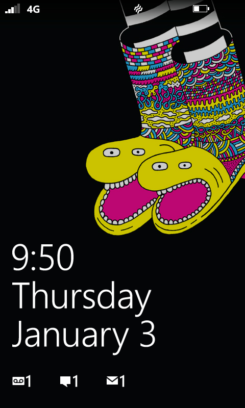
Clicking the power button on the right side of the phone, you'll pull up the lock screen, which can be cleared by tapping anywhere and sliding upwards. The lock screen prominently features the date, time, and day of the week in large lettering atop the image of your choice, plus will show notifications of emails, messages, missed calls, and more, along with battery, Wi-Fi, and reception indicators.
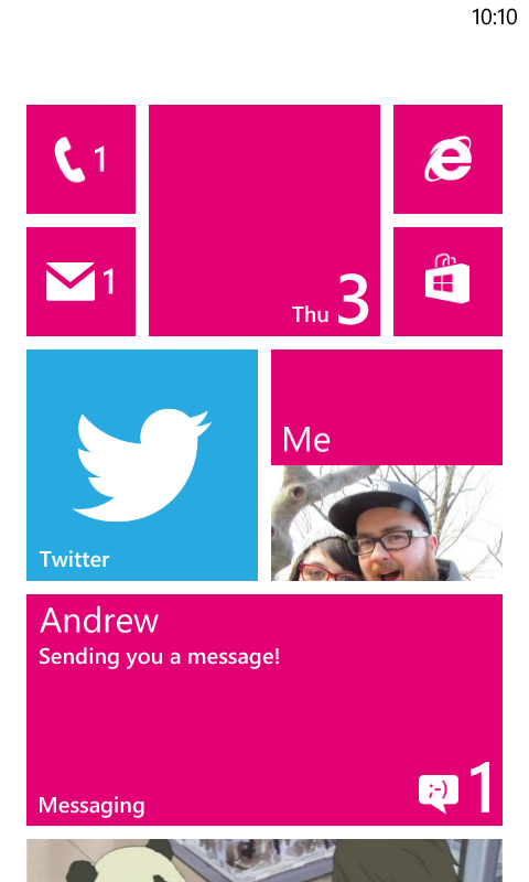
Clearing the lock screen gives way to the dazzling Start menu, with its tweakable and attractive tiles. Most tiles can be kept in the standard square shape, expanded out into a larger rectangle, or contracted to be one-fourth the normal size, and while the decision is yours, know that the size often dictates the usefulness of each tile.

For example, a larger rectangle tile for email or messages will show a preview of unread content inside, while a rectangle for Facebook uses your cover photo as the backdrop and also shows recent notifications. Normal squares include the name of the app and may show a condensed preview of recent notifications or messages, while the smallest tiles will show only the icon and a number, if needed.
Flexible sizing allows you to create your own unique Start screen layout, whether you prefer an iOS-like bundle of tiny icons, a standard array of squares, or some combination of all three sizes. As usual, the screen scrolls upwards and can be extended out with tiles as far as desired.
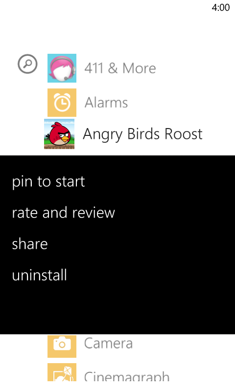
Beyond the single, scrolling Start screen, all additional apps that you don't want large icons for are found in a text listing accessed by swiping left. Holding down on any app name brings up options to pin to Start, rate and review, share, or uninstall in the case of third-party apps.

Tapping the magnifying glass button below the display pulls up Microsoft's own Bing interface, which lets you search for a term (by typing or speaking) and have it pull up the results on the web, within your own apps, and on the app store; the last option is helpful when a site might have a native app that you weren't aware of.
Windows Phone 8 also adds voice recognition, which isn't quite as robust a function as Siri or Google Now but does appear throughout, whether you're looking to pull up an app ("open Angry Birds Star Wars"), search Bing, or dictate messages or emails. Our attempts to speak out emails yielded unintentionally hilarious results, though, so it may not be quite polished enough for extensive use.
The Lumia 810 only offers a dual-core processor, but clocked at 1.5Ghz with 1GB of RAM in support, the OS sings throughout. It's speedy in regular use, flips to apps without noticeable delay, and looks great the entire time. If iOS and Android are looking a little too stock after a few years, perhaps the breezy and beautiful Windows Phone 8 interface is right up your alley.
