Why you can trust TechRadar We spend hours testing every product or service we review, so you can be sure you’re buying the best. Find out more about how we test.
It's probably fair to say the bright, blocky live tiles of Windows Phone have become as recognisable as either an iOS or an Android homescreen. Of course, recognition doesn't always translate to acceptance, so Microsoft has tweaked and fine-tuned in an effort to bring Windows Phone 8 up to speed.

If you've been using WP7 or 7.5, you'll immediately understand the new OS. In fact, it's fair to say this is more an incremental change than a full-blown reimagining.
The basic look and feel is carried over from WP7. You have a home screen full of live tiles and a separate, vertical-scrolling menu of all your apps. You can pin your most-used apps to the home screen and also drag and reposition the tiles in an order of your choice.
The beauty of using the Windows mobile operating system is that it takes very little time to get used to it. The inevitable downside is that, although you can change your basic colour theme, there's no option to add wallpapers or widgets à la Android.
At the beginning, you're met with the lock screen, which you can customise with a picture of your own. Unlike Android or iOS, there's no way to access any apps from the lock screen, save hitting the camera shutter button to launch the camera app.

The lock screen does however show relevant information like your next synced calendar appointment and whether you have any messages or emails. You can also set certain apps, such as Facebook, to display your latest status update on the lock screen.
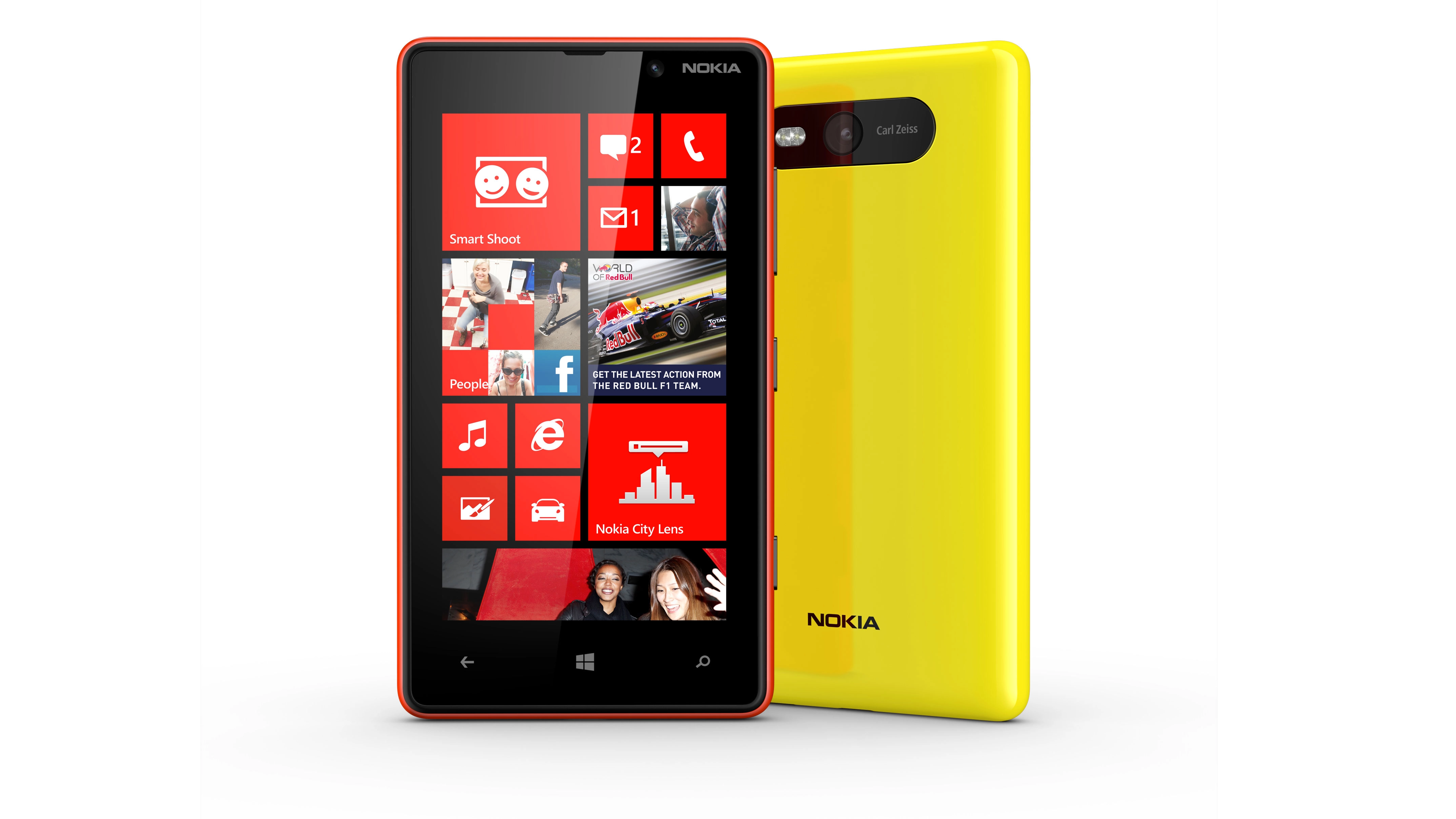
Once past the lock screen you're into the Windows interface proper. Windows Phone 8 has included smaller live tiles than Windows Phone 7 and pulled the interface across slightly, so its more centrally placed than WP7 or 7.5 which left you with a small arrow and blank space guiding you across to the app screen.
Live tiles can be moved around and resized according to preference. Full size spans the entire home screen, with half size and quarter size options also available - allowing you to efficiently divide up your screen real estate. It doesn't work quite as well as folders on iOS or Android for compartmentalising services, but does allow for a degree of customisation.
The live tiles have been given that name for a reason - most will update with new information, such as a tweet, picture or news headline, automatically. This means you can glance over your home screen and get snapshot updates on what's going on.

Third-party apps often have their own live tile design so although for the most part you'll see a block colour of your chosen theme, this is interspersed with headlines and logos.
Swiping left takes you to the vertical list of apps on the Lumia 820. This is a quick and clear way of displaying apps but (and we pointed this out with the Lumia 920) if you're particularly app-happy then you're going to very quickly accumulate a long list and a lot of scrolling time.
Once you're familiar with the layout of the interface, you'll find yourself moving about it at some speed. The three soft-touch keys at the bottom of the phone let you either jump back a screen, go straight back to the top of the home screen or fire up Bing search for a quick internet query.

The 4.3-inch screen is particularly sensitive and responds very quickly to pinching and swiping. The increased sensitivity of the screen also means you can use the Lumia 820 with gloves on - a feature no doubt as useful in London as it is in Helsinki, but not so much in Brisbane.
Holding down the back key brings up a thumbnail slideshow of your recently used applications and lets you quickly skip back and forth. Microsoft calls this multitasking, which is a little misleading as you can't actually close apps this way.
We've given our thoughts on Microsoft's interface before on reviews of other Windows devices, such as the Lumia 920 or the HTC 8X. It's a clean and simple interface that works, and easy enough to get to grips with.
It looks noticeably different from the horizontal, icon-focused iOS and Android systems and as such, won't appeal to everyone but there is a fair amount to discover and it works well once you start using it properly.
- Read our Nokia Lumia 920 review