TechRadar Verdict
Just one level below the Lumia 930, the Lumia 830 suffers from the same OS flaws as the bigger handset as well as poorly implemented design and low powered internal components.
Pros
- +
Decent Battery
- +
Big bright screen
- +
Well powered camera
- +
Camera shutter button
- +
Metal frame
Cons
- -
Poor design
- -
Sluggish in use
- -
Poor front camera
- -
Windows feels disorganised
- -
Lack of apps
Why you can trust TechRadar
Somewhere between the budget Lumia 735 and the flagship Lumia 930, you'll find the Lumia 830. Not quite a flagship, the Lumia 830 aims at the higher end of the middle market, competing against the Galaxy S5 Mini and HTC One Mini 2 on contract with prices on EE hitting £33.99pm to get the Lumia 830 for free with 4GB of double speed 4G and free EU roaming.
Alternatively, you can also get it for £19.99 with no extras and a £59.99 upfront fee. In the US, it's available for $99.99 with an AT&T plan. If you're looking for more freedom, the Lumia 830 can found for £280.99 on PAYG or £304.99 SIM free. In the US, you can buy it for US$449.99 without a service plan, while in Australia you can pick it up for AU$535 at JB HiFi.
What does this actually get you though? The Lumia 830 has a metal body and a 5-inch, 294ppi, 720p HD screen. Under the skin, there's a quad-core Snapdragon 400 CPU clocked at 1.2GHz backed with 1GB RAM to run Windows Phone 8.1, and it also includes a 10MP PureView camera with Carl Zeiss lenses.

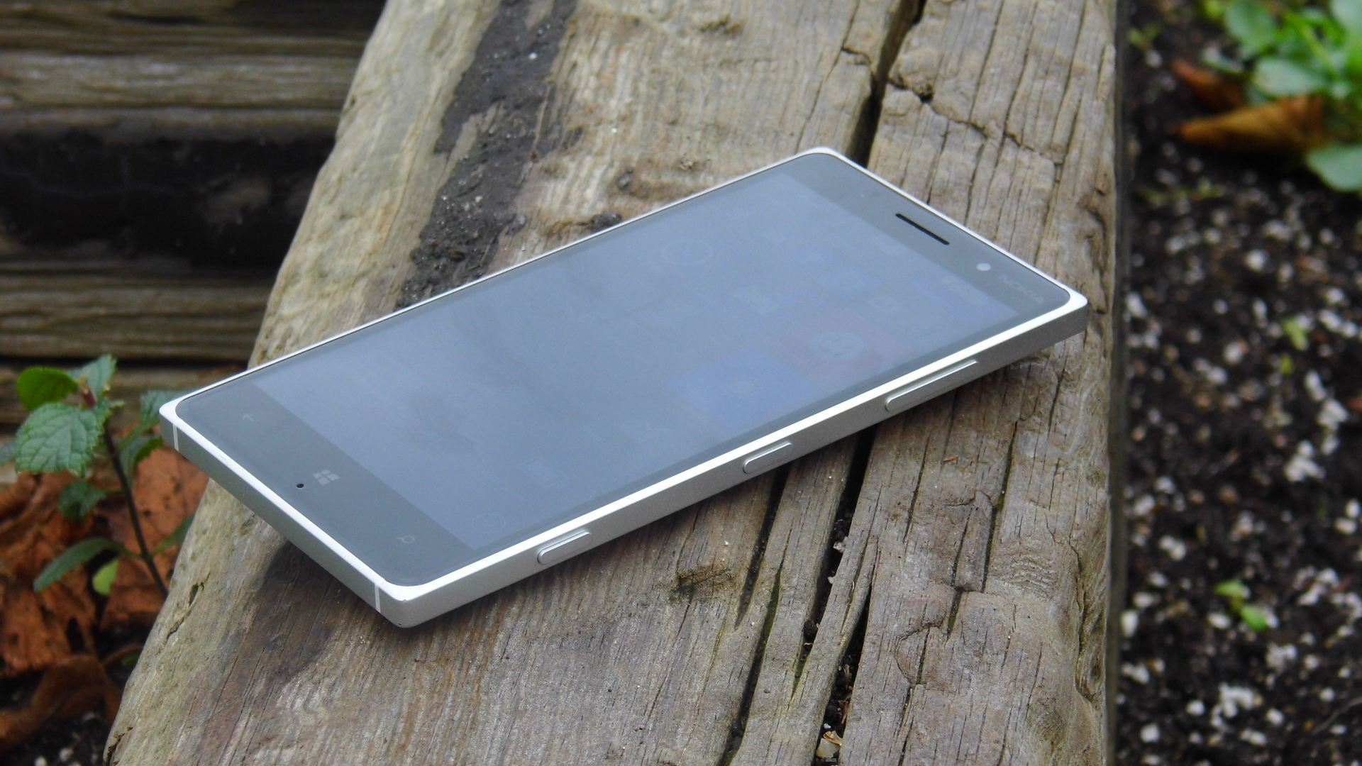
Metal handsets are often commended for their premium feel - a perception driven by the iPhone range and the HTC One M8, But I think that the metal frame is actually detrimental to the Lumia 830.
This is in part because of the plastic back, which detracts from the overall feel, and partly because of the shape. While the HTC One M8 comes with a beautifully ergonomic curved back, and the iPhone 6 is nicely rounded, the Lumia 830 just feels like a metal brick.
The chassis comes in two colours. The silver version is the less attractive: the contrast with the black face exaggerates the overall squareness of the handset. The black version has a more elegant look.
Couple the hard lines with the larger 139.4 x 70.7 x 8.5mm frame and you're left with a phone that sits uncomfortably in the hand. It also feels a little heavy at 150g. Despite the metal build, I would not feel overly confident about the chances of a phone this hefty surviving a drop.

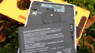
The plastic back plate of the 830 makes it slightly grippier, but comes with its own faults. Being exceptionally thin means that it feels borderline flimsy, especially when I removed it to pop in the SIM. And that's before I get to the colours.
The Lumia 830 comes in four colours: a silver frame with white, orange or green back, and a black frame with black back. My review model was silver and orange, and I'm not a fan. Bright shades are a hallmark of the Lumia range - but whereas the 735 is enveloped in fun and outrageous colours, the orange and green plates on the 830 simply seem unnecessarily garish.
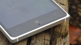
The Lumia 830 has soft back, Windows and search keys below the screen (so there are no on-screen navigation buttons) as well as the traditional hard volume rocker and power/lock key. There is a dedicated shutter key located with the other hard buttons on the right hand edge, which can be used to launch directly into the camera app.

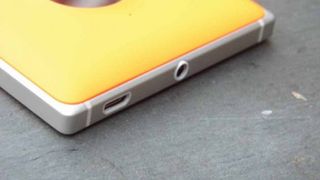
On the top edge, you'll find the standard 3.5mm headphone jack, and microUSB port for charging and connecting to a PC. This is perfect for the headphone port, as it means you can slip the Lumia 830 into your pocket while listening to music. However, it's a different story for charging.
There must be a good internal design reason why the microUSB port is on the top, but it makes it awkward to use the Lumia 830 when it's connected to the wall. However, a strong battery performance means this is unlikely to be an issue. With normal usage, you'll only have to charge it at the end of the day.
And with so much to criticise about the look of the Lumia 830, it will need to be a phone of substance over style to succeed. How does it fare? Read on to find out.

