Why you can trust TechRadar
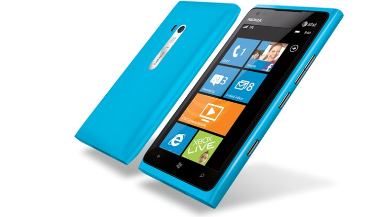
The Nokia Lumia 900 comes packing the Windows Phone Mango operating system, also knows as version 7.5 for those of you who like your figures.

And even better news for Windows Phone fans: while you won't be getting the fancy-pants Windows Phone 8 upgrade, you will be getting version 7.8, which brings new ways of interacting with the home screen.
We've been intrigued by Windows Phone since Microsoft debuted it nearly two years ago.
While Apple's iOS looks largely the same as it did when the original iPhone launched in 2007 and Android has borrowed liberally from that look to varying success, there's certainly no mistaking the unique Metro style.
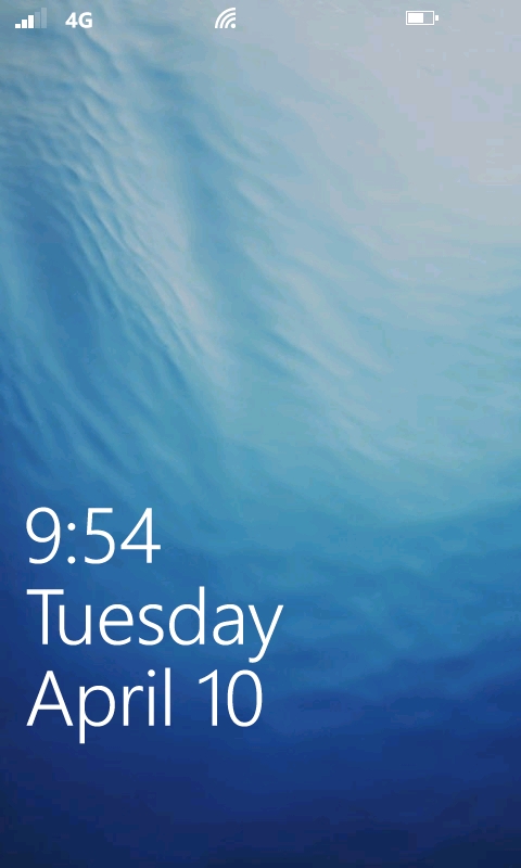
The Lumia 900's lock screen displays signal levels for cellular, Wi-Fi, and battery at top, with time and date more prominently at bottom.
Upcoming calendar events handily appear below the date, along with icons for incoming email or message counts as they come in.

While locked, notifications appear in a band of colour at top, which varies depending on what theme you have selected – with the preset being a rather fetching shade of blue, known as "Nokia Blue" in the settings menu.
If you hold down the shutter button on the right of the Lumia 900, you can jump straight into the camera app from the lock screen, perfect if you fancy taking a quick snap.
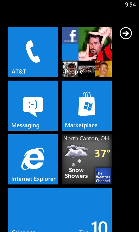
Swiping a finger from the bottom of the screen unlocks the Lumia 900 and reveals two columns of tiles representing apps, services and contacts.
Many of these are "live" tiles, which can display information such as missed calls, text messages, email inbox counts and more – think of them as simpler versions of Android widgets.
Simply hold down on a tile to manipulate it, with the choice to either change its position in the grid, or remove it from view, which is known as "unpinning".
It's a refreshing departure from the grid of icons we're used to seeing from Apple and Google.

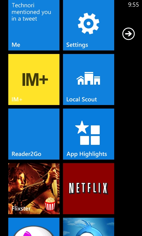
Tap the arrow at the upper right of the display, or swipe from right to left to reveal the list of installed apps, sorted alphabetically.
At first, this is one continuous list, but Microsoft has cleverly enabled the ability to group apps by letter once you've installed 40 or so titles.
To quickly jump to an app, tap any letter and choose from an A to Z grid – for example, "T" for Twitter.
Frequently used apps can also be pinned to the Start menu; simply tap and hold on the desired app, then select "pin to start" (the same method is used to "rate and review" or "uninstall").
Once pinned, many apps include live, updating information like photos, weather or news in place of a dedicated notification area used by competitors.
To quickly jump between open apps, hold down the Back button for a moment to bring up the basic multi-tasking menu, then swipe and tap to select.
Windows Phone Mango only offers you the options for the five most recently used apps in this list, where as iOS and Android show all open apps in their multi-tasking menus.
Much like earlier versions of iOS, not all Windows Phone apps support background running yet – a plus for battery life, but the short wait required as they reopen can be a bummer when you're in a hurry to answer an incoming IM, for example.
Some say specs are dead, and in the case of the Nokia Lumia 900, that may be a good thing. The hardware runs on a humble single-core Qualcomm APQ8055 + MDM9200 processor clocked at 1.4GHz with a mere 512MB of SDRAM, but don't let the numbers fool you – we were able to flick, tap and swipe our way through each day without noticeable lag.
A bit of a bug bare for us is the Lumia 900 doesn't constantly show you your network signal, Wi-Fi connection or any other icons in the notification bar at the top of the screen – with just the clock getting a permanent fixture.
A swipe down from the top of the screen will display the additional icons, but it seems somewhat unnecessary and we'd prefer to see them all permanently.
Overall, although as not fully featured as Android, or elegant as iOS, Windows Phone on the Lumia 900 is a joy to use, running smoothly on a phone which, on paper, lacks in power compared to the competition - providing an simple, but pleasant user experience.
