Why you can trust TechRadar
The Nokia Lumia 925 runs Windows Phone 8, which is the latest version of Microsoft's mobile operating system, but it's also the same version the Nokia Lumia 920 runs, so it's another area where we're getting a sense of déjà-vu.
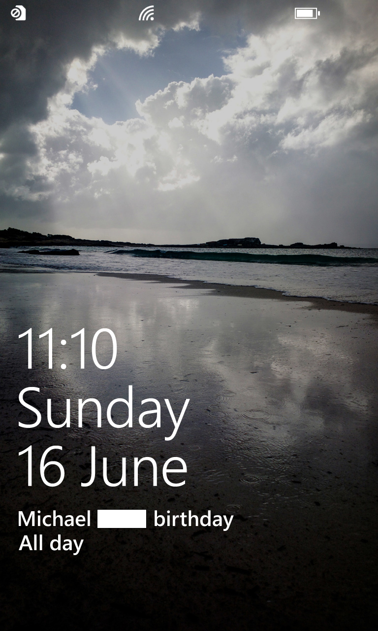
The first thing you'll see when using the phone is the lock screen. This displays a wallpaper in the background, then overlays that with the time, day and date in large white writing.
Below this you'll see your latest calendar event or reminder or missed calls, texts or emails, depending on how you set it up in the Settings screen.
At the top there's a battery bar, signal strength indicator and additional icons for any active data connections.
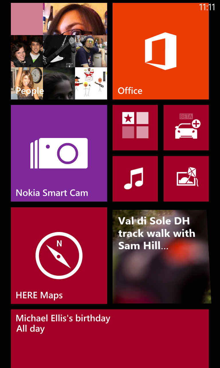
Swipe up to clear the lock screen and land on the start screen where you'll find the familiar tile-based layout that makes Windows Phone handsets stand out from the crowd.
Each tile corresponds to an application and you can tap on it to launch the app or long-press it to move, resize or remove the tile.
Many of the tiles aren't just static images, instead displaying relevant pictures or information.
For example your email app might tell you how many unread messages you have, while the People app has a slideshow of contact images.
It's an attractive and stylish design, but beyond that it makes the tiles more useful than the mere shortcuts that most apps on Android or iOS use. Each tile can almost be considered a widget in its own right.
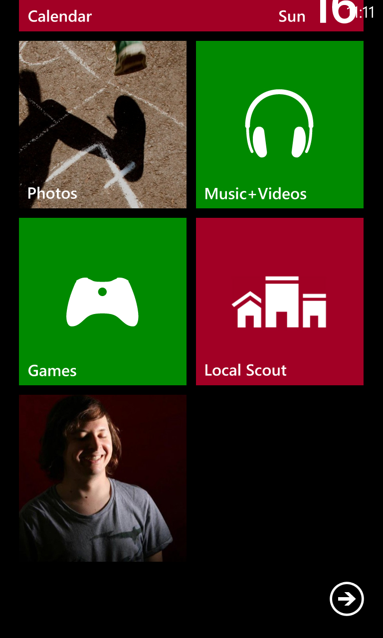
Another way in which Windows Phone 8 is different from competitors is that rather than having a series of distinct home screens that you swipe horizontally between, it has one long start screen that scrolls seamlessly up and down.
Aside from launching apps and rearranging icons there are a few other things that you can do here.
The top-right of the Nokia Lumia 925's screen displays the time in small white writing, but if you want to see anything else - for example the battery level or signal strength - then a quick tap at the top of the screen will momentarily reveal these things.
It keeps the start screen tidy but it's not something that you'd necessarily discover very quickly the first time that you use the phone, so we wish it was a bit more intuitive.
The soft touch buttons below the screen each have at least one use.
The Back button enables you to scroll back through previous screens if you tap it, but if you long-press it you're presented with an overview of all your recently used apps and can just tap one to return to it.
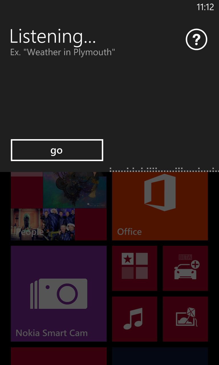
Similarly, the Start button also has two uses. Tapping it will return you to the start screen if you're anywhere else, while holding it for a second will bring up a voice-based personal assistant.
You can ask it to open apps, make calls, send texts or look something up on the web, and it does a good job too - though if you know your way around the phone it's not really any quicker than just doing things by hand.
Finally, the Search button brings up a Bing web search if you'd rather type your search queries than speak them. Unlike the other two buttons this one only has a single use.
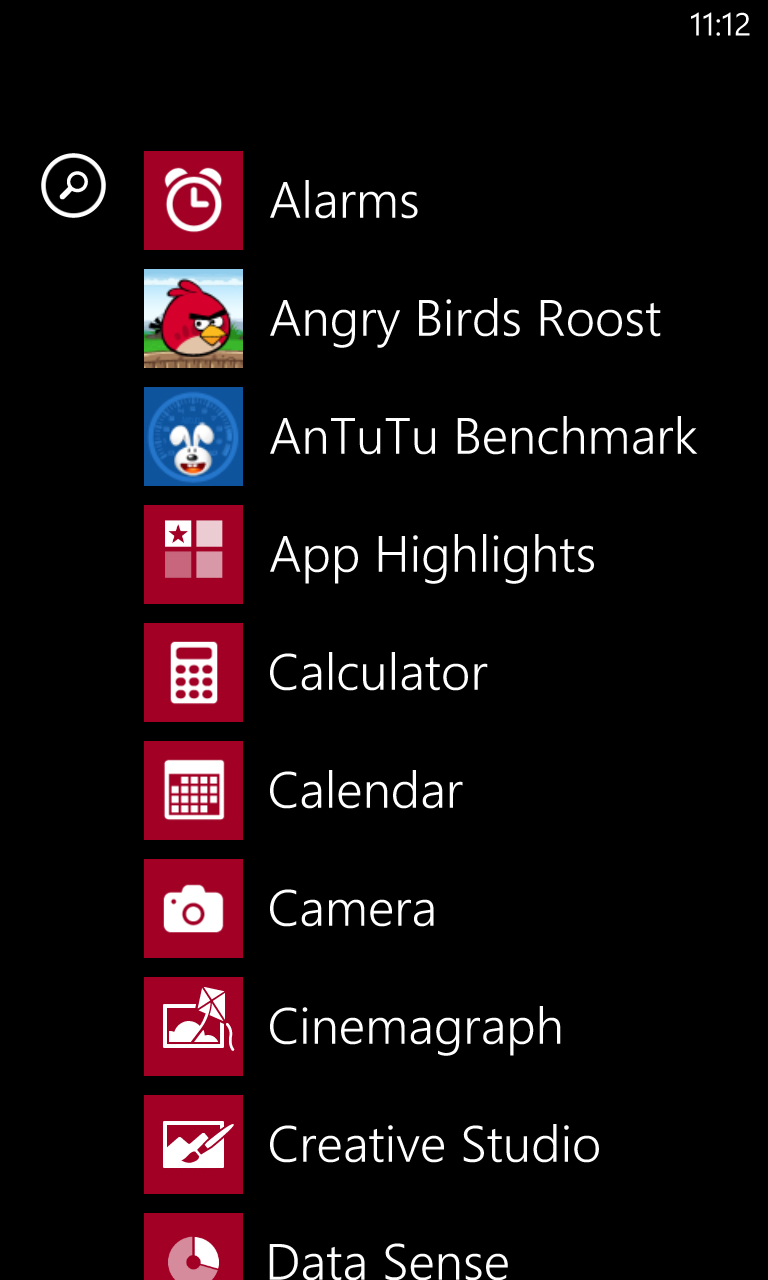
Swipe right from the start screen and you'll find a list of all your apps laid out in alphabetical order.
While you can make start screen tiles for everything, you don't have to, and this list will give you access to things whether or not they're on your start screen.
If you do want to add something new to the start screen just long-press it, while tapping it will launch it as you might expect.
There's also a magnifying glass at the top that enables you to type in a search for a specific app, although as it's laid out alphabetically anyway there shouldn't be much need.
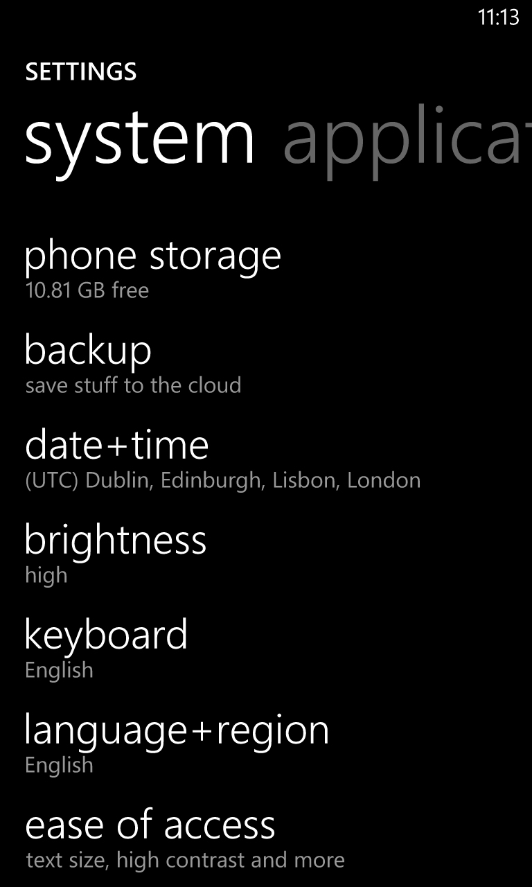
You'll find a link to the Settings screen near the bottom of this, and it's a screen that looks rather different to the start screen. Gone are the bright colours and tiles, so instead it's just a black and white list of options.
It's basic but looks nice enough, and more importantly it's easy to navigate and actually get to the options you need, which include everything from changing your ringtone to adjusting how long the screen will stay on for.
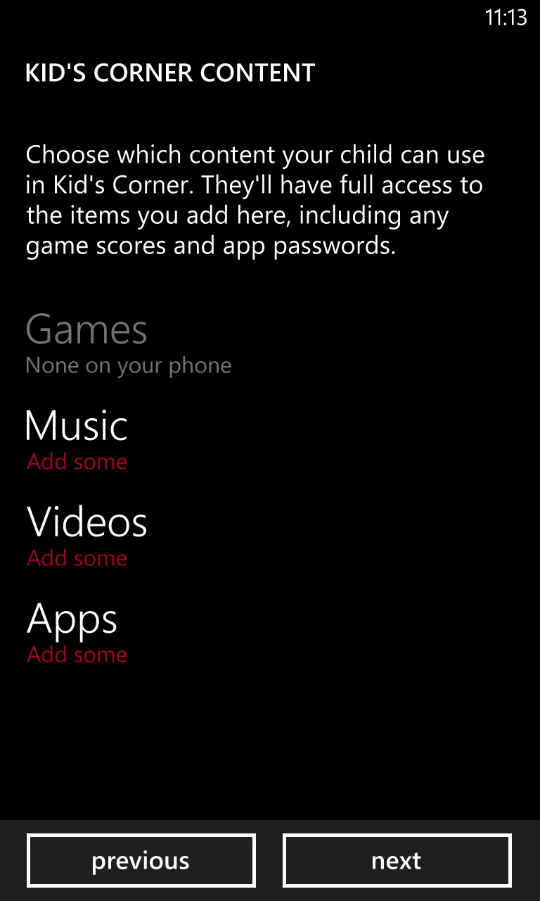
There's also a Kid's Corner option, which enables you to set up a child-friendly user area on the phone, with restricted access to apps.
While things are easy to find once you're on the Settings screen, there are certain things that we wish there was a shortcut to, for example turning 3G and Wi-Fi on and off.
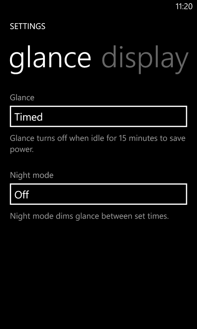
If you leave the screen to time out on its own then rather than turning off completely it displays a Glance Clock, which is a screen with the time on it.
This isn't a lock screen as such, in fact it's not a screen that you can really interact with at all - so swiping achieves nothing, though a double-tap will take you to the actual lock screen.
That in itself can take a bit of getting used to, but on the whole we quite like it.
Phones are increasingly replacing watches, and if you just want to check the time then having to turn the screen on feels like an unnecessary extra step.
Thankfully if you don't like it you can disable it from the Settings screen. You'll also find options there to have it dimmed (and a rather natty red) at certain times, such as night, or set it to turn off after 15 minutes.
Actually operating the Nokia Lumia 925 is a dream, because it's generally very fast and smooth to navigate despite the fairly low specs.
Saying that though, when using the Settings screen you'll sometimes have to wait a second or two for it to load a menu, which is just not on, since things like that should be instant.
It's also mostly very intuitive, and at 4.5 inches the screen is a comfortable size to use.
It looks good too, with bright and colourful images, though the resolution isn't quite a match for many recent Android handsets such as the Samsung Galaxy S4 and the difference is noticeable, with neither images nor text looking quite as sharp on Nokia's handset.
On the other hand, the screen on the Nokia Lumia 925 does have some things going for it, thanks to the return of the clever PureMotion HD+ ClearBlack technology used by the Nokia Lumia 920.
Among other things this makes the screen impressively viewable in direct light.
It still looks a bit washed out, but it's perfectly useable and that's an improvement over most phones.
It can also be used with gloves on, or at least in theory it can be. In practice we tried three different pairs of gloves of different thicknesses, and it only responded to the very thinnest, so if you have visions of taking this on the slopes and using it with ski gloves on, then think again.
James is a freelance phones, tablets and wearables writer and sub-editor at TechRadar. He has a love for everything ‘smart’, from watches to lights, and can often be found arguing with AI assistants or drowning in the latest apps. James also contributes to 3G.co.uk, 4G.co.uk and 5G.co.uk and has written for T3, Digital Camera World, Clarity Media and others, with work on the web, in print and on TV.
