Why you can trust TechRadar
Interface
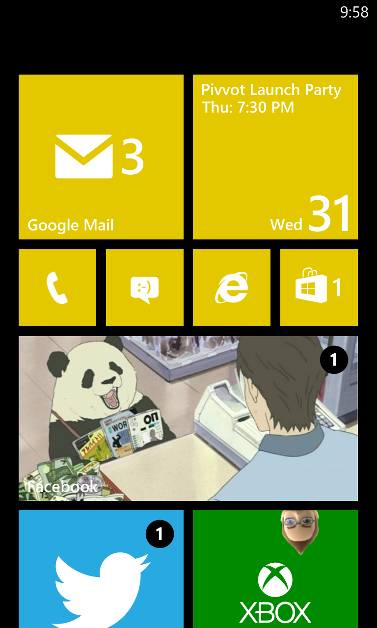
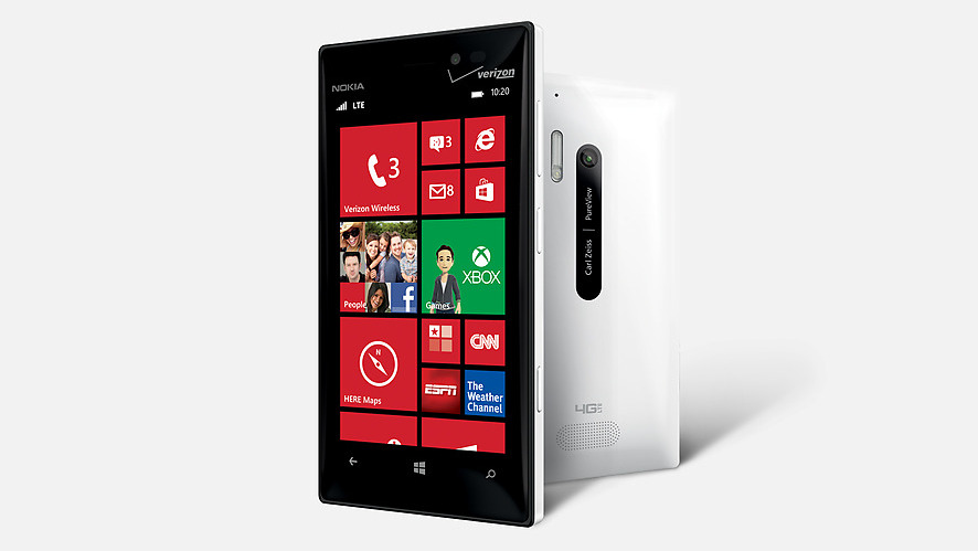
Windows Phone 8's interface remains a paragon of minimalist beauty in the smartphone market, and it's always refreshing to go from iOS and Android's similar grid-based icon layouts to the large, colorful Live Tiles on the Start screen here. A white or black backdrop can be used, and you can choose from numerous colors to blanket the core apps' tiles, though third-party apps typically use set logo designs.
You can pin as many (or as few) apps as you'd like to Start, and customize their sizes and placement to your choosing; tiles can take the size of a tiny square, a large square, or a full rectangle, and the design and utility of each Live Tile changes as you alter its size on the screen.
For example, the Facebook icon is merely the now-iconic "F" logo at the smallest size, while the larger square will flip to a (cramped) teaser of recent activity – like "John Doe commented on your activity." Expand it all the way out to a rectangle and the backdrop becomes your header image from your Facebook profile, and then will flip to a full description of recent happenings on your account.
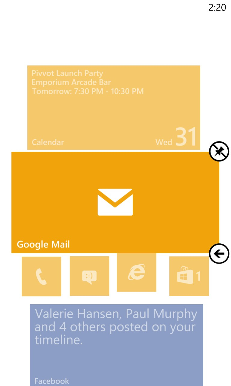
Other apps, like Email, CNN, and Twitter all have their own way of using the Live Tile to keep you updated outside of the app itself, and it's one of the defining features of the OS. Apps that aren't pinned to Start can be found in a list accessed by swiping to the left or tapping the little arrow on the bottom right of the menu.
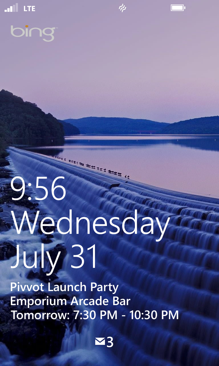
The lock screen can be customized with a photo or backdrop of your choosing, or set to automatically pull a photo from Bing or your Facebook friends' images. The date and time are displayed in large lettering, while small notifications of emails, text messages, missed calls, and voicemails are shown as tiny icons at the bottom. Swiping upwards reveals the Start menu.
Notifications come in the form of a small banner that appears at the top of the screen, whenever you have an email, text, or activity within an app (like Facebook or Twitter), though Windows Phone 8 lacks a notifications hub like those seen in other top mobile operating systems.
All told, Windows Phone 8 remains smooth and stylish, but it's a simpler operating system, and lacks the fine-grained control and customization that power users might expect. For those users, choosing a WP8 device might feel like picking style over substance, but the average phone owner probably won't feel like they're missing crucial functionality.
Contacts and calling
The People app in Windows Phone 8 is designed as the one-stop hub for contacts, and it'll sync up your contacts from Facebook and Microsoft accounts as desired. As of this writing, Google contacts still do not sync to the Lumia 928; updates have been sent out to some Windows Phone 8 handsets recently to enable the feature once more, but the 928 hasn't yet received it.
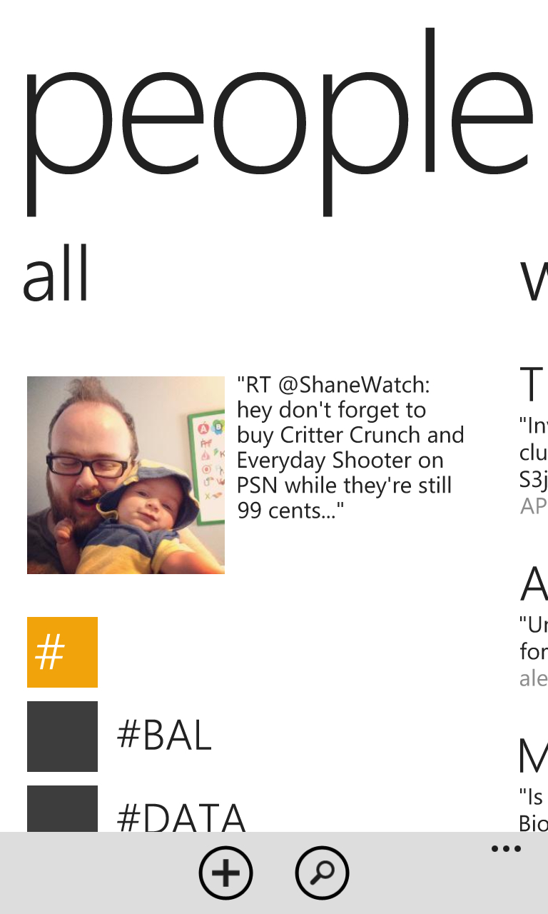
People also shows your latest social networking activity and recent tweets from those you follow, giving you a quick look at what's new without opening up an actual Twitter client, though the app's main purpose is to house your contacts.
The app does a great job of automatically merging contacts synced from disparate sources (like Facebook and Outlook) into one, and you can manually merge them with ease (via the little chain link icon at the bottom of the screen) if needed. And naturally, you can add your own local contacts in addition to the synced ones.
Calling
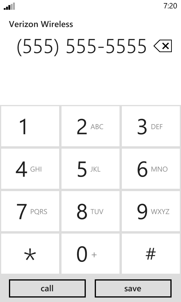
The Lumia 928 runs on Verizon's 4G LTE network, and in our testing around a major American city, we had no issues with reception or call quality. We could clearly hear the person on the other end of the line nearly all of the time, though using the speakerphone feature wasn't quite as pristine in use.
Windows Phone 8's minimalist dialer screen features large numbers that dominate the display, though it doesn't suggest contacts as you're tapping in numbers, which would've been a helpful addition.
