Why you can trust TechRadar
Nokia's heritage is easy to define (well, if you forget about the cables, wellies and tellies it used to make): the call and the text message.
Who didn't love the Nokia 3310 as an easy way to get hold of your mates or excitedly get a text from that special someone (albeit in my case, once to be told that things weren't working out and it was over)?
But in the days of the modern smartphone, imbued with all manner of data and information flying through, the critical parts of owning a phone are starting to become less of a priority.
What's interesting though is that Nokia's not got the best calling or messaging experience by a long way any more – although you can lay most of that blame at Microsoft's door really.
Calling
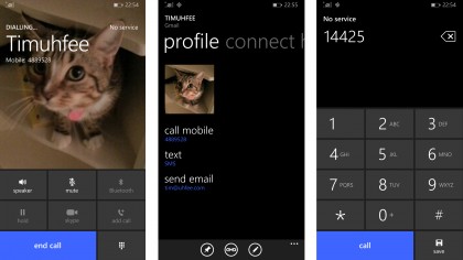
Actually, the actual act of calling is fine on the Lumia 930, with clear and easy to hear voices going both ways.
It helps that there are multiple microphones dotted around the handset, as this improves the voice clarity no end for those listening on the other end.

The speaker and earpiece are both loud, and the overall app is easy to use and understand – I'm not a fan of having to slide up and then press answer, but it's hardly the biggest problem out there.
The issues really come with the contacts. With most phones there's a strong connection between the contacts book and the phone dialling app, but that's never been the case with Windows Phone.
For me, the phone app and the contacts are one. So smart dialling (where you tap numbers corresponding to the person's name) should be a given. Easy access to the contacts list to do more than just dial the number would be great.
You can see the thinking here, but the competition has worked out that there's a lot of mileage in making smartphones interconnected, and Nokia / Microsoft hasn't really picked up that game yet. It's cool that you can make Skype calls from within the app, and if you're a strong user of that app it saves money and improves the performance, but in reality most of us just want a good phone experience.
Messaging
This is another area where Microsoft desperately needs to step up. A large part of this review is really focused on what Windows Phone offers, which you can argue is not Nokia's fault (and not really its problem anymore thanks to the buyout) but still has a large effect on the usability of the phone.
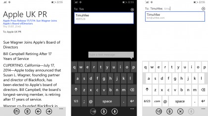
The problems aren't terrible, they're just many. For instance, while I like the fact that emoji support is baked into the keyboard, I want to be able to turn it off. The amount of times I hit that darned picture key instead of the more oft-used comma was dizzying, and such things show that keyboard customisation is important.
The keyboard needs to be more accurate too. Three years ago it was one of the best around, but multiple third party choices have proven to be a better and faster way of doing things. I like the way it can work out what my fudge-fingered missives are trying to say, but it takes a few seconds to work it out, which is too long.
Slide to text is there, and for the most part OK, but again, it's not market leading. Microsoft needs to improve this keyboard or open up to other third party choices that will be more accurate if Windows Phone is going to be brilliant in this space - and given the company's enterprise heritage, it should be.
The messaging app itself is aging too - it once experimented with other applications in the same space, but thankfully that's been pulled back inside. But the user interface hasn't really changed, and the look of it needs something of a refresh now.

Overall, the messaging experience needs a refresh. Whatsapp integration - not as a separate screen, but properly baked in - would be great, and given the Microsoft / Facebook synergy, could happen. Apple's making great strides with iMessage, and there's space for others to do so too.
Like messaging, the email client on the Nokia Lumia 930 feels like it's stuck in the dark ages. The fact that you still need to download internet pictures, or wait for the rest of the message (even when you tell the phone that you don't mind everything downloading at once) feels like I'm using a Windows Mobile circa 2002.
I know that this is designed to protect data, and that's a very important thing to be considering. But if I choose to have it all appearing then it should do just that. Microsoft needs to stop thinking of its OS as enterprise first and remember that consumers want simplicity and to be amazed by the way things look, not have to tap the screen to see a picture only to find it's an email signature.
And given the proliferation of Gmail users these days, it's crazy there's a) no proper Gmail app out there, and b) that doing so through the main email app doesn't offer the same rich functionality of archiving and searching as efficiently.
It's these small things that Microsoft needs to be more inclusive. If it can launch an Android phone (such as the Nokia X) then it can integrate Gmail better into its OS.
Internet
I feel like this 'The Essentials' section has turned into a place to moan at Microsoft for its core parts, but in truth these are the areas that are starting to creak for Windows Phone and the Lumia 930 suffers as a result.
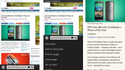
Internet Explorer, like the other points mentioned here, is equally guilty of not moving with the times correctly. The same tired interface as before looks too industrial, too enterprise, and the overall speed and functionality of the web browser is poorer than the competition.

It's irritating that I can't have other browsers on here, as many users are starting to get integrated into a certain browser ecosystem, be it Chrome or Safari as the popular ones.
But here I just can't find as much pleasure idly browsing the web with the mobile version of Internet Explorer. Perhaps if you were wedded to the main browser, this would be an awesome way of using it, because you can pick up tabs you had open on another computer easily.
When I think of IE, I think of the same industrial font with large black surrounds, and a slower browser that doesn't look as visually appealing as the rest - and doesn't allow you to default into the desktop mode of sites, which makes more sense with the larger screen on offer.
As such, my smartphone use goes down - but then again, perhaps some people will see that as a good thing.

Gareth has been part of the consumer technology world in a career spanning three decades. He started life as a staff writer on the fledgling TechRadar, and has grew with the site (primarily as phones, tablets and wearables editor) until becoming Global Editor in Chief in 2018. Gareth has written over 4,000 articles for TechRadar, has contributed expert insight to a number of other publications, chaired panels on zeitgeist technologies, presented at the Gadget Show Live as well as representing the brand on TV and radio for multiple channels including Sky, BBC, ITV and Al-Jazeera. Passionate about fitness, he can bore anyone rigid about stress management, sleep tracking, heart rate variance as well as bemoaning something about the latest iPhone, Galaxy or OLED TV.
