Why you can trust TechRadar
As we mentioned earlier, the Nokia N8 is using a new operating system, Symbian^3. Symbian has been used by the Finns for umpteen years, and hasn't gone through a huge amount of development in that time.
The new iteration is designed to help bring Nokia's touchscreen phones in line with those from Apple and Google - and while it certainly fixes the foibles from older iterations of the UI it doesn't quite pack the pizzazz of other smartphone interfaces on the market.
Firstly, the new home screen system - you only get three displays to scroll through, and you can only populate these with identically-sized widgets.
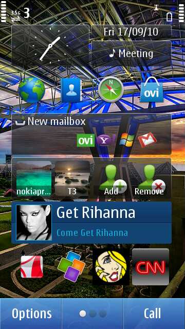


We get the reasoning behind this, as the Nokia N8 displays the widgets nicely in both landscape and portrait modes (and flips pretty quickly too between landscape and portrait). However, if you want to add a few specific applications to the front screen, you have to open a 'shortcuts' widget and then put up to four icons on there.
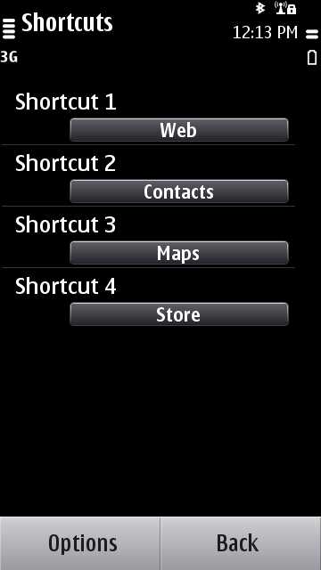
It takes a lot longer than the simple Android system of opening the menu, holding an icon down and then seeing it jump to the front screen, but is more intuitive than the endless lines of iPhone icons.
The widget offering is also pretty limited, although more will be available to download as time goes on from the Ovi Store.
Another problem - Nokia has still got a long way to go in terms of perfecting the home screen interface. When you want to move between home screens you have to make a sideways swiping gesture... then wait for the screen to catch up.
It's a simple thing and while it does move fairly quickly and accurately, if you've filled the screen with widgets you can find that you may press one accidentally, or the screen won't respond at all meaning multiple attempts at times.
The good thing about the new Nokia N8 is there are a range of separate areas where it's significantly upgraded over previous models - for instance, there's a 680MHz ARM 11 processor on board, and while that sounds low it belies its specs in performance.
Previous Symbian devices have paused, lagged or even crashed regularly in the past, and Nokia has ironed this out to create stability on Symbian^3 and its UI, which is a major plus - hopefully those lessons can be seen in MeeGo devices combined with a more powerful UI.
Multi-tasking is included on the Nokia N8 too, as part of the Nokia heritage the company has been so keen to remind people of - simply long-press the menu key and a central window pops up with large thumbnails of open programs.
There's a large X in the corner of each thumbnail to shut down the respective program, and then the rest all shift up to fill the screen.
However, if you're trying to shut down a number of programs at once, the Nokia N8 does take a short while to react so when a thumbnail shifts left it can land in a new position - meaning rather than shutting down a program, you'll accidentally hit the picture and open it if shutting down many apps at a time.
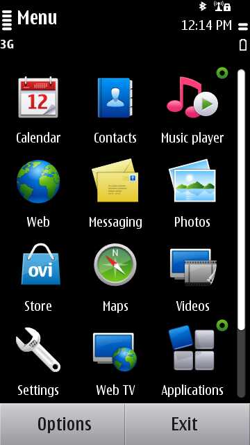
When opening up the main menu (using the single button on the front of the phone) the Nokia N8 responds quickly and then when scrolling through the icons, the phone reacts exactly to your touch – which makes it all the more curious why the same system wasn't integrated into the home screens.
Another cool feature is hitting the battery icon - it will display any found Wi-Fi networks, USB connections and others and a larger clock which you can use to enter the alarm clock - again, with a decent reaction under the finger.
But the decent reaction aside, there are still a few too many throwbacks to the old Symbian UI from years gone by for our liking: when moving between apps the screen will sometimes jumble the icons up for a split second, which doesn't really affect the operation but does look slightly buggy.
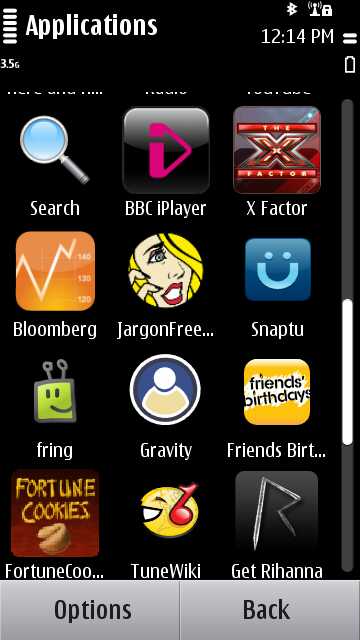
Things like having to drill down through multiple menus to get to simple options at times and the clunkiness of the home screen widgets make it feel very archaic when compared to the slickness of other mobile operating systems.
The widget manipulation is a great example: you have to press down for quite a while (almost twice as long as most other mobile operating systems) to begin editing the elements on the screen, and then you can only add or remove the widgets or move them up or down.

You can't move a widget from one home screen to another, meaning if you want to rearrange all three home screens at once you'll be spending a long time deleting and re-adding widgets all over the place.
What's more annoying is the opportunity here for Nokia - if the home screen experience was stunning rather than just functional and simplistic it might entice a lot of users in that rate user interface as one of the most important things about their phone, especially if they're fed up with the camera on the iPhone 3G and are now considering this as an upgrade.
It just pales in comparison to the Live Wallpapers and up to nine home screens of Android - and that's before we even get into the excellent overlays such as Sense UI.
True, you can skin Symbian as well - but we reckon the majority of prospective users aren't going to bother surfing for custom overlays.
Nokia's menu-based system might be familiar to some, but the time is now right to change things - the old fans need to move into the next generation of smartphone operation, rather than Nokia catering for them now almost exclusively.
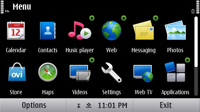
Things like when downloading a WebTV app from the Ovi Store and finding it's not in the Web TV folder when completed; and when editing a list (emails, for instance) to delete multiple items you need to press menu, mark, select the items, press menu, then delete and confirm (although you can go into settings, message display and change the last step).
Compare that to the iPhone's system: edit, select items, delete. Done.
Or re-ordering your icons: open the menu, click organise, then move the icon through the grid. If you need to go 'up' a level, then you have to throw the icon into the relevant slot. If you need to move it to another folder, you can't just drag it and drop it onto that folder, and you'll need to go through the tree structure to find it. It's not overly difficult, but just feels like it adds more steps where others don't.
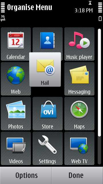
Spend some time customising the interface and you'll get to where you want - for instance, we eventually moved the applications folder to the front screen, removed a lot of the apps in there we didn't want or couldn't delete to another folder we created then placed, and suddenly newly downloaded apps from the Ovi Store were a lot more accessible.
But it's unlikely the average user will go down this road, and could end up with a lot of apps they don't use or understand (like the User Guide, which is in the menu of every screen, or the software updater) cluttering up their applications folder, much like it used to on older Nokia phones.
What makes it all the more disappointing is that Maemo 5 on the Nokia N900 is a really good OS - it was a little laggy on that phone but the widgets, extended home screens, simpler connection management and overall feel was new and improved, and the level Nokia should have been hitting with the high-end (and now more expensive) N8.
For lower-end phones, Symbian^3 might be OK - but the Nokia N8 feels like the phone the X6 or 5800 XpressMusic should have been, but with better hardware. Regular or long-term users of Symbian will be attracted to its simplicity, but there's a danger that luring non-Nokia customers expecting a flashier user interface might be put off by the more functional UI on the N8.
Current page: Nokia N8: Interface part one
Prev Page Nokia N8: Overview, design and feel Next Page Nokia N8: Calling and contacts
Gareth has been part of the consumer technology world in a career spanning three decades. He started life as a staff writer on the fledgling TechRadar, and has grew with the site (primarily as phones, tablets and wearables editor) until becoming Global Editor in Chief in 2018. Gareth has written over 4,000 articles for TechRadar, has contributed expert insight to a number of other publications, chaired panels on zeitgeist technologies, presented at the Gadget Show Live as well as representing the brand on TV and radio for multiple channels including Sky, BBC, ITV and Al-Jazeera. Passionate about fitness, he can bore anyone rigid about stress management, sleep tracking, heart rate variance as well as bemoaning something about the latest iPhone, Galaxy or OLED TV.
