TechRadar Verdict
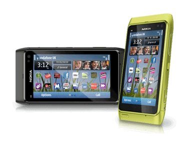
The best phone Nokia has ever produced with some class-leading functionality, but let down on the user experience and internet experience
Pros
- +
Great camera
- +
Superb battery life
- +
Clear and crisp screen
- +
Decent audio output
- +
Stylish aluminium casing
- +
HDMI-out port
Cons
- -
Average virtual keyboards
- -
Unintuitive UI
- -
Unimpressive internet experience
- -
Confusing connection management
- -
Poor social network integration
Why you can trust TechRadar
Nokia's reputation as a leader in the smartphone market has been under increasing pressure in recent years, as a string of 'high end' handsets have failed to capture the minds and wallets of the phone-buying public.
So to fix that, Nokia's gone back to the drawing board to bring out the Nokia N8, featuring a new OS and a huge amount of high end tech packed under the hood.
If you're in the market for a new smartphone, you can check out our quick video guide to what to look out for:
Having announced the phone back in April, Nokia has been holding off on release to make sure the user experience is as good as possible.
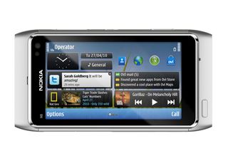
But it needs to be very good indeed seeing as most other brands announce a phone then release it within weeks – we've been waiting nearly half a year for this one.
The underlying software has been improved and Symbian^3 builds on the previous iterations of the OS seen on the likes of the Nokia 5800 XpressMusic and Nokia X6, but adds in multiple home screens, widgets and an improved UI.
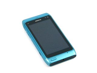
Hardware-wise, Nokia has pushed the boat out too with the new N8, offering a full metal chassis with anodised scratch-proof paint to give the phone a really high end feel.
It really is scratch-proof - rubbing keys on it produced no ill-effects, although the slider switch on the side can get its paint rubbed off over time.
However, with a 12MP camera with Xenon flash bolted on the back, it's not a super-slim device - it fits in the hand well enough but the dimensions 113.5 x 59 x 12.9 mm aren't going to rival the likes of the iPhone 4 and the Samsung Galaxy S, especially when being forced into more tightly fitting trousers.
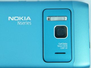
The Nokia N8 also doesn't have a removable battery either - the full metal chassis is completely enclosed so unless you've got a very particular screwdriver, you're not getting in to replace any innards.
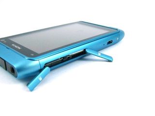
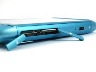
To that end, Nokia has put two hinged gates on the side of the N8, giving access to the microSD card slot and the SIM card port - both are quite hard to pull open (which isn't a bad thing as you're probably not going to be opening them very often) and clicking cards in can be tricky too without long fingernails.
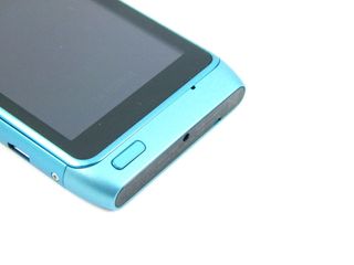
The rest of the Nokia N8 continues the higher-end feel: the 3.5-inch capacitive OLED screen really pops with colour (although doesn't quite match the impressive sharpness of Samsung's Super AMOLED) and the minimalistic design sees only one rather functional-looking button on the front, eschewing the extra soft keys Nokia has implemented for so many years.
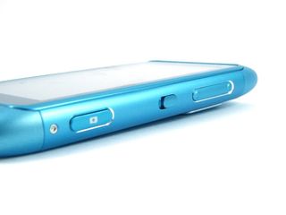
The right-hand side of the phone houses the camera key, which has staggered press levels to allow you to only push it down partway for autofocus. There's also a volume key with raised buttons, although these are fairly far away from each other, so can be hard to hit when you're not looking and trying to work out which one you're pressing.
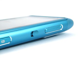
There's also the slider switch on this side of the Nokia N8 - if you're a fan of physical unlocking, then this is a good example of that, although we prefer the on-screen offering, where a short tap unlocks the phone and works far more easily and effectively in our opinion.
The left-hand side of the Nokia N8 is a little more sleek, with only the aforementioned gates for microSD and SIM, as well as the uncovered microUSB slot, which may perturb some who are used to their Nokia phones having a gate on top to prevent dust creeping in. But has anyone really ever had a dust-destroyed port in the past?
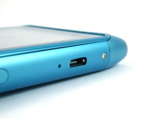
The top of the N8 is where it mostly happens though - there's a mini HD port, the 3.5mm headphone jack and the power switch, which is also used to quickly change profiles when buzzing through the N8's interface.
The bottom houses the charger port - and it's a standard 2mm 'new Nokia charger' port, which initially seems like an odd choice when you can also charge through the microUSB port too, like all other phones, even when connected to a PC.
We can only assume that Nokia has done this so that when you're streaming over USB on the go (more on that later) you can keep charging the phone too.
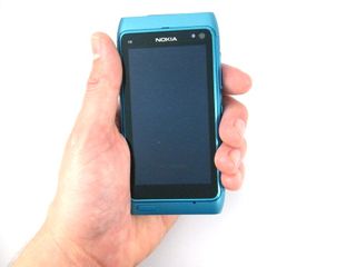
But as we said before, the Nokia N8 sits in the hand well enough and allows you to access all the functions pretty easily and you don't need to jiggle it around in your palm too much.
In the box
Nokia has thrown a large range of toys in the box with the N8 - an adaptor to convert HDMI to mini HDMI, decent earbuds with an inline remote, a slim line Nokia pin charger and a USB lead with adaptor too to attach hard drives on the go..
This is all packaged in an eco-friendly slim box, and certainly looks premium and worth the money you'll need to be forking out.
Current page: Nokia N8: Overview, design and feel
Next Page Nokia N8: Interface part one
Gareth has been part of the consumer technology world in a career spanning three decades. He started life as a staff writer on the fledgling TechRadar, and has grown with the site (primarily as phones, tablets and wearables editor) until becoming Global Editor in Chief in 2018. Gareth has written over 4,000 articles for TechRadar, has contributed expert insight to a number of other publications, chaired panels on zeitgeist technologies, presented at the Gadget Show Live as well as representing the brand on TV and radio for multiple channels including Sky, BBC, ITV and Al-Jazeera. Passionate about fitness, he can bore anyone rigid about stress management, sleep tracking, heart rate variance as well as bemoaning something about the latest iPhone, Galaxy or OLED TV.
