Why you can trust TechRadar
Nokia has rehashed its Symbian S60 OS for the fifth time on this handset (and also the Nokia 5800 XpressMusic) but has sadly decided against making any wholesale changes, which is a shame as it means the lag and general bugginess of navigation through the handset is still very much apparent.
That's not to say we're talking the same fail rate of the first N95 or the N96, but there's a definite sensation that the Nokia N97 still falls some way short of the noted slickness of the HTC Magic or the Apple iPhone.

This could be partly down to using a less-than-500MHz processor on board this mini-computer, where the lack of power is horribly apparent at times and makes you wish that the designers had picked up a Snapdragon processor in the building process.
With a 1GHz effort under the hood it's easy to imagine the Nokia N97 would be able to whizz through almost any task with aplomb.
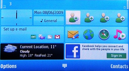
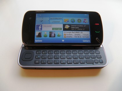
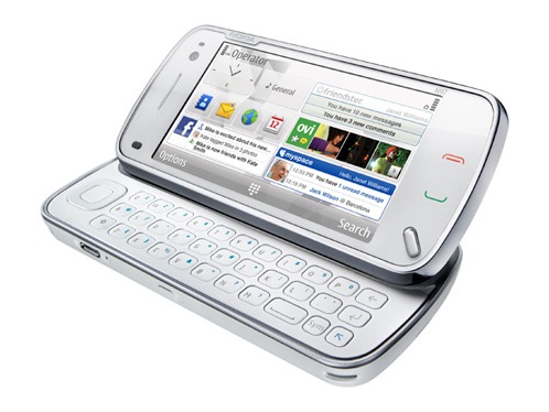
The new home screen, designed specifically for the Nokia N97, has elements of the 5800 XpressMusic about it (ie being able to select four favourite contacts) but has added in a great number of widgets to choose from, which automatically re-align themselves from landscape to portrait as necessary.

The default widgets (Email, Facebook, Accuweather, shortcuts, favourite contacts and clock function) are a decent selection, and can be added to with a whole range of items, from a news feed index to extra contacts to a miniaturised music player.
There are also those like an Amazon widget, which seems to only display random items as a hyperlink, and are a bit less useful. But overall, a nice selection that it's a shame you can't add to, and we'd like to think there's a chance that Nokia will extend the range on offer in future firmware updates and the like.
However, the default widgets, which are also the first thing that people will see when turning the phone on for the first time, are a little unpredictable and prone to error.
For instance, the Accuweather function flitted between showing excellent weather updates for our current location and not being able to load at all, with a strange mangled graphic thrown in every so often for good measure.
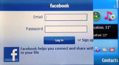
Similarly, the Facebook application, which showed messages and friend requests as well as status updates, frequently decided to log us out of our account, no matter how many times we requested to go back in and look at our full profile in the mobile version of the social network, as well as opting to show a portion of the home screen when in landscape mode, which looks frankly amateur for a phone of this potential.

The menu screen has evolved nicely over the time Nokia have been mass producing mobile phones and is still laid out nicely in the grid system many other manufacturers have mimicked over the years.
A little spinning disc next to an icon means that it's running in the background, and the interface has been cleaned up for the S60 5th edition with fewer icons on the main menu page, although we're a little perplexed as to why the calendar is one of them.
We can only assume that Nokia's research showed it that the main demographic for this phone would be using it to make a lot of dates and meetings, otherwise it would have been better served by putting a video player or similar there instead.
The applications section in the bottom left of the screen is where all downloaded programs from the newly created Ovi Store now live, which means that it can quickly become cluttered with different applications.
The Apple iPhone obviously brings a similar navigation system to the party, but we had hoped that Nokia would have found a more efficient way of searching through the plethora of applications we would be looking for.

The touchscreen on the Nokia N97, despite being resistive, is faster and more responsive than that found on the 5800 XpressMusic, with clear presses enabled from the off thanks to larger and wider buttons.
Each menu comes complete with its own virtual scroll bar at the side, and despite being slim it's surprisingly easy to 'grab'and slide up and down, so menu navigation is blindingly simple on the Nokia N97.
Current page: Nokia N97 Interface
Prev Page Nokia N97 overview Next Page Nokia N97: calling and contacts
Gareth has been part of the consumer technology world in a career spanning three decades. He started life as a staff writer on the fledgling TechRadar, and has grew with the site (primarily as phones, tablets and wearables editor) until becoming Global Editor in Chief in 2018. Gareth has written over 4,000 articles for TechRadar, has contributed expert insight to a number of other publications, chaired panels on zeitgeist technologies, presented at the Gadget Show Live as well as representing the brand on TV and radio for multiple channels including Sky, BBC, ITV and Al-Jazeera. Passionate about fitness, he can bore anyone rigid about stress management, sleep tracking, heart rate variance as well as bemoaning something about the latest iPhone, Galaxy or OLED TV.
