Why you can trust TechRadar
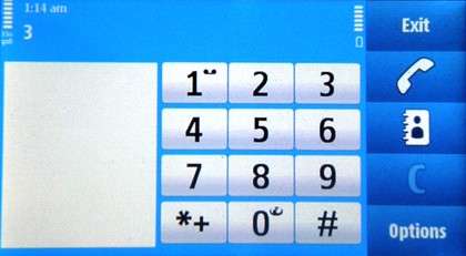
Anyone that's played with a Nokia phone before knows how to call and use contacts, as it's among the most rudimentary methods of finding your friends on the phone that there is.
First of all, the 'favourite contacts' tab on the home screen gives instant access to your buddies with a picture attached. In the default theme this uses a black font to write the name of each person across the photograph, which means most of the time you can't read the label.
However, with them being a favourite you probably don't need it, but still it's rather irritating. Changing themes sorts the problem out, but it's another 'out of the box' faux pas for the Nokia N97.

The same favourites are listed at the top of the contacts screen, where users can either type in the name of the person they're searching for, or scroll down using the slide bar at the side.
Both methods allow you to find the person you're after pretty easily, although if you have over 200 contacts in the phone book you'll struggle to use the slide bar to land accurately on the right person.
Each person is neatly laid out with simple icons to call, message or video call the person, as well as a group effort should they belong to another set of users on the phone.
Call quality is a little less impressive however, with nearly all the calls we made on the test handset not connecting the first time despite having more than enough signal. This seemed like a teething problem at first but then developed into a full-time raging issue, as trying to make a call took at least two or three minutes more than it was meant to.
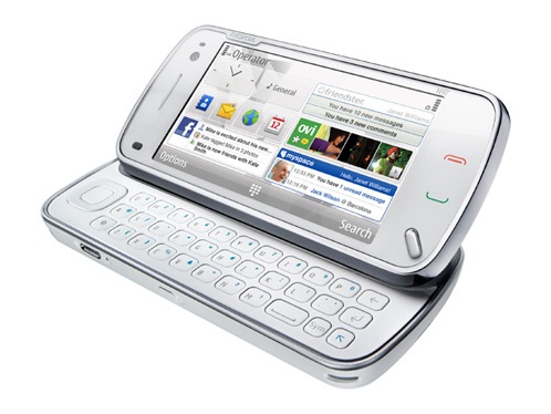
Also, if you answer the phone when slid open, it automatically defaults to speaker mode. While this is a useful feature, most of the time you'll want to talk normally on the phone, so you have to slide it shut before you can answer the call.
The aforementioned lag on the new S60 system means that you have to wait around two seconds before you can answer the phone after shutting the handset, which again is irritating.
The call and terminate buttons are touch sensitive, which adds an elegant sleekness to the phone but can be murder to hit accurately half the time, even with haptics turned up to full blast.
The menu button is thankfully raised, but you always have to look to see where your fingers are when using the green and red buttons, again adding time to the calling process.
Current page: Nokia N97: calling and contacts
Prev Page Nokia N97 Interface Next Page Nokia N97 Messaging
Gareth has been part of the consumer technology world in a career spanning three decades. He started life as a staff writer on the fledgling TechRadar, and has grew with the site (primarily as phones, tablets and wearables editor) until becoming Global Editor in Chief in 2018. Gareth has written over 4,000 articles for TechRadar, has contributed expert insight to a number of other publications, chaired panels on zeitgeist technologies, presented at the Gadget Show Live as well as representing the brand on TV and radio for multiple channels including Sky, BBC, ITV and Al-Jazeera. Passionate about fitness, he can bore anyone rigid about stress management, sleep tracking, heart rate variance as well as bemoaning something about the latest iPhone, Galaxy or OLED TV.
