Why you can trust TechRadar
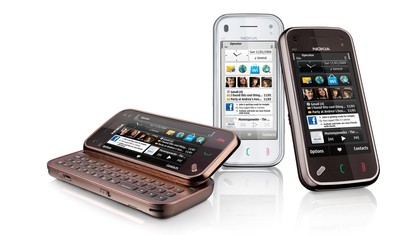
The typical touchscreen slab look of the Nokia N97 Mini is similar to the original N97, with a minimalist front panel sporting a trio of keys below the screen.
But the bodywork is smaller than the bulky N97 - the N97 Mini measures 113(h) x 52.5(w) x 14.2(d) mm and weighs 138g, compared to the original's 117.2(h) x 55.3(w) x 15.9-18.25(d)mm, 150g pocket-bulging package.
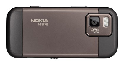

That doesn't make the Mini a miniature phone by any stretch - it's still big, but it does cut a more pocket-friendly figure. While it's thick for a touchscreen phone nowadays, this is explained away by the slide-out tray containing the QWERTY keyboard. Its build quality is reassuringly substantial, with some metal adding to the casing's solid feel.
The display is scaled down from the N97's 3.5-incher to a 3.2-inch screen on the Mini. It's a 640 x 360 pixels, 16.7 million colour screen that's lovely and bright, with a decent amount of clarity. It doesn't have the pixel count of the very best touchscreens on the market, but it looks good enough on this showing for multimedia playback and browsing.
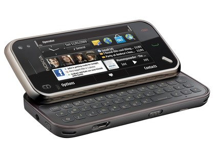
Like its predecessor, a resistive touchscreen is used on the N97 Mini - which means you don't get the smoothly flowing multi-touch capability of the capacitive screens used on the iPhone and some Android OS-equipped models.
The screen is, though, more responsive to touch than Nokia's earlier 5800 XpressMusic effort. It may not have quite the gentle-finger-stroke nimbleness of the iPhone but it reacts quickly to prods, taps, drags and swipes, and appears reasonably fluid for a resistive display.
Scrollbars on the side of menus helps scrolling through longer lists, and the operating system generally allows sufficient room to negotiate with finger tapping alone. Indeed, on this model there's no stylus supplied (unlike the 5800 XpressMusic). It's not the iPhone, but it's decently usable.
Under the display, there's just the touch-sensitive Call and End buttons plus a raised angled Menu key, which pulls up the main menu or (with a long press) shows open applications.
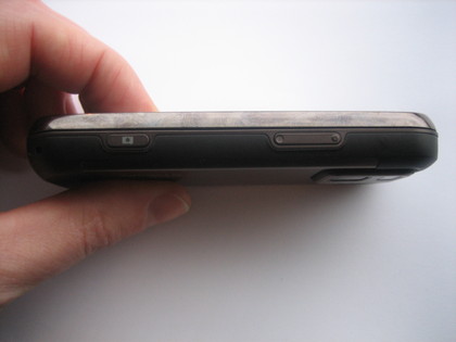
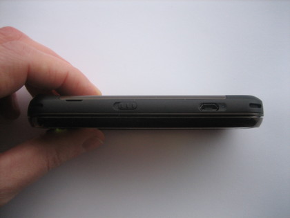
Around the body of the phone, there's a lock/unlock sprung slider, volume rocker keys and a dedicated camera button. A microUSB port on the side takes care of data connections and charging, while thankfully Nokia has again included a 3.5mm headphone socket on the top of the phone.
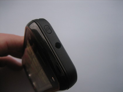
A secondary camera for video calls sits on the front above the display, next to a light sensor (which is used to automatically adjusts screen brightness).
The main camera action, though, is on the back. Unlike the original N97, the Mini's camera has no sliding lens cover to protect it. The lens and LED flash array still sits proud above the back surface though.
The screen still automatically tilts at an angle when the QWERTY keyboard slides out, with a reassuringly rock solid spring-loaded mechanism locking it in place.
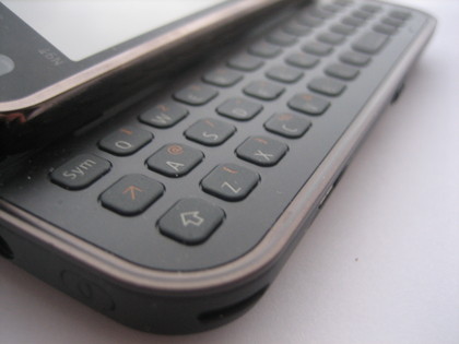
The QWERTY keyboard has been given a makeover from the N97; gone is the five-way navigation pad, leaving a bit more finger-room for the 38 keys (which include direction keys). It has a much more usable feel, the rubber-like keys slightly less flush to the surface so you can feel more action as you type.
The space bar is still shifted over to the right rather than central, and while that may not satisfy the touch-typist, it's very easy to get used to. And, in practice, it's rather useful when you're thumb typing when holding the device.
The keyboard buttons have a responsive action, unlike some stodgey phone keyboards; it's comfortable to type accurately at a reasonable pace, even with our large digits.
The angle of the screen with the keyboard out makes it ideal for typing when sat on a desk. The phone is reasonably well balanced for desk typing - though there is a touch of wobble in the left-hand corner owing to the raised camera lens on the back of the bodywork - something that might have been easily remedied with a slight tweak in the casing design.
Current page: Nokia N97 Mini: Design and handling
Prev Page Nokia N97 Mini: Overview Next Page Nokia N97 Mini: User interface