Why you can trust TechRadar
The Nokia N97 Mini adopts a similar S60 5th edition user interface to the original N97 - although it appears more stable on this model than we found when we first unboxed our review sample of the N97.
The S60 5th edition platform is an evolution of the earlier S60 software used in the likes of Nokia's Nseries handsets, but adapted for the touchscreen environment.
As such, it's not been developed 'from-the-ground-up' as an all-new touchscreen interface (like Apple's iPhone OS and Android). Instead, many elements have a look and feel that will be familiar to Nokia users. Many of its control conventions and menu structures are familiar too, and consistent with earlier Nokia smartphones.
Menu system
In many ways it feels more like an S60 device re-tooled for touch than a fresh new system. While that'll be attractive to those who like Nseries handsets, some of the control elements have a more dated feel than the more fluid, newer operating systems.
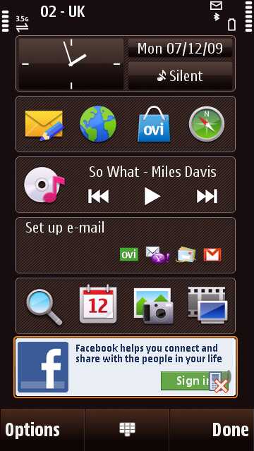
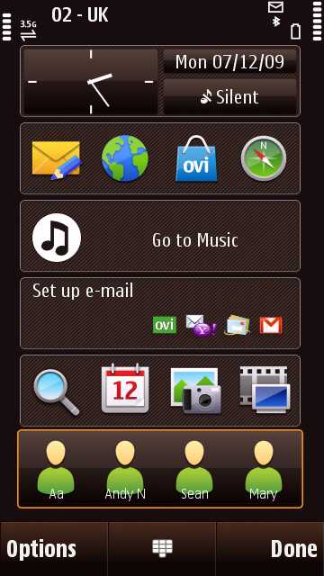
The home screen set up is similar to the N97's; it comprises a set of six stacked widget panels. The out-of-the-box default selection (email, music player, time/date/profile, Facebook plus two rows of four shortcuts) can be changed for other function widgets - there are around 18 to choose from.
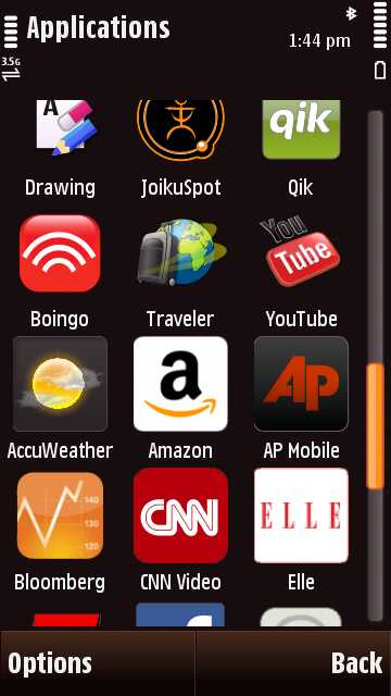
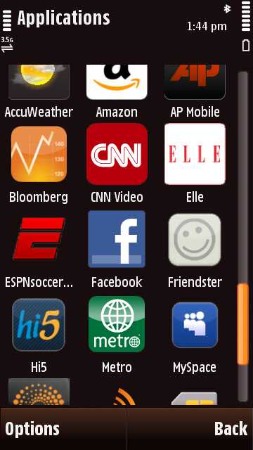
These include various online services and applications available on the phone (from MySpace and AccuWeather to CNN Video and Amazon) plus phone apps such as calendar, favourite contacts and the WLAN Wizard.
These widgets can be rearranged on the screen, and automatically adjust to the layout when the screen is switched to landscape mode - which happens when the QWERTY keypad is slipped out (or if you set the accelerometer motion sensor to automatic switching in the settings menus).

Within the widgets, you can tap to activate individual elements - such as either time or date or profiles in the clock widget, or launching any of the shortcuts separately from the shortcuts widgets. They're simple to operate and serve up an easy way to work features and functions straight from the desktop.
As with other S60 5th Edition handsets, among the home screen options you can set up favourite contacts panels, offering four icons or photos assigned to contacts, for one-touch selection. These pull up options for voice and video calling or texting.
If the home screen is looking cluttered, a sideways swipe can bring up a blank home screen view without the widgets. Naturally, you can customise backgrounds as you like. A quick press on the top corner of the display accesses info like battery and connectivity status (for Wi-Fi, Bluetooth, and so on), which is handy.
Softkey options on the bottom of the home screen include dialpad and contacts, so you can swiftly get communicating. Hitting the Menu button under the display brings up a familiar-looking S60 menu.
Main menu
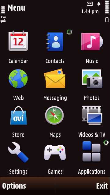
The main menu is arranged into a straightforward 3 x 4 grid of icons representing functions or sub-menu options. Nokia keeps things relatively simple to follow; most icons bring up further lists of options.

One trait of S60 5th Edition is that some options require double tapping to select while others only require a single tap - not a deal breaker in itself, but it does feel curiously inconsistent and may be an irritant to some. That familiar navigation structure of the S60 menus also means some useful settings options can be quite a few clicks away.
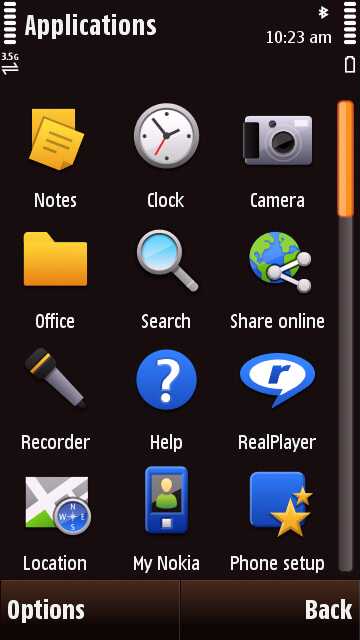
The Applications folder contains most options, with plenty of pre-loaded software tucked away here - there are over 40 apps to start with - and it's where downloaded apps are stored by default. It's scrollable with a finger swipe, and you can rearrange the order by dragging and dropping icons around the display, should you wish to organise it more to your liking.
Current page: Nokia N97 Mini: User interface
Prev Page Nokia N97 Mini: Design and handling Next Page Nokia N97 Mini: Calls and messaging