Why you can trust TechRadar
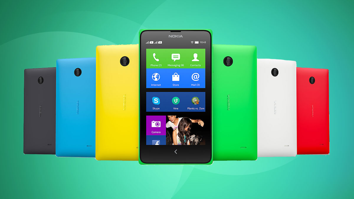
If you buy a bright green Nokia X the colour is all you can see at first. It is incredibly bright. As soon as you start to handle the phone though, the other thing to note is how solid it feels and how well it is built.
Nokia has long been the master of plastic and it continues to use the material in a way that most other manufacturers can only dream of. The plastics on the X are reasonably hard but not at all scratchy, having an almost soft feel. The edges and angles are sharp but in a positive way, they never dig in.
All of the port cutouts including the speaker on the back of the Nokia X have soft edges, which adds to the quality feel.
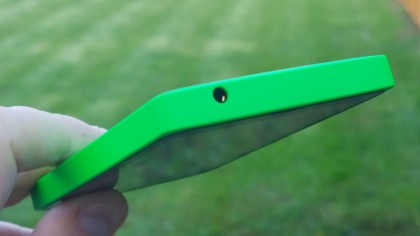
It is a somewhat square device but sits very comfortably in the hand and all the controls are within easy reach. The size of the phone is well judged and it is easy to hit all four corners of the screen without stretching.
It is not the most svelte device on the market but then you should not expect it to be at its price. The thickness is not a hindrance though and the Nokia X never feels bulky.
There are gentle curves leading to the edges of the back of the Nokia X that seem to serve two purposes. Firstly they make the phone feel less bulky than it really is, and secondly these curves help the shape be more natural to hold.
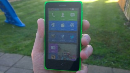
Nokia has a history of designing phones extremely well and it has got the ergonomics absolutely spot on with the X.
If you have used Android devices before, one big change that is immediately noticeable in the design of the X is that there is only one button on the front.
Most Android devices either have three buttons – task switch, home and back – or use on-screen buttons.
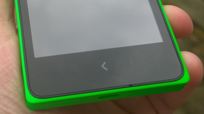
The Nokia X has a completely reworked interface though and just like the Nokia Asha range, there is just one button and it is clearly a back button.
If you choose the Nokia X in one of its brighter colours, or even in white, it is a handsome enough looking phone that will be hard to lose.
Choose it in black though and it becomes somewhat anonymous and boring. I would recommend being bold and picking a nice, fun bright colour.
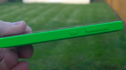
The back of the phone is especially striking as the subtle Nokia logo, camera and speaker cutout just let the colour zing.
Talking of the camera it may have very basic specifications, but at least there is no unsightly camera hump, allowing the back to be completely even and smooth.
You will also notice there is no flash. Beyond the issue of taking photos in dark environments, it does allow for a cleaner finish to the design.
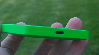
The coloured part of the phone is just a shell in which the actual electronics sit, so I would expect you could swap the coloured shells if you would like. I quite fancy green for the day and perhaps a nice clean white for smarter occasions.
The main disappointment here is the screen, which is fairly low resolution and a very basic display. It is usable but it really needs to be able to go much brighter, especially for outdoor use. Touch responsiveness is fine, but it only supports two simultaneous touch points, which can be an issue for rapid typing.
Ultimately though this is a well designed phone that looks and feels great.
