Why you can trust TechRadar
The Symbian S40 operating system is really long in the tooth. Even before touchscreens were all the rage, S40 was the lowly relation to S60, offering less flexibility and less third-party app support. S40 has had a touch sensitive makeover, and we've seen its touchy-feely guise before, for example in the Nokia C3's Touch and Type iteration.
The trouble is that touch alone does not make a good operating system, and S40 suffers from three main problems.
First off, it's stuck in the past as far as the user interface is concerned. Nokia has done its best to deliver a customisable Home screen and plentiful shortcuts, and this is fairly intuitive to use, but nowhere near as flexible as you'll find in an Android-based handset.
Tap and hold on any item on the Home screen and you get a 'personalise view' menu, which you can use to set up the Home screen. Tap any of the top three rows and you can add in a shortcut to something specific.
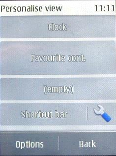
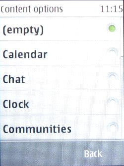
Tap the tool icon in the fourth row and you can configure four mini shortcuts to apps.
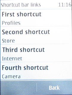
To help you get over the limitations of having a single Home screen, there is a second shortcuts screen. On the bottom of the main screen are Menu, Names and Go To options. Tap that last one and you get a 3 x 3 grid of additional shortcuts.
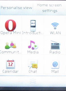
You can personalise this by tapping the 'Personalise view' option at the head of the screen then tapping any link that you want to swap for a new one.
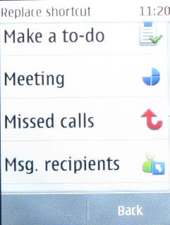
Again, it's a bit of a fiddle, but at least it gives you some additional personalisation options.
In addition, you can tap and hold an item on the main screen to get to a menu of related options. So, for example, if you have your favourite contacts showing, you can tap and hold to edit who is in the list.
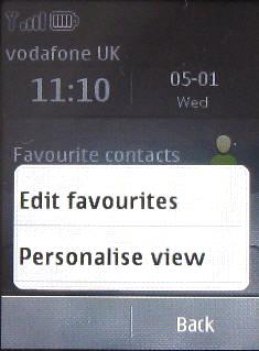
All this is fairly flexible, but you're stuck with the one Home screen with its ancillary nine shortcuts, and as we noted earlier, getting what you want onto the Home screen in particular is nowhere near as fast as the simple tap-and-hold convention of Android.
The second main problem is that the touchscreen is resistive and not capacitive. Now, we don't doubt Nokia has chosen resistive technology to help keep the handset cost down, and we do like the haptic feedback you get when you press the screen and the way menus roll on if you sweep at them fast enough.
But you need to press into the screen to get a response, and if you've ever used a capacitive screen which responds to the merest touch, you'll feel the Nokia X3 Touch and Type is sluggish.
There is another user-interface problem, and that is the small screen. Measuring just 2.4 inches and with a mere 240 x 320 pixels on offer, there simply isn't the real estate available to show a lot of detail.
The main apps menu, for example, manages to offer just nine shortcuts and this is where we hit the third problem.
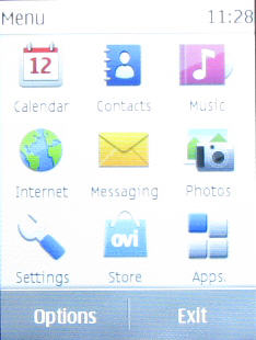
We are used to seeing all apps ranged in a single list, as on Android handsets or the iPhone, for example. Here you get nine shortcuts and within these can be buried further shortcuts. Hit Apps, and you get a long scrollable list of apps.
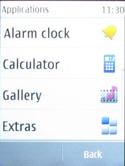
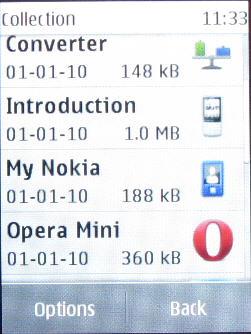
One of the options here is Extras, and you have to tap that to see anything on your microSD card, games and a range of additional apps that have been downloaded, hidden in the Collection folder. These include things like Opera Mini, and a unit converter. It's quite a mess, really.
Current page: Nokia X3 Touch and Type review: Interface
Prev Page Nokia X3 Touch and Type review: Overview Next Page Nokia X3 Touch and Type review: Calls