Why you can trust TechRadar
When Symbian went all touchy feely with version ^3 we were less than impressed. Nokia knew it had to do something with its operating system, because ^3 was generally not received very well, and, before it announced its deal with Microsoft to put Windows Phone 7 into handsets, it worked on Anna, a revamp of ^3.
We've already seen Anna in the only other handset to sport it so far, the Nokia E6. Most notable of the changes is a new icon set – which we like – but among the other changes is the fact that menus are often slicker to work with.
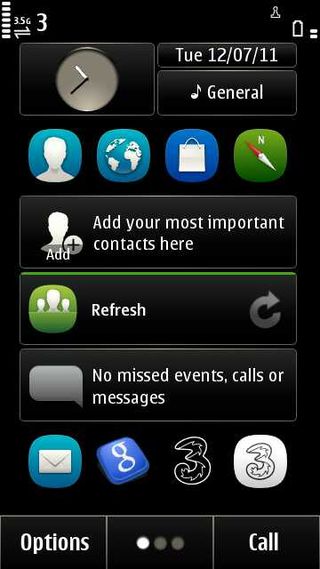
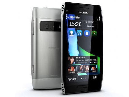
The Nokia X7 starts out with three home screens (the E6 had four). You can't add more as you could with the E6, and that's a pity. Still, you can fill the home screens with widgets and shortcuts, and there's plenty of room on them for many people.
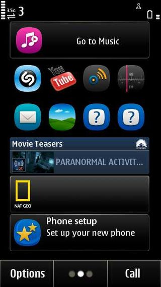
Finger sweeping between the home screens is a really comfortable experience. The responsiveness to touch is great, and while there is a slight judder as each new screen resolves itself, the wait is almost too small to notice.
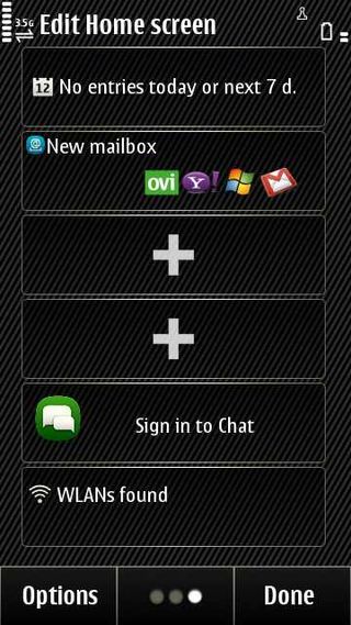
Getting shortcuts onto home screens is slightly convoluted – tap and hold a home screen to get + signs where you can add new stuff.
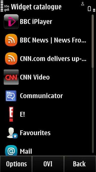
If you wish to add something, just tap a plus sign and a whole raft of options pops up.
Tap what you want to add and it appears on the home screen.
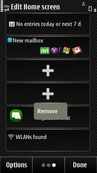
Or to remove something, tap and hold it in the same way and interact with the pop up menu to clean things up nicely.
Widgets are a fixed size and there's room for six on a home screen. Any of these widgets can be designated for shortcuts and can then contain four small icons, each of which you can populate separately.
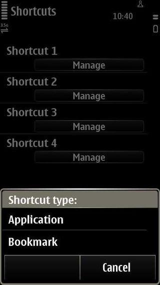
This is a multi-step process. First configure a widget for Shortcuts, as above, then tap and hold a shortcut and choose 'Settings'.
Now you can decide what to put in each of the four shortcuts – which can be an application or a web bookmark.
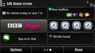
The Nokia X7 screen auto-rotates, and widgets fit into a grid pattern in both wide and tall screen modes.
You can put a WLAN scanner widget onto a home screen, but it isn't necessary, because a tap at the top-right of the screen will call up a little shortcuts bar telling you whether WLANs are found. It also offers a shortcut to set an alarm (tap the time), check on percentage battery charge (tap the battery) and the full connection manager (tap the connection icon).
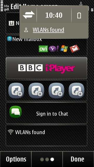
At the bottom of each home screen on the Nokia X7 is a row of three touch buttons.
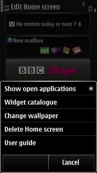
Options enables you to do things such as fiddle with wallpaper, turn widgets offline or online and switch between open apps. Call opens up the dialler. The middle button flicks you between home screens. It's redundant really, given that you can finger swipe to do that.
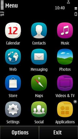
If you want to see the full apps list, hit the lozenge beneath the screen. Then you are into a full screen of shortcuts with an Apps button at the bottom left that takes you into a vertically scrolling second screen showing more apps, including anything you've installed.
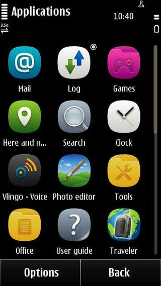
A little circle to the top-right of any icon indicates that an app is running.
It is a slightly convoluted system. We'd prefer a single apps screen that scrolls, with the added opportunity to categorise apps yourself if you want to.
In the end, though, you are likely to stick lots of shortcuts on the home screens and rarely venture into this part of the Nokia X7 - and plaudits should go to one of the few operating systems that offers up widgets rather than just long scrolling lists of applications.
Current page: Nokia X7: Interface
Prev Page Nokia X7: Overview, design and feel Next Page Nokia X7: Contacts and calling