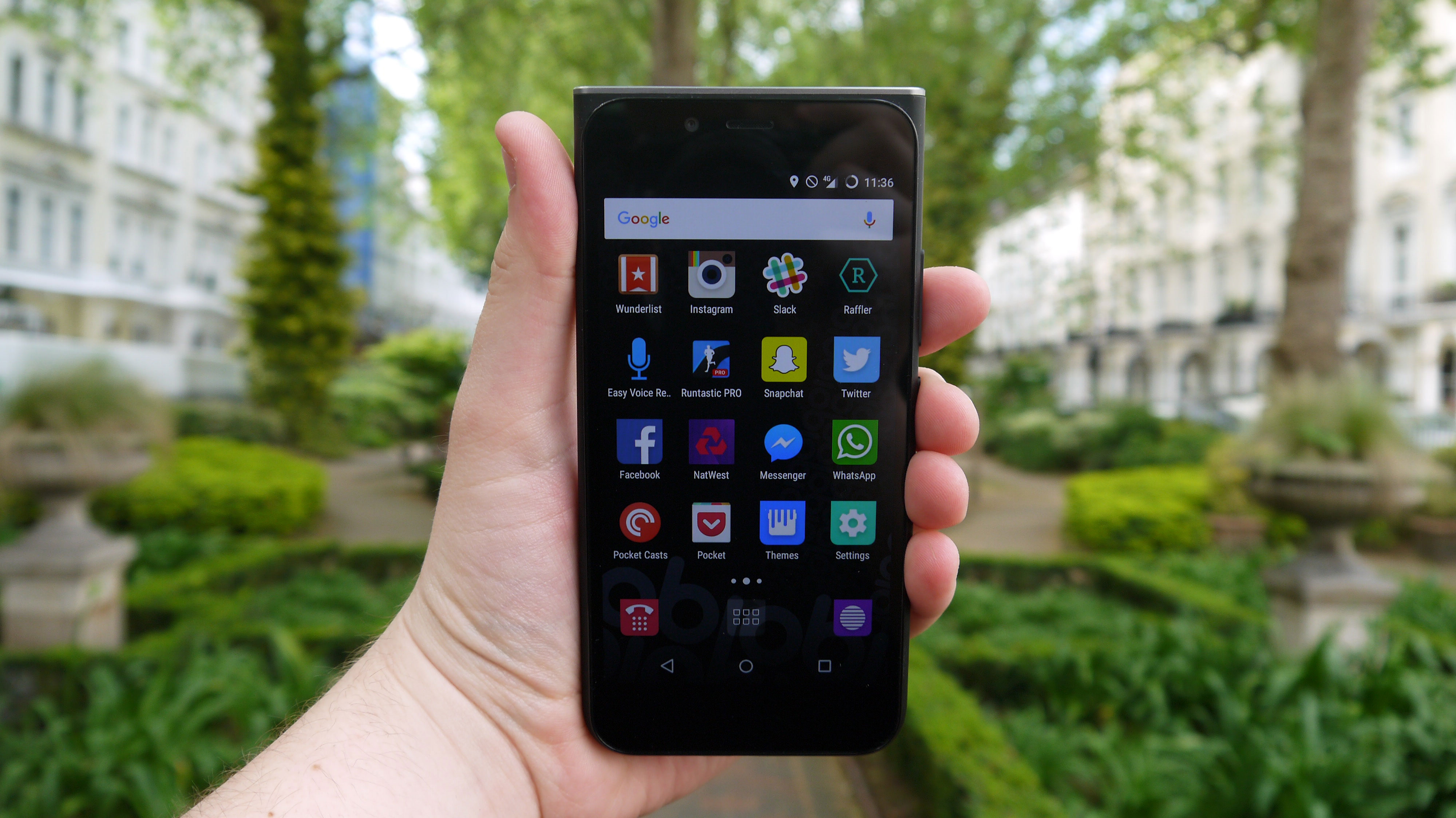
TechRadar Verdict
The MV1 doesn't achieve all Obi claims to have done. It wants to have changed phone design forever, but instead it just looks different for the sake of looking different. It may be cheap, but it's not exciting.
Pros
- +
Satisfactory display
- +
Low price
- +
4G connectivity
Cons
- -
Ugly design
- -
Terrible battery life
- -
Poor processing power
Why you can trust TechRadar
Obi Worldphone is a Silicon Valley tech company set up by ex-Apple CEO John Sculley – the man who notoriously fired Steve Jobs, before being let go himself.
Initially intended for developing markets, the Obi MV1 is now in the UK and will cost you £99. There's no news of a US or Australian release date yet. Obi Worldphone will sell the phone for £79 for a while but it's then set to jump back up to the normal £99 price point.
That's a cheap phone, but the budget end of the market is packed with rival handsets from both established brands – for example the Motorola Moto E – and from newer companies, such as the Wileyfox Swift. So can the MV1 hold its own against such tough competition?
Design
The Obi MV1 looks different to every other smartphone you can buy right now, but it's for all the wrong reasons – although parts of the design feel slightly iPhone-ish, this is nothing like the things of beauty Sculley's former employer creates.
There's no denying the design of the MV1 is unique – it takes a lot of elements from other phones and combines them into one strange hybrid.
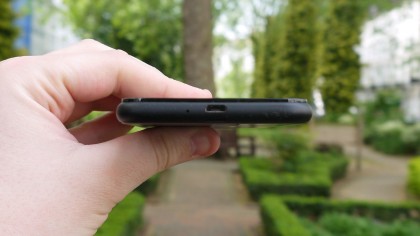
The main body of the phone is reminiscent of a budget Microsoft Lumia, and it looks like the display has been plonked on top, and it's raised above the body.
The marketing material from Obi reads: "It's a shape that is so unique for a smartphone that you'll always know which way your MV1 is placed in your pocket or bag."
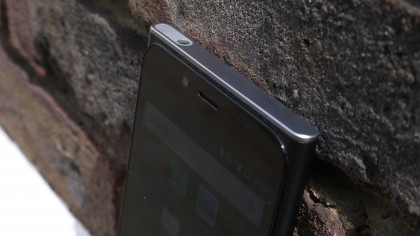
Personally, I don't go through my day fretting about which way up my phone is in my bag – and if I really need to know I'll reach in for the volume rocker and know instantly.
And while this design feature may be to some people's taste, no one I've shown it to has particularly enjoyed the look of it.
The back of the phone isn't much nicer – it's a fingerprint magnet – but the rear panel can be removed easily to get inside the handset, which is something you don't always get on a smartphone these days. It's easy enough to pull this off without feeling like it's going to snap as you do so.
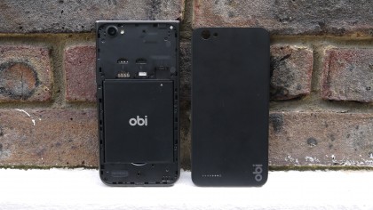
This gives you access to the dual SIM slots, a microSD slot and the removable battery. The panel itself doesn't feel premium though, and it picks up greasy fingerprints very quickly.
The bottom edges of the phone feel nice in the hand as they're rounded off; however this highlights the fact that the top edges are squared and quite sharp, and don't feel – or look – good at all.
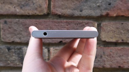
You get the impression that Obi has tried a bit too hard to create a phone that looks 'different' – although if by 'different' you mean 'not particularly good-looking' then it's succeeded.
It could be argued that it's not easy to make an attractive-looking phone in this price bracket, but the Wileyfox Storm proves that just because a phone is cheap it doesn't have to be ugly.
James is the Editor-in-Chief at Android Police. Previously, he was Senior Phones Editor for TechRadar, and he has covered smartphones and the mobile space for the best part of a decade bringing you news on all the big announcements from top manufacturers making mobile phones and other portable gadgets. James is often testing out and reviewing the latest and greatest mobile phones, smartwatches, tablets, virtual reality headsets, fitness trackers and more. He once fell over.
