Why you can trust TechRadar
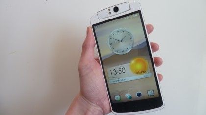
As for the physical size of the Oppo N1, it's huge and fairly heavy. I'm coming from using the modest Moto G and Sony Xperia Z1 Compact as my main mobiles, so opening the box and taking out the massive N1 was a shock.
It almost seems like a joke at first, but, as usually happens when switching up a few inches, after a day or two you find yourself getting used to the extra screen size.
The rotating camera mount means the headphone socket is placed on the bottom of the N1, where it battles for space alongside the USB connector and speaker.
The left-hand edge only houses the microSIM slot - accessed by poking a pin in to pop out the tray - while the right-hand edge has the power button a little above the middle for easy thumb access.
It's surprising to see there's no SD card support on the N1, as it's usually a banker on phones from lesser known makers.
Despite its size and weight, and the fact that I felt embarrassed flopping out such a whopper in public for the first few days, it fits in the hand(s) pretty well.
It's never going to be usable in one hand alone as you'd need to have King Kong's hand grafted on to hold it and reach the notifications tab with your thumb, but it's not impossible to imagine carrying it around all day.
The free case helps you to hold it. It's textured and grippy, plus it flips open like a book - so you can hold it like a book. Because it's as big as a book. A thin book, mind, so it's not that noticeable in your trouser pocket.
One problem I had with the case was that it hides the power and volume buttons a little, with the edge of the case recessing them further back. I never managed to train my fingers and thumb to find the power button automatically, as the edges of the case mask the buttons.
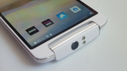
It would be nice if the power and volume toggles poked out a bit more, especially as the volume-down button also doubles as a camera shutter button when taking photos. But the fact that it's often a little hard to find meant I stuck with the on-screen software shutter during my time with the N1.
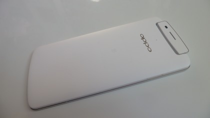
As for build quality, it feels solid. Easily as impressive to hold as the Samsung Galaxy Note 3, with the matte white plastic and occasional bit of chrome-style finish giving it quite a Samsung-like appearance.
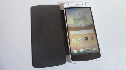
It's also really thin when out of its case, with Oppo measuring it at just 9mm thick. This helps it fit some pockets, although it's still so enormous there's a worry it'll pop out and end up on the floor if you're forced to crouch for any reason. So best use that free case.
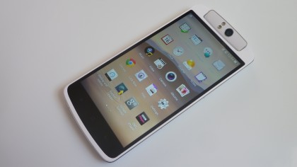
The display is another area where Oppo matches that offered by today's more familiar brands. The N1 outputs at 1920 x 1280 resolution, and the separate capacitive buttons mean you get all of that screen devoted to action.
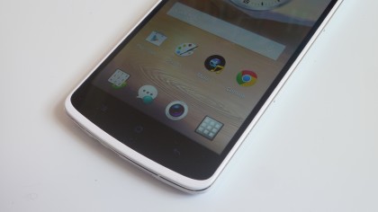
It's a lovely display, bright and colourful, with plenty of contrast when viewing photos and video clips. It's so bright I never had to have it anywhere near maximum brightness, even when outdoors, which can only help squeeze more life out of the phone's hard-pressed battery.
Viewing angles are great, too. Colours and contrast are consistent even when your arms start dropping under the weight of it and the phone starts to move about in your hand, making it ideal for watching downloaded media.
