Why you can trust TechRadar
The Oppo N1 runs on the quad-core 1.7GHz Qualcomm Snapdragon 600 chipset, which is technically one performance tier behind the Snapdragon 800 that sits inside some of today's top-drawer Android models like the HTC One and LG G2.
It's backed by the standard 2GB of RAM other hardware makers put in their flagship models, so multitasking works well, with apps staying alive in the memory.
Meanwhile, switching back and forth between several apps is nice and quick, as is web use in the pre-loaded Chrome browser.

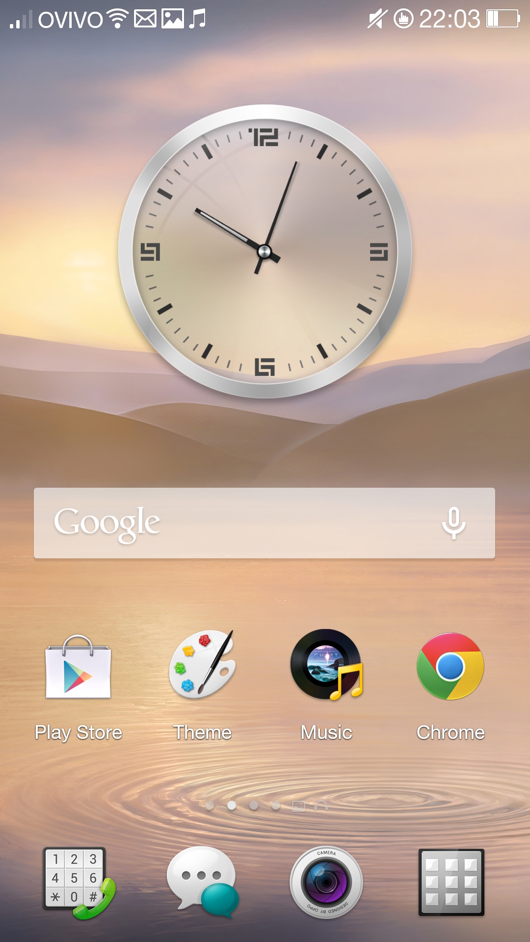
Android 4.2 Jelly Bean is the core behind the Oppo N1, with the maker customising this through a skin it calls the Color OS.
It's a fairly standard example of a manufacturer Android skin, offering a different clock and optional weather widget, a floating dock along the bottom for up to five permanently accessible apps, plus the usual drop-down notifications tab that's also accessible from the lock screen if you tap the relevant toggle in the Settings menus.
I was horrified upon first booting the N1, as the notification pull-down area is absolutely rammed with row upon row of grim grey toggles and options, but that's really the only place where the ColorOS intrudes on the usual simplicity of Android.
In fact, once your eyes have calmed down and noticed there's a useful brightness slider right there in the Notification area, you quickly forgive it for appearing so packed, as quick, one-touch access to the brightness setting is nice to have.
You can have up to nine home screens, each filled with whatever collection of app shortcuts, folders and live widgets suits you best.

A long-press on an empty bit of the display (or the Menu button) brings up the customisation menu, from where you can install app shortcuts and widgets, select from a massive number of themes, edit transition effects and change your wallpaper.
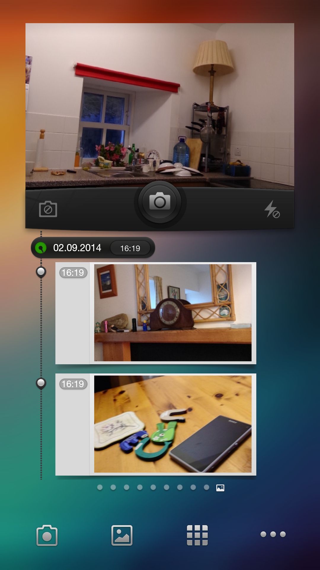
What Oppo has included that's exclusive to the N1 is a pair of custom home screens dedicated to music and imaging. These are what Oppo calls its Exclusive Spaces, which offer easy access to photo messaging and music playback.
They're basically enormous widgets, though, with the music player filling a whole screen with a record player graphic, which will thoroughly baffle any teenagers.
This doesn't exactly offer any thrilling features, simply functioning as a simple music player, much like Android's smaller, simpler, widget option. Only taking up a whole screen. One of Oppo's more baffling creations, that.
The Photo Space page is equally odd. The live camera viewfinder widget at the top of it is impressive, but it takes low-res images designed to have text attached to them for sharing via text message and social media.

It's something I wouldn't ever use, as there's not a lot of point in deliberately taking low-res images in exchange for the ability to share them with a caption embedded upon them.
As for how the OS and Snapdragon 600 combine here, benchmarking powertool Geekbench 3 rates the Oppo N1 with a multi-core score of 2,008.
That's a little lower than that scored by the Nexus 5, which runs on the next-rung-up Snapdragon 800 chipset, but you'd struggle to notice any difference in terms of real-world use.
The Oppo N1 is generally smooth in use, with a camera app that's possibly the fastest I've seen on an Android phone.
It may not have the very best processor available, but picking up on that would be like complaining your new car can only do 130mph instead of 145. As long as the windscreen wipers and heater works, it'll still do what you need.
Oppo's also made a few tweaks to Android's way of navigating its menus. The Settings zone is now tabbed, which might confuse you for a few minutes. The ColorOS breaks down the N1's options into three areas - General, Sound and Display - which are accessed through three tabs along the top of the screen.
Plus you can have folders inside the app drawer, if there's a lot of pre-loaded apps in here you're unlikely to want to use. And there are. I had one folder dedicated entirely to hiding Google+.
