Why you can trust TechRadar
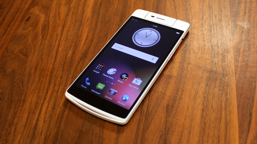
While the camera is clearly the headline on the Oppo N3 (more on that later), there are a number of other features to note that help the N3 stand out against the vast array of other smartphones.
First and foremost, the fingerprint reader, while not being a feature Oppo is shouting about particularly loudly, works surprisingly well. With the N3 held in the right hand your forefinger rests pretty comfortably onto the reader, allowing you to unlock the phone with a simple click, rather than the unwieldy swipes some other phones demand.
Pressing the reader also wakes the phone, meaning you can wake and unlock the N3 quite simply with just one finger. Should you want to share the phone with others, or have the flexibility of using multiple digits, the N3 can be taught up to five fingerprints.

A relatively standard feature in the far-east perhaps, the dual-SIM capability is now finally becoming a more wide-spread feature in phones here in the UK, including the incredibly cheap Huawei Honor 3C.
It essentially means users can choose to use their phone for both business and pleasure; the N3 is capable of taking one nano-SIM and a secondary micro-SIM.
One slight downside is that the micro-SIM slot also doubles as the micro-SD card slot, meaning users will have to choose between either additional storage on top of the phone's 32GB built-in capacity, or a secondary SIM.

Oppo has included a little gadget called the O-Click. It's a key-fob sized accessory that can be used to remotely trigger the camera, find your phone or control playback music.
You can even set it up to give you an alert if it goes out of range of your N3, meaning you'll never forget your phone again. It's a nice little extra that feels like a welcome bonus Oppo could have easily charged a few extra quid for.
Interface
Android 5.0 Lollipop is finally making its way to a variety of smartphones, including many that were launched in the earlier part of 2014 such as the HTC One M8.
The N3 is still on Android 4.4.4 and because of the heavily skinned Color OS that Oppo has employed, it is unlikely to see the Lollipop update until later in the year. if ever. Fortunately, this previous version of Android has full compatibility with all aspects of Google's services, and it doesn't hamper the experience in any way.
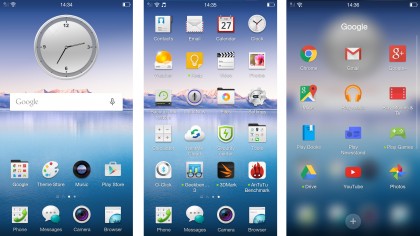
Color OS is a Chinese version of Android that is heavily skinned to look drastically different from the stock Google OS. It has been used previously on a variety of phones in Mainland China, and featured on the Asian version of the OnePlus One.
The first main difference you will notice when you first start using the N3 is that Color OS does away with the Android app drawer, keeping everything on the home screen. You'll have to be pretty diligent and employ the folders to keep your home screen tidy.
Fortunately Oppo offers a seemingly unlimited amount of home screens at your disposal. I got bored after adding a 28th home screen page, so I'm pretty sure no one will ever run out of space to add as many widgets and shortcuts as they desire.
Like many other Android skins, there is the ability to change the theme, with Oppo pre-loading its own 'theme store', which is filled with a wide variety of themes that change the wallpaper, icons and the overall look of the operating system.
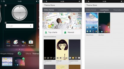
Some of the themes are childish, others are chintzy, but there are one or two that are worth the download to customise the look of your phone. Personally, I switched onto the 'Jelly Bean' theme and breathed a partial sigh of relief.
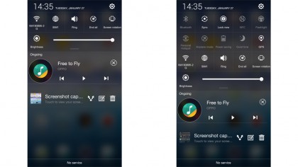
Whatever theme you choose, the notifications pane has had the once over by Oppo, offering all the setting toggles you might need at the flick of a finger. There's everything from Bluetooth and NFC switches, to an emergency 'lock now' toggle, and a very handy flashlight toggle.
Should you have lots of notifications pending, the toggles will shuffle upwards and only consume a single line, offering the most popular setting adjustments; to access the full quota, a settings shortcut is always to hand in the top right of the pane. To clear notifications, simply tap the 'brush' icon that shows up at the bottom of the notification pane.
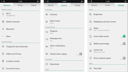
Speaking of settings, Oppo has split the settings menu into three separate tabs, similar to that which you would find on the Touchwiz-toting Samsung Galaxy S5. The 'general' tab houses most of the main settings, covering wireless and networks, accounts & security and system options.
The second tab covers everything concerned with the phone's sounds and notifications, and also allows you to enable the 'Maxx Audio' setup, which offers a selection of preset sound modes, and the ability to manually adjust them with a graphic equaliser or bass, treble, volume and dialog sliders.
Color OS comes pre-loaded with a bespoke weather app, backup and restore functionality, as well as access to the NearMe cloud services that allow contact and SMS backup, and a 'find my phone' function.
Overall, it isn't the worst Android skin I've used and I'd honestly rather use this than Samsung's Touchwiz, but I'd still choose Google's original OS interface any day.
Current page: Key features and interface
Prev Page Introduction and design Next Page Performance and battery life