Why you can trust TechRadar
Let's not forget the bare necessitates when we look at an all-singing, all-dancing smartphones such as this. There's still the ever-so-2005 functions of telephone calls and SMS messaging to consider.
In this department I'm happy to report that the Oppo N3 makes both functions straight forward and easy to get-to-grips with. Calling and texting can be accessed directly from the lock screen for fast response to missed calls and texts.
Neither are crammed with any particularly ground-breaking special features, but they are the definition of functional. There's a whiff of Apple's iOS that binds the design of both apps, though this isn't necessarily a bad thing, just a bit lazy.
The primary internet browser included on the N3 is based upon Android's stock browser, but, as with many other aspects of the phone, it has had a fresh lick of paint applied in the form of an overhauled UI.
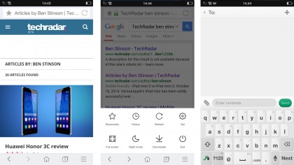
Perhaps because of the over-sized display, Oppo has cleverly moved the main navigation and menu buttons to the foot of the browser window.
There are front and back keys; a home key which brings up a page of easy-access bookmarks and well known favourites such as Google, Facebook and Twitter; and a menu button which brings up a further set of options such as a high-contrast night mode, a full screen browsing toggle and various other additional settings.
Overall I rather liked Oppo's own browser, and think it has done a good job of making it work well on a large screen. If, however, you can't get on with it, Google's Chrome is pre-installed as a safe alternative.
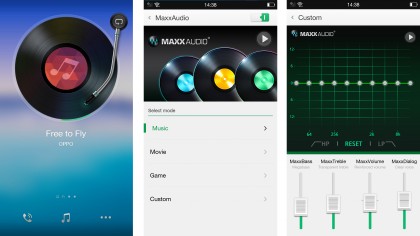
Music playback is handled via a relatively sparse app that allows you to create playlists, choose favourite tracks and even search for new music via the phone's mic, similar to Shazam.
On the homepage, Oppo dedicates a special page to music playback that presents you with a record-player interface that allows you to swipe the needle arm onto the record in order to start music playback. It's quite fun the first few times, but ultimately a bit of a worthless gimmick.
Browsing photos and other pictures on the N3 is also taken over by Oppo's own app. Like all the other Color OS apps I've encountered so far, the interface is simple yet acceptable.
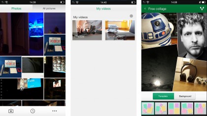
Pictures are displayed in a collage-like fashion, though there doesn't appear to be any special algorithms behind the screen making 'better' photos stand out.
One built-in feature that users might enjoy is the ability to create photo collages from any of the photos or pictures on your phone and save them as a single image. While there's a million other apps out there that will do the same thing, having the feature built into the gallery is a nice little touch.

The video app? Oppo's designers clearly ran out of steam with this one. It's bland and totally devoid of any special features. One major upside, however, is that the app natively plays MKV files, a common format for 'downloaded' movies, without a hitch.
Camera
Here's the bit you have probably come to this review for, and overall it doesn't disappoint.
The Oppo N3 is the first smartphone to have a fully motorised camera that is both your front, and rear facing camera. This means the 16MP camera with Schneider Kreznauch lens is for both high-res selfies and gorgeous landscapes.

After a little glitch with the app which caused the screen to go black when changing to front-facing mode (fixed with a side-load of the latest camera app), I was away and snapping. Slowly swipe downwards on the camera preview screen to make the camera module tilt upwards.
This gives you quite versatile shooting angles, although a colleague pointed out that it could be responsible for some rather naughty candid-camera public photography.
A quicker downward swipe flips the camera around for your selfies, and once you're done, another fast upward swipe brings the camera back around to rear-facing mode. Fortunately, when you do switch modes, the camera app knows what to do and spins the view around too, otherwise all your selfies would be upside-down.
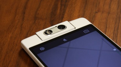
The module itself, apart from the ghastly faux leather stitching, feels solid and secure, and can be manually positioned should you wish. One neat feature that I found really handy is that even with the phone in sleep mode, you can quickly wake and get straight to snapping photos by spinning the camera around.
My biggest concern? Cases. What kind of fully-protective cases will accommodate for the camera module? The answer, unfortunately, is a case that won't cover the camera module whatsoever.
As for the camera app itself, more work has gone into this than most of the other replacement apps, and considering the camera is the phone's headline feature, this is no real surprise.
Swipe up from the shutter icon and you are given a range of different camera modes such as 'Ultra HD', a night mode, an 'auto panorama' mode (which automatically rotates the lens to capture a wide panorama), 'beautify' mode and an 'expert' mode.
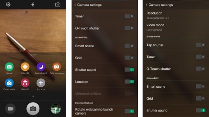
'Normal' mode is more like an automatic camera mode, and does well to cope in most lighting conditions without the need to switch settings.
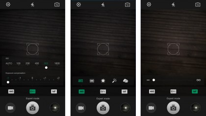
The 'expert' mode allows easy control of exposure, ISO, white balance and manual focus. It's definitely a nice touch and afforded the opportunity to tinker with photos when the opportunity arose.
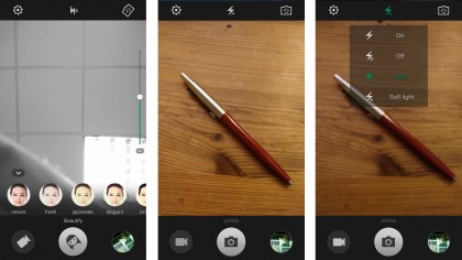
Get bored of the included photo modes? Well Oppo has made it easy to add on more. Currently available are a HDR mode (which probably should have been pre-installed), alongside a unique RAW capture mode and a'super macro mode' (read: digital zoom).
There's also an 'after focus' which, as the name suggests, lets you change the focus of an image after you've taken the photo. It's a great idea in principle, but as it relies on software processing, the effect isn't that pronounced.
If you are willing to spend the time in Adobe Lightroom, the RAW mode can gift you some truly excellent photos, but at the expense of phone storage. Each picture weighs in at about 30MB rather than the usual 3-4MB.
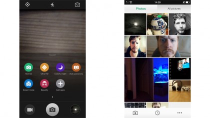
There are plenty more features to explore, such as a 'soft light' mode which turns on just one of the two LED flashes to illuminate a scene without 'flooding' the image with harsh white light.
As for the photos themselves? Overall I was really impressed. There are a few minor hiccups such as the really poor stitching of panoramas which makes the auto panorama mode a bit of a let-down.
Having all those megapixels means that using it in front-facing mode is a real joy compared to a lot of other hampered low-res snappers such as the low-res 1.2MP front camera on the Apple iPhone 6.
For day-to-day snapping, the camera launches quickly and has all the features and filters you could want, and admirably keeps up with competition from the other top smartphone snappers such as that found in the Samsung Galaxy Note 4 or the Nokia Lumia 930.
Where video is concerned, I was surprised to see 4K and HDR video omitted, though the 1080p video is still of usable quality. It's almost like Oppo got so carried away with making the N3 great at stills, it forgot to do anything with the video capabilities.
Current page: The essentials and camera
Prev Page Performance and battery life Next Page Camera samples