Why you can trust TechRadar

We really, really liked the original Orange San Francisco, and it became out benchmark for budget mobile phones throughout 2011. We thought the Orange San Francisco 2 might become the one to beat in 2012. But having spent time with this sequel, we aren't so sure.
Budget smartphones such as the HTC Wildfire S, Samsung Galaxy Y, BlackBerry Curve 9300 Huawei Blaze and Motorola Atrix 2 have proliferated over the last year, and to lead the pack a phone has to be really special. The Orange San Francisco 2 does move things on from its predecessor, but not hugely, so it doesn't sit head and shoulders above the rest as the original Orange San Francisco did.
We liked
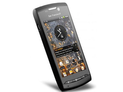
The touchscreen is sharp and clear - 480 x 800 pixels in a 3.5-inch screen are bound to deliver well.
Battery life is pretty good, although as ever we temper that comment with the fact that your own pattern of use might drain it relatively quickly.
We disliked
We wanted the Orange San Francisco 2 to be more of an upgrade than it is, so we feel a bit let down overall.
The build isn't as great as we'd have liked. The Orange San Francisco 2's shiny black plastic is so-so, although we haven't seen the white version, so that may be a nicer-looking handset.
The absence of Twitter and Facebook clients and the lack of integration of their contacts is a big chasm in functionality.
The Orange San Francisco 2's touchscreen feels a little unresponsive to us, especially when entering text.
Final verdict
Small, neat and affordable, the Orange San Francisco 2 is far from being a bad buy. But Orange set the bar very high with the original San Francisco, and this follow up just doesn't represent a giant leap forward.
That's got to be good news for the competition, whose budget Android handsets have been overshadowed by the Orange San Francisco for many months. So come on, everyone, the field is now wide open.
