Why you can trust TechRadar
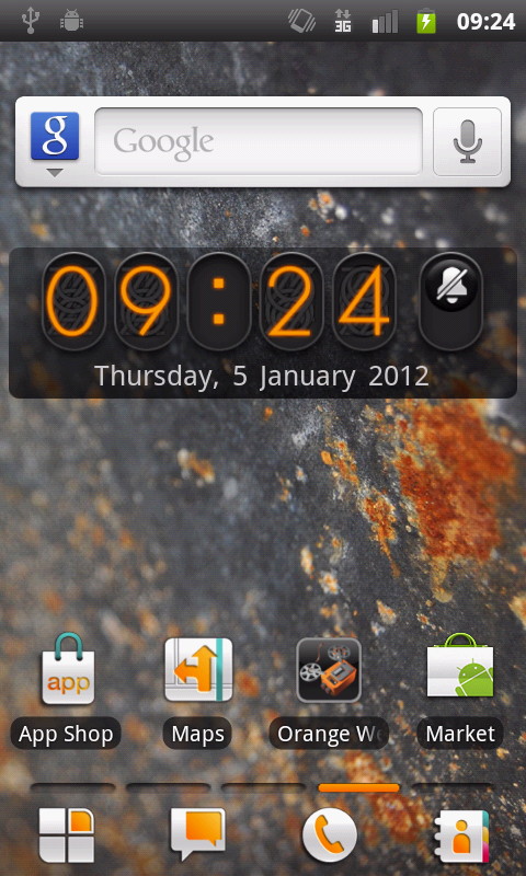
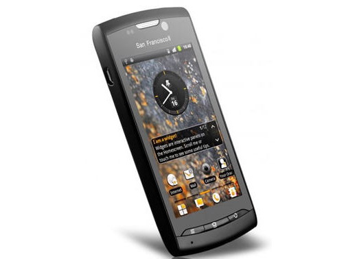
Orange just loves putting its own skin onto Android, and as we said earlier it has skinned the Orange San Francisco 2 within an inch of its life.
Unfortunately Orange doesn't seem to understand how to do skinning well. The default wallpaper is dour, and we aren't fans of Orange's icon design either. Yes they use the orange colour, but they just look staid and old-fashioned.
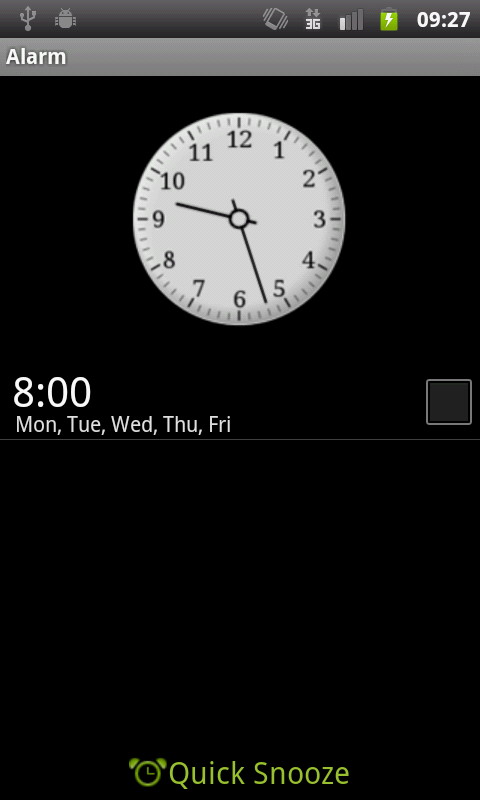
On the main home page, Orange drops a clock with a handy alarm icon. Tap that and you can immediately set up an alarm. It's great for those of us who like to use our phone to wake us up in the morning - and the Quick Snooze feature enables you to configure how long you want your lie in to be.
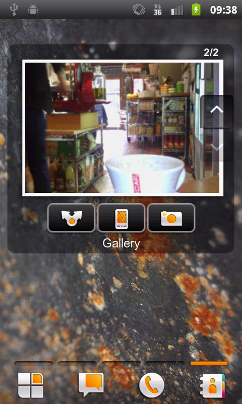
Move around the five home screens and you come across more Orange efforts in the shape of widgets. We have to admit here that Orange has often done a nice job. Take the Orange San Francisco 2's Gallery widget, for example. It has nice large thumbnails of your shots, plus a quick share option and a link into the camera.
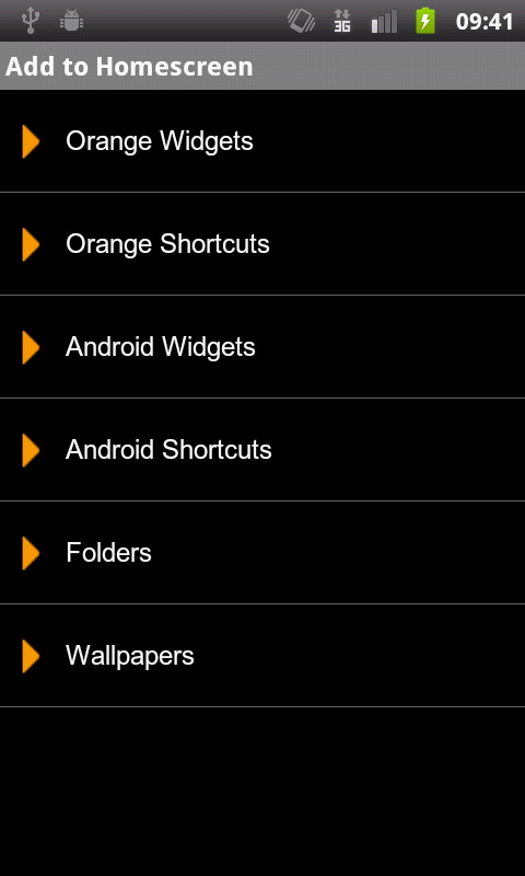
When it comes to personalising things, Orange has separated its own widgets from the Android ones. We like this because there's some duplication of functions, and the separation could save Android newcomers from some confusion.
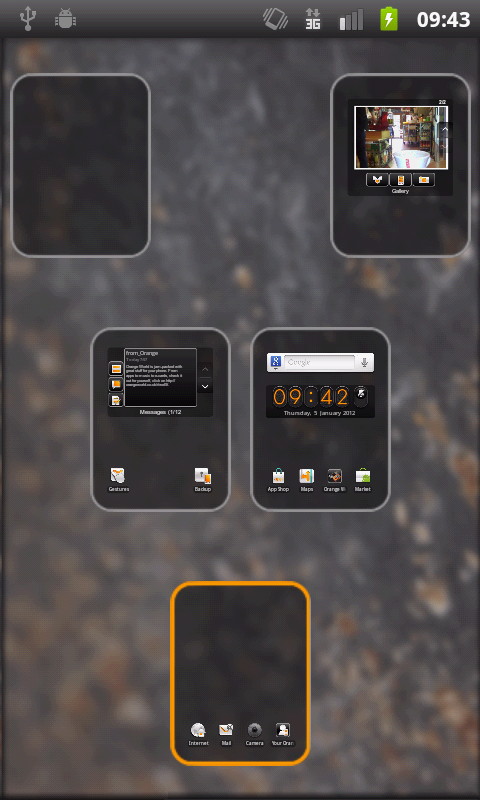
Each home screen has a bar of four shortcuts running along the bottom edge. These take you to the main apps menu, messages, the dialler and contacts. Tap and hold on this bar for a screen that shows all the home screens in thumbnail view, making it easy to get around.
