Why you can trust TechRadar
The Pixi Plus boasts the latest version of Palm web OS, v1.4.1, which doesn't feature any significant changes. The biggest came earlier, with v.1.4 adding video capture to proceedings. However, big changes aren't needed to this OS, it's very well conceived, hugely intuitive and really easy to use.
The interface is perhaps second only to HTC's Sense UI, used on phones like the HTC Desire, in terms of functionality and ease of use. It's fantastic to see it employed again here in full force instead of a scaled back version, short of features and functionality.
Palm's web OS is different to every other operating system out there. It doesn't rely on a series of widgets, housed on customisable Home screens, but on an application 'card' system, which assists in making it a very effective multitasking device.
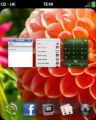
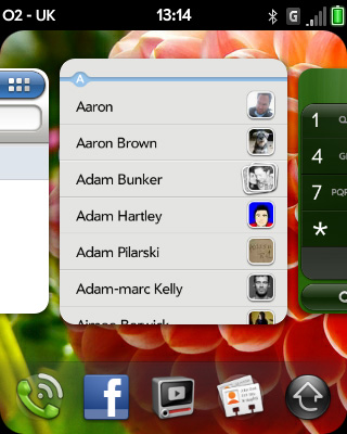
If you have an application open, a live card is shown on the application screen. The more you have open, the more you're able to scan through. Tapping on the card, or performing a downward drag on the the gesture area, makes the app full-screen, allowing you to work within it. Another downward drag minimises it.
You can open as many cards as you like and flick through them on the Home screen. However, the more applications you have open, the greater toll it takes on battery and processing speed.
Any more than five and you're looking at a of slowdown, potentially.
Moving between the apps was very fast on the Pre Plus, but with the slightly less grunty processor and half the RAM on offer here, it doesn't quite have the same pep, but it's still fairly pacey.
Sometimes screens don't render properly when working within an application, and very occasionally the phone froze and reset itself when trying to launch an app.
Those who buy this phone won't be doing so necessarily for Desire-like speed, so we're happy to cut it some slack for trying to be the best it can be.
Dragging a card off the top of the screen closes the application (which gives out a reassuring 'whoosh!'), while swiping to the left on the gesture area takes you back a step within the application.
This works very well, especially as a back button when browsing, or working in multi-layered applications like the music player.
So the Home screen isn't really customisable aside from the Launch Bar at the bottom of the screen. You can drag that up from the gesture area to move between the four chosen applications and the menu launcher.
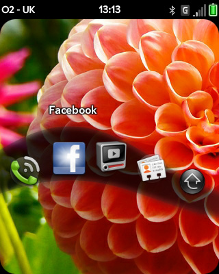
Then you can easily move between the icons like a wave, letting go when your choice is highlighted.
Another nice little touch is that the Palm Profile remembered our favourite apps after we switched SIMs between the Pre Plus and the Pixi Plus. It's sometimes the little things that make the difference and web OS is loaded with them.
The interface is very intelligent, and pretty soon you'll be whizzing through your favourite features with great ease, using the thumb to swipe up, down, left and right with great fluidity.
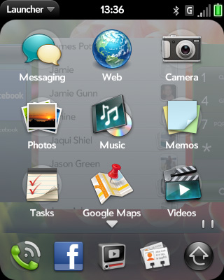
It all feels so natural and it's fantastic to see Palm employ the full version of the OS on this second-tier handset, without any limitations involved.
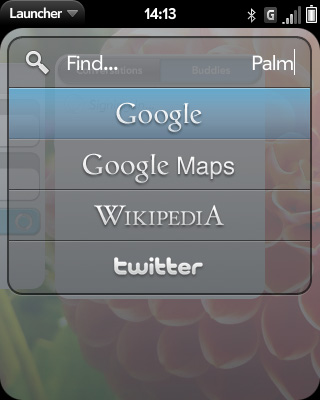
Another thing we liked about the Pre was the general search feature, which scans the phone for apps and contacts as soon as you start typing.
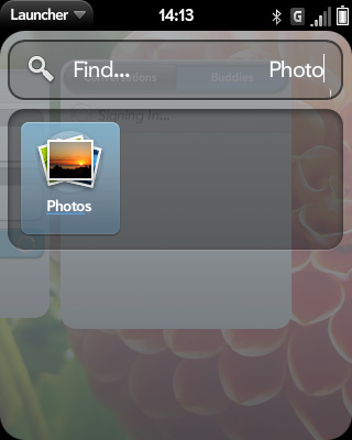
Once it realises that nothing of that description is housed within the handset, it serves up options to peruse Twitter, Google, Google Maps and Twitter. It's a nice feature to have and we used it more often than not.
Notifications of new emails, texts, Facebook activity and IMs appear in the bottom right corner of the screen, and are joined by a flashing light on the gesture area. That little strip of light also flashes when you swipe the gesture area, depending on which direction you swipe.
The notifications are non-instrusive, but they don't go away until you've acted upon them, or swept them to the right to get rid of them, which is kind of annoying if it's another "Joe Bloggs also commented on John Doe's status".
They can be turned off though. The Palm Synergy functionality is pretty neat too, synchronising all of your events from Facebook, Google and Outlook into a colour co-ordinated timetable.
Another little annoyance is having to press the power button to wake the phone up when the screen goes to sleep. We'd much prefer to just hit the keyboard. That's minor though.
Current page: Palm Pixi Plus: Interface
Prev Page Palm Pixi Plus: Overview, design and feel Next Page Palm Pixi Plus:Contacts and callingA technology journalist, writer and videographer of many magazines and websites including T3, Gadget Magazine and TechRadar.com. He specializes in applications for smartphones, tablets and handheld devices, with bylines also at The Guardian, WIRED, Trusted Reviews and Wareable. Chris is also the podcast host for The Liverpool Way. As well as tech and football, Chris is a pop-punk fan and enjoys the art of wrasslin'.
