Why you can trust TechRadar
Palm Pre 2 review: Verdict
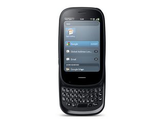
It was hard to know exactly what to expect from the Palm Pre 2. The name inherently implies something more than the upgrade to the Pre Plus, and yet having nearly the same handset design with just a modest spec boost seemed to suggest otherwise.
We're left to look at the HP webOS software for the changes, then. Certainly, it looks similar to what came before, but iOS has barely changed in appearance since its inception, and it has many more features now than in 2007.
Sadly, the new webOS just isn't that much a boost. The 2.0 moniker feels undeserved, to be honest. It's an improvement over what came before, but only a mild one, while Android and iOS have been upgrading fervently.
We liked
Okay, we've just gone and called the new webOS not that much of an improvement, but it still goes in the 'Liked' column because it was so phenomenally good in concept to begin with.
Even if some its cooler features have been picked up by other OSes, the card system is still just an incredible piece of UI design, and Stacks is brilliant addition to it.
The Just Type features, even though it's technically very similar to what was already available, is a well thought-out addition.
The phone is still easy to set up and use. We don't think it's the most intuitive around for beginners, but after a little time with it, it ends up providing powerful features in a way that's easier and simpler in the long run.
The cloud integration is as good as ever, making this ideal for messaging enthusiasts and social networkers (lack of official Twitter app notwithstanding). We even think the keyboard isn't bad, despite how tiny it looks.
The camera is also capable of producing some very nice shots and video, under the right circumstances.
We disliked
We mentioned encountering some bugs and slowness in various sections, and this was really disappointing. Fortunately, Palm has been quick off the mark with a 2.0.1 update that's touted to fix lots of bugs generally. Even with that, though, webOS 2.0 feels surprisingly raw technically in places – more like a 1.0 release.
We're not convinced by the Pre 2's form factor, either. While the materials are actually nice, and we think it should last well, it's thick and heavy.
Palm hasn't really moved past where it was back in 2008, which is shocking when you look at the incredible industrial design in the iPhone 4, or beautifully solid and reassuring build quality of the HTC Desire.
And not having an updated screen is a huge disappointment. 320 x 480 may only be six months out of date, but we've simply moved on since then to bigger and better.
The battery life is pretty poor, too. Again, every other smartphone has improved in this area, but the Pre 2 hasn't.
It's also a real shame that no networks are offering the Pre 2 subsidised. While it's hard to blame Palm for it, it's fair to say having the only price for this phone being £399.99 is definitely something we dislike.
Verdict
At this point, the Palm Pre feels like an old friend you'd lost touch with. You're a bit surprised he dresses the same as when you last knew him, but when you get talking you remember what an awesome time you had together.
But he has a few oddities about him, and the more time you spend together, the more you realise you've grown up and he hasn't – at least not enough.
There's an absolutely world-beating phone sitting somewhere in the Pre 2's DNA, but it hasn't revealed itself here. It simply doesn't stand up to the iPhone 4 or modern Android phones such as the HTC Desire Z. Even webOS's status as the design-conscious UI is under threat from Windows Phone 7.
We like it, but it just isn't top of the pile.
Current page: Palm Pre 2 review: Verdict
Prev Page Palm Pre 2 review: Official gallery
Midjourney V7 gives the AI image-maker power, speed, and correctly shaped hands

This Ryzen-powered NAS is barely bigger than a shoe box and can hold 11 SSDs and HDDs, delivering more than 500TB of storage

This is the world's first 1TB microSD Express card to go on sale, just in time for the launch of the new Nintendo Switch 2


