Why you can trust TechRadar
Palm Pre 2 review: Design
While the Palm Pre 2 looks much the same as its predecessors on the outside, there are actually a fair few differences.
An all matt-black finish on the back and around the edges makes the Pre 2 easy to grip, but picks up fingerprints and smudges more than just about any other handset we've seen recently.
The glass front is equally as bad for this – it really is a total nightmare to keep clean. It rarely becomes totally unusable, but it can get very annoying, very fast.
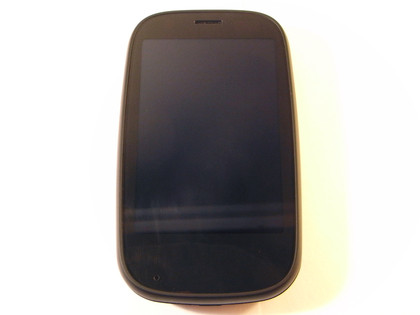
Interestingly, the glass is now totally flat. It gives the Pre 2 an odd look, since the handset on the whole is clearly designed to be curved all around – it's almost as if someone has just sheared off the very front with a meat slicer. It makes the screen nicer to use than before, though.
We know that the curved back and sliding mechanism is an important part of the Pre, but we would have preferred a flat back. When you've got the phone closed laid out on a table and are using the touchscreen, it's fine.
However, open it up and it becomes almost unusuable due to the level of wobbling it does on the table. Obviously, it's intended that you'll hold it in hand most of the time, but it would be nice if it didn't spin all over the place anyway.
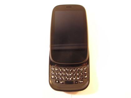
Underneath the screen in the 320 x 480 HVGA screen. It hasn't received an upgrade since the Pre Plus, which is a real shame, since the 3.1-inch screen isn't that much smaller than something like an iPhone 4, which has a much higher resolution.
We're used to seeing stunning 480 x 800 WVGA screens even at the cheaper end of smartphones, such as the HTC 7 Trophy and the Orange San Francisco.
The card system in particular would do much better with a higher-res screen, because you'd be able to see each card with more clarity.
However, the screen is bright and vibrant, and the resolution is still high enough for text to be perfectly readable in the nice large fonts used in webOS.
Below the screen is the gesture bar, with a small light that indicates which direction you've swiped in.
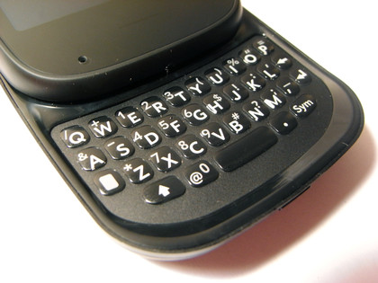
Slide open the handset and you'll have access to the keyboard. It's still as tiny as ever, and the edges of the slider are just as sharp, too. We'll go into what it's like to use for writing in the Messaging section, but it's incredibly solidly built.
The backlit keys feel as though the whole lower part of the case is one solid piece, rather than individual buttons, and it feels like it'll last forever.
On the left side of the device is a volume rocker, while the right houses the microUSB port for charging and connecting to a PC. On top of the Pre 2 is the on/off/sleep button, as well as a little switch for setting the phone to silent. It's also up here in the centre that you'll find the 3.5mm headphone jack.
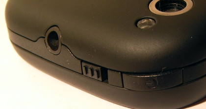
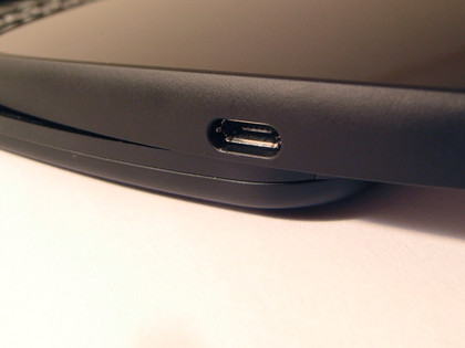
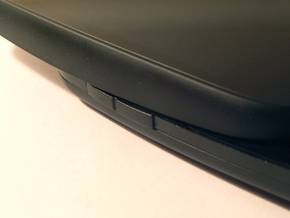
Turn the phone over and you'll see the lens for the five-megapixel camera, along with its little flash. There's also an outlet for the loudspeaker.
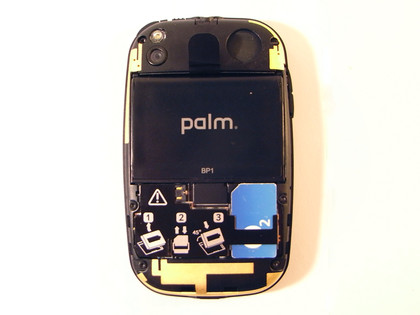
This rear battery plate is ready for use with Palm's Touchstone charger. To open it up, you press a little button on the bottom, then slide your nail around the edge to pop open a catch (it's a bit like opening a car bonnet). Underneath the cover is the battery, which can be removed using a handy pull-tab. However, you don't need to pull it out the get at the SIM-card slot, which sits in the bottom-right corner.
The materials used in the Palm Pre 2 all feel nicely premium. There's a small amount of give in some of the joins, but nothing concerning, and we'd say build quality is very high overall.
At 59.6 x 100.7 x 16.9mm, it not a small phone, and the 145g weight is also pretty hefty these days.
Current page: Palm Pre 2 review: Design
Prev Page Palm Pre 2 review: Overview Next Page Palm Pre 2 review: Interface