Why you can trust TechRadar
Palm Pre 2 review: Messaging
With all those fancy contacts drawn from the cloud and a keyboard attached to the bottom of the phone, it's probably time to send some prose.
The Messaging app combines your SMS conversations and instant messaging, all in one handy threaded view.
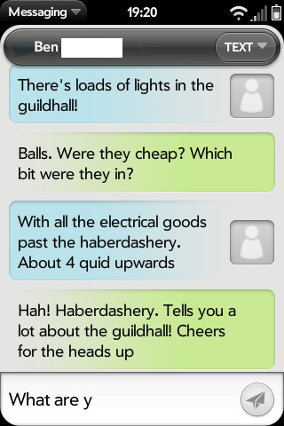
The main screen shows the different people you've been conversing with, and from here you can select which to look at.
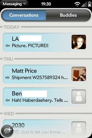
The back and forth is much more defined than on a lot of other phones, with clear distinctions and different colours, rather than just the subtly differentiated speech bubbles you get on a lot of other phones.
If you have a picture attached to the contact of the person you're chatting with, this will also appear next to their words.
You can switch the conversation with someone to another number or IM account in their contact details using the button at the top right of the window. You enter text in a field at the bottom, and there's a paperclip icon should you want to attach a photo or video.
Email is simple for Google, Yahoo and Microsoft Exchange users – these all ready for simple setup with your username and password, and you can manually enter POP or IMAP settings for a webmail account off the menu.
Your inbox is arranged by date by default, but you can sort it by sender or subject if you'd prefer.
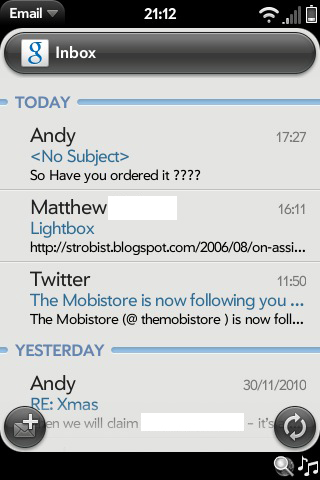
Emails are clear and easy to read. You have the sender's name (and picture, if they have one in your contacts) at the top, and you can tap this too see their full contact details. The subject appears in a blue field, and you can use the left and right arrows on here to move between messages without going back to the inbox.
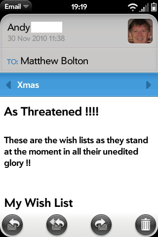
Email conversations aren't shown grouped or threaded here, which is a shame. It's something most other phones are doing these days, so it would be good see it added to HP webOS.
The icons at the bottom of a message enable you to reply, reply to all, forward and delete the message.
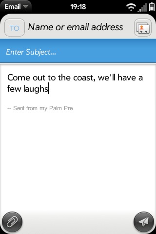
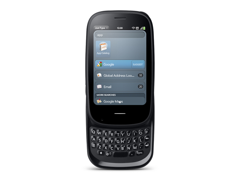
Writing messages and emails using the keyboard is nowhere near as bad as the Pre 2's small keys would have you believe. It was a criticism of the first Pre, and though things haven't overtly changed, we don't think it's all that bad now.
Believe it or not, we actually found it easier to use than the BlackBerry Bold 9780, thanks in part to nice clear gaps between each letter. It wasn't as easy to use as a keyboard with larger keys in the first place, such as the Nokia C6 or HTC Desire Z, but we didn't make too many mistakes.
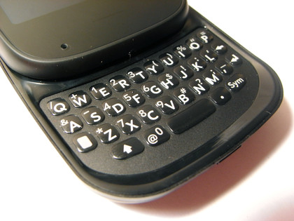
The sharp raised edges do make it feel as though you're trying to type in a shoebox or something, though. Just having a nice flat (or at least smooth) edge would have been preferable.
The backlighting on the keyboard is fairly subtle, but is more than enough to let you see what you're doing in the dark.
Current page: Palm Pre 2 review: Messaging
Prev Page Palm Pre 2 review: Contacts and calling Next Page Palm Pre 2 review: Internet