Why you can trust TechRadar
When you turn the phone on for the first time, it's easy to forget about the hardware. Palm put all of its resources into making sure the operating system – called WebOS and essentially a very well-designed Linux distro for smartphones – as fluid as possible.
It is so fluid, when you touch the screen, you see a subtle ripple effect. There's a quick set-up process where you create a profile for the phone, a tutorial and a video. Let's start by covering the touch interface.
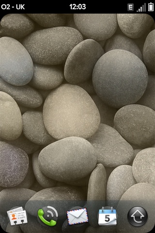
HOME SCREEN: The interface is extremely zippy and responsive
Palm uses a dualistic design approach where you touch the main screen to perform actions such as deleting emails (by swiping to the left) or moving windows on the screen.
Then, below the main screen, there's a second gesture area where you can swipe to the left to close the current window. Apps run on "cards" that are easy to manage and move around.
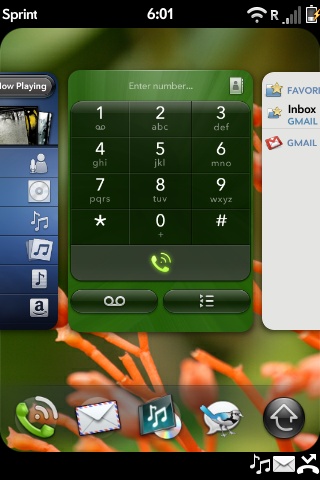
CARDS: Applications sit on cards which you can move about
You can swipe to the left or right to see cards on the screen, toss them up to remove them, and select options on each card with your finger.
The card interface is important because the Palm Pre supports multi-tasking, the best implementation of the PC concept of running multiple apps at once and switching easily between them.
Still, if you open more than about five apps, the phone will start to run slow and your swipes and other gestures won't work as accurately. There's an easy solution: close a few of the open apps.
Speaking of the touch interface, it's powerful and accurate if you are already familiar with a touch phone interface, and we found it was great after about 15 minutes of trial and error.
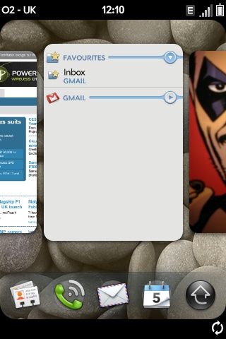
APPS: The Pre can run many apps simultaneously
Some of the gestures are a bit odd – such as flicking your finger up to start the app launcher. It's likely won't find this gesture by accident. In fact, we tested our Palm Pre with several teens and a couple of adults who just couldn't understand how to use the phone.
It requires some training, which is not good for a device that Palm hopes will sell in the millions. When we explained that you flick left to go back, and press the center button to see cards, our test subjects had a much better experience - but the touch interface is not as intuitive as the Instinct or iPhone.
That said, in the short time we've had to play with it we've also realised just how much we prefer some of the functionality of the webOS platform to the iPhone. Going back to the iPhone, we kept having to swipe a finger to go back a screen (instead of always having to press the home button). We've learned to run only a few apps on the Pre, but the interface on the Palm is just outstanding. We have also noticed another perk.
When you combine Facebook contacts with Gmail, the Pre automatically uses the Facebook profile picture for that contact, even if you did not have it for Gmail. This is the future integration we liked so much, and points to a day when Web services communicate with each other and make the Internet more like a cloud OS.
Accurate touching
Accuracy is very good - the touchscreen recorded finger presses and swipes perfectly - unless we had too many apps running.
The iPhone will occasionally have problems with finger presses, especially on the edge of the screen, but the Palm Pre is more accurate. Navigating through apps on the Palm Pre is a breeze, and it's easy to add applications using the Pre App Catalog.
Applications
There are only about 20 or so apps available at present, but that will likely change soon - Palm will be offering a free SDK this year and has a long history of working closely with developers.
It is encouraging to see a few new third-party apps have been released since its launch, including one from Intuit that lets you process credit card transactions, the Evernote client, and a few syncing utilities. This is good news, because it means developers are starting to release apps for the device - about three or four per day so far.
Also, you could argue that there are thousands of apps available for the Pre already if you count legacy apps that run using the free, third-party, free-to-try Palm Classic app (which does cost to own though).
However, classic apps can't match the ease-of-use and integration characteristics of apps designed for the Palm Pre – running classic apps would likely appeal only to those who have a Palm app they really need.
Below the main screen, you can store five apps – they are interchangeable, so you place the music player icon there instead of the mail icon for instance.

SHORTCUTS: Store five apps at the bottom of the home screen
Placing apps there is reminiscent of using a Palm phone of yesteryear, but you quickly learn to access apps from the main launcher. It's impossible to know, incidentally, whether having hundreds of apps installed on the device is even possible or will make the Palm Pre hard to use, since there are so few available at the moment.
But the paradigm for accessing apps is sound – you can flick up or down or side to side to see more icons. The HTC Hero has a much more awkward paradigm where all apps are either stored on the desktop screen in a viewing area that only supports one center screen and three side screens either side, or in one long collection of apps.
The iPhone offers up to 9 holding areas for apps and can support up to 148 apps at once.
More interface features
There's a few more interface options to mention. If you hold you finger on the lower portion that holds up to five apps and drag it up, you will see a ribbon that flows on the screen in an animated fashion.
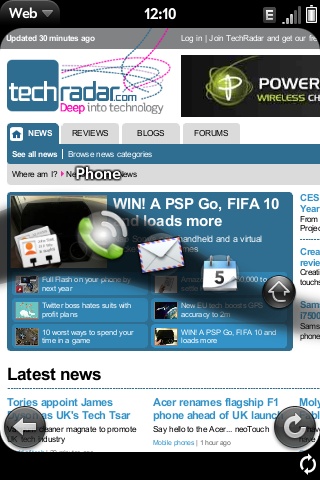
It's impressive, but not necessarily that useful because you can't load dozens of apps there and use it like the dock on a Mac or the taskbar in Windows Vista.
One other interesting UI feature – there's a drop-down menu in the upper left corner that is easy to miss unless you look for it. For example, when you are typing up an email, you can access the menu to see options for that email (such as marking the message as a high priority), saving the message as a draft, and the copy and paste functions.
Pinch to zoom
The Palm Pre also supports zoom in and out by pinching and spreading your fingers out, such as when you are browsing sites and when you are viewing photos.
There are quite a few interesting gestures to explore on the phone. When you have the launcher up, you can close it by flicking up from the gesture area. You can press and hold down on a card to move it to another spot. You can double-tap to zoom all the way in or out on the screen.
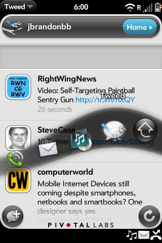
RIBBON: Active apps can be controlled from the ribbon
The touch interface is not entirely perfect, however. The ripple effect when you touch the screen is helpful, but there are times when you press the screen and you don't see a ripple, or you see it and it seems like nothing happened. If you are running too many apps, you can swipe to delete an email and nothing will happen for about a second.
If you swipe again, you can delete multiple emails by accident as the Pre catches up. These are occasional glitches, and likely all related to memory handling.
Keyboard niggle
Another minor issue: the Pre has an accelerometer that senses the direction of the device, so it will switch to landscape mode if you are viewing something at that orientation, but that also means the keyboard is now useless.
An onscreen keyboard has been found inside, but that's only accessed as a secret option.

See all Palm Pre deals:
All deals | Pay monthly | Pay as you Go | SIM free

John Brandon has covered gadgets and cars for the past 12 years having published over 12,000 articles and tested nearly 8,000 products. He's nothing if not prolific. Before starting his writing career, he led an Information Design practice at a large consumer electronics retailer in the US. His hobbies include deep sea exploration, complaining about the weather, and engineering a vast multiverse conspiracy.
