Why you can trust TechRadar

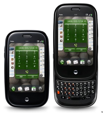
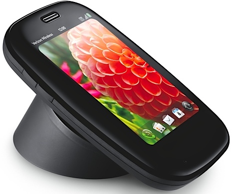
The Palm Pre Plus goes a little way to remedying many of the ills that have prevented the Palm Pre from assailing the smartphone heights first time around.
Having double the RAM assists with the speed in moving around applications, the tweaked keyboard makes the nigh-on-impossible task of coherent typing that little bit easier, and the extra storage will allow users to carry around a more reasonable array of movies and music.
We liked
The web OS operating system is primed for stardom. It's such a different approach, and one that remains attractive even in a year when the Sense UI and Motoblur stole most of the headlines. It just works so well, and weaves everything together in an original, intuitive and well-thought out package.
The multitasking capability is second to none, and the way gestures enable you to navigate through applications is straightforward and fun.
We love how easy it is to open and close applications, and the browser is also at the top end of the market.
The 3.1-inch touchscreen is vibrant and colourful, but also very accurate – and thanks to the improved RAM, whizzes through the phone's functionality very naturally.
Getting rid of the centre button and incorporating its functionality into the gesture control was the right call, also.
The incorporation of video capture, thanks to the latest version of web OS is a big plus, and Palm capitalises on that by introducing a handy clip-editing tool, and easy uploads.
We disliked
The keyboard still isn't quite there, for us. Picking it up to type emails or text messages is a laborious task that saps your enthusiasm for using the phone. The slight changes to the keys has helped, but it's not enough to make typing an enjoyable experience.
Why is the brilliant touchscreen not utilised with an on-screen keyboard?
The phone's more secure hinge feels great, but Palm could've taken the opportunity to smooth out the edges also, as you could really do some damage with the rim of this phone.
The App Catalog is still chronically short of depth and quality, and until that improves it's unlikely that this phone will engage the smartphone community in the way the Apple and Android plaforms continue to do.
There are other naggy things too, like the lengthy start-up time, the lack of real Facebook integration in contacts and the basic camera functionality, but it's still the two things that bothered us about the Pre that are now bothering us on the Palm Pre Plus – the App Catalog and the keyboard.
Verdict
A few small improvements to the Palm Pre's hardware means that the Pre Plus takes some baby steps towards doing its brilliant web OS operating system justice.
The keyboard is better, and so is the build quality, and there are more apps to chose from this time around – but these are slight tweaks rather than a serious attempt to iron out the perceived flaws.
We really liked the Palm Pre, and we like the Palm Pre Plus – they're both excellent handsets, but we can't help but see this as a missed opportunity for the company, because there's nothing here to win over those who weren't convinced in the first place.
Current page: Palm Pre Plus: Verdict
Prev Page Palm Pre Plus: Official galleryA technology journalist, writer and videographer of many magazines and websites including T3, Gadget Magazine and TechRadar.com. He specializes in applications for smartphones, tablets and handheld devices, with bylines also at The Guardian, WIRED, Trusted Reviews and Wareable. Chris is also the podcast host for The Liverpool Way. As well as tech and football, Chris is a pop-punk fan and enjoys the art of wrasslin'.

