Why you can trust TechRadar
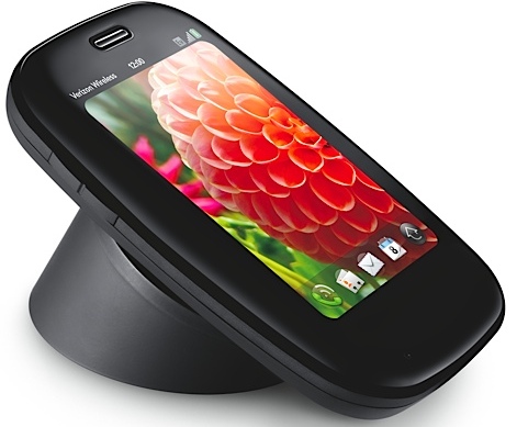
The Palm Pre Plus comes loaded with Palm web OS v1.4.1, which was unveiled in April and is the latest in a host of minor updates to the operating system wheeled out since Palm unleashed the Pre last year. 1.4 was the most important update yet, bringing video capture.
Thankfully there are no big changes to what is a wonderfully conceived operating system, perhaps only slightly inferior to the HTC Sense UI layered over Android and Windows Phone operating systems.

The difference here is that Palm hasn't piggy-backed on an established open source platform like Android – it has done all the work itself.
It still is among the most natural-feeling user interfaces available on smartphones at present.
There's no multitude of home screens, like the seven available on the HTC Desire, because everything is based around the idea of the application card system, which makes the Palm Pre such an effective multitasking device.
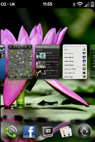
If you have, for example, five applications open, then you will be able to scroll through those five application cards screens using the touchscreen.
If you tap one of them or make a slight downward drag on the touch-sensitive gesture panel below the screen, the card will be maximised to full screen where you can work within it. Another downward drag will minimise the application and return you to the application card interface.
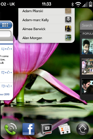
All this can be done really quickly thanks to the extra RAM, which gives the Pre Plus that little extra pep. If you want to close an application and remove it from the card menu, just drag it off the top of the screen and it's gone. Opening applications still feels like it takes longer than it should, though.
There are no 'widgets', as you'd see on Android and Nokia phones like the N900, which can be placed as fixtures on the home screen and it's not something that we miss. It's also nowhere near as rigid as the iPhone's interface.
The only customisable area of the home screen is the Quick Launch bar, which displays four applications of your choosing plus the Launcher (main menu screen). You can just touch to select what you want, or drag the whole bar into the middle of the screen, by slowly pushing up from the gesture pad onto the screen itself.
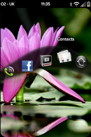
You can move between the icons, like a wave, and then just let go to open the one you've highlighted. It was one of the real 'wow' factors on the Palm Pre and it still makes us a little giddy now.
The gesture panel is an ingenious little touch, too.
If you're working deep within an application, like browsing through a photo album, using the touchscreen to scan through the photos (which takes a little bit longer to render than we'd like), swiping to the left on the gesture panel takes you back to the album menu, swiping left again minimises the application and takes you back to the application card menu on the Home screen.
It adds to the ease of use of the operating system and also works great as a 'back' button when using the web browser. It's all very easy; you'll find your thumb going up, down, left, tap in a seamless sequence.
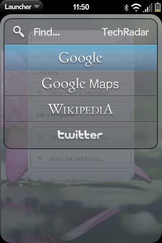
The Pre Plus also maintains the general search functionality that was such a nice feature on the original device.
Simply start typing when on the Home screen and it automatically begins searching the handset for contacts and applications. Once it realises nothing of that description lives on the phone it offers the option of searching Google, Google Maps, Wikipedia and Twitter. It works exceptionally well.
New emails, texts, IMs and Facebook notifications arrive in a non-intrusive fashion underneath the Quick Launch bar, and a little tap on the message icon (which leaves a nice ripple at the point of contact) will open the relevant app, although this can get a little confusing when multiple messages come in at the same time.
The calendar app is also pretty great, with Palm Synergy pulling down events from Facebook, Google and Outlook, and merging them into one neatly colour-coordinated timetable.
Basically, the interface is great and remains, even after about 18 months, completely unique to Palm. When it all comes down to it, the web OS software is the reason why HP bought the floundering company, and we're excited to see it put to good use on different devices.
Current page: Palm Pre Plus: Interface
Prev Page Palm Pre Plus: Introduction and overview Next Page Palm Pre Plus: Calling and contactsA technology journalist, writer and videographer of many magazines and websites including T3, Gadget Magazine and TechRadar.com. He specializes in applications for smartphones, tablets and handheld devices, with bylines also at The Guardian, WIRED, Trusted Reviews and Wareable. Chris is also the podcast host for The Liverpool Way. As well as tech and football, Chris is a pop-punk fan and enjoys the art of wrasslin'.
